The Renaissance of CSS: How Native Browser Capabilities Are Redefining Digital Expression

In the early days of the web, animation and complex visual interactivity were synonymous with heavy JavaScript libraries. Developers were forced to rely on external dependencies that bloated site weight, drained battery life, and often resulted in "jank" as the main thread struggled to keep up with the browser’s demands. Today, that paradigm has shifted entirely. We are currently witnessing a golden age of CSS, where native browser capabilities have reclaimed control over visual interactions, offloading the heavy lifting to the GPU and ensuring that modern web experiences are as performant as they are beautiful.
The Shift to Native Performance
The modern web developer’s toolkit has expanded to include 3D transforms, sophisticated layout techniques, clip-path, custom properties, scroll-driven animations, and the revolutionary @property rule. Perhaps most impressively, we can now animate nearly any property—even to auto-height—without a single line of JavaScript.
By leveraging the browser’s engine to optimize performance under the hood, we are building code that is inherently more robust and accessible. This shift is not merely about aesthetic preference; it is about architectural integrity. By moving away from external libraries that risk deprecation, we ensure the longevity of our projects and respect the device’s processing power.
Motion as Communication: Defining Intent
Before diving into the technical mechanics, it is essential to establish a design philosophy: we should not move things just because we can. Every animation on a webpage acts as a form of communication. Unnecessary motion can lead to cognitive overload and distract from the site’s primary purpose.
To ensure animations serve a clear intent, I employ a "keyword methodology" during the planning phase. By defining the "vibe" of a project, we can narrow down our technical choices. Consider a project for a nature event focused on mushrooms:
- The Psychedelic Rave: Might prioritize high-contrast transitions, rapid staggered animations, and fluid, non-linear movements to mirror an energetic, transformative experience.
- The Spiritual Retreat: Would likely utilize subtle fades, gentle scaling, and slow, intentional easing functions to evoke a sense of calm and introspection.
By aligning our CSS properties with these core themes, we ensure that every interaction—from a form submission to a hero section reveal—feels like a deliberate part of the narrative.
Advanced Techniques: Beyond the Basics
Split Text Animations
Text animations remain a cornerstone of expressive design. While plugins like GSAP’s SplitText have long been the industry standard, CSS allows for a lightweight, performant alternative. By wrapping characters in <span> tags and utilizing custom properties to calculate animation-delay, we can create complex, staggered text reveals.
However, developers must proceed with caution regarding accessibility. Research by accessibility advocate Adrian Roselli has demonstrated that splitting text into individual spans can confuse screen readers, often reading characters out of order or ignoring the word structure entirely.
The Best Practice: If you must use split text, always provide a visually hidden fallback for screen readers. Better yet, explore modern alternatives like using the letter-spacing property to animate characters into view, which keeps the DOM clean and accessible without the need for complex aria-hiding hacks.
Masking vs. Clipping
Understanding the distinction between clip-path and mask is vital for performance.
- Clipping is binary; it creates clean, geometric boundaries (circles, polygons, etc.) that the browser can render with minimal overhead.
- Masking operates on luminance or alpha channels, allowing for soft edges, gradients, and organic textures.
For high-performance visual effects, clip-path should be the default choice. By animating a clip-path from circle(0%) to circle(100%), we can create sophisticated reveals that are hardware-accelerated, providing a "psychedelic" yet smooth experience that doesn’t sacrifice the user’s scroll performance.
Scroll-Driven Animations
The introduction of animation-timeline: view() has fundamentally changed how we approach interaction. Instead of firing animations on a timer, we can now tether them to the scroll position of the user. This creates a deeply immersive experience where elements appear to "breathe" or react as the user navigates the page. By varying the offset of these animations, we can create a parallax effect where foreground elements move at different velocities than the background, adding a sense of depth and tangible space to a flat screen.
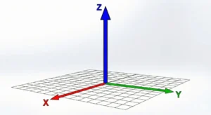
3D Transforms and Voxel Engineering
We have moved past the era where 3D required WebGL or Canvas. Using perspective and transform-style: preserve-3d, developers can now construct complex scenes directly in the DOM. Tools like VoxCSS demonstrate that we can render 3D cuboids using nothing but CSS Grid and transforms. When combined with scroll-driven interactions, these 3D scenes create a hypnotic, dancing visual language that is impossible to achieve with static design.
Custom Cursors and Anchor Positioning
The cursor property is one of the most underutilized tools in the designer’s belt. While it should be used sparingly—as it overrides default browser behavior—it offers a powerful way to provide context-sensitive feedback. By utilizing SVG cursors, developers can maintain visual fidelity across high-DPI screens, provided they stick to the standard 32x32px size to ensure compatibility across Firefox and Chrome.
Furthermore, CSS Anchor Positioning is currently revolutionizing how we handle UI elements like tooltips or hover cards. By anchoring a single pseudo-element to a target item, we eliminate the need for redundant DOM nodes, allowing for smooth, performant transitions that track the user’s cursor as it moves between elements.
Implications for the Future
The technical barriers that once hindered web designers have effectively crumbled. The question for the modern developer is no longer "is this possible?" but "does this movement tell a better story?"
As we look toward the future, the integration of these features—such as the upcoming sibling-index() function and expanded pseudo-selector support—will only make these workflows more efficient. We are moving toward a future where the browser is a canvas that responds fluidly to the user, provided we maintain our commitment to performance, accessibility, and, above all, the story we are trying to tell.
Summary Checklist for Modern CSS
- Respect Preferences: Always implement
@media (prefers-reduced-motion: reduce)to ensure users with vestibular disorders are not negatively impacted. - Test Accessibility: If you are manipulating text or DOM structure for animation, test it across multiple screen reader and browser combinations.
- Prioritize GPU: Use transform-based animations rather than layout-triggering properties (like
toporleft) to ensure smooth 60fps performance. - Define Intent: Use your keyword lists to justify your design decisions. If an animation doesn’t support the "vibe" of the content, remove it.
By adopting these modern standards, we move away from the "JavaScript-everything" era and back toward a web that is faster, more sustainable, and infinitely more expressive.


