Mastering Depth: A Comprehensive Guide to the CSS translateZ() Function
In the evolution of web design, the leap from two-dimensional layouts to three-dimensional space represents a fundamental shift in how we build user interfaces. At the heart of this transformation is the CSS translateZ() function. While modern web browsers are inherently two-dimensional, translateZ() provides the necessary bridge to manipulate elements along the Z-axis, allowing developers to simulate depth, create immersive parallax effects, and optimize rendering performance through hardware acceleration.
Main Facts: Understanding the Third Dimension
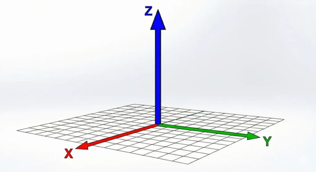
At its simplest, translateZ() is a CSS transformation function that shifts an element along the Z-axis—the axis perpendicular to the plane of the screen. While translateX() and translateY() move elements horizontally and vertically, translateZ() dictates how close or far an object appears to be from the viewer.
However, there is a common misconception that translateZ() acts as a scaling tool. When an element is moved along the Z-axis toward the user, it appears larger, but its actual dimensions—its width and height—remain unchanged. This "optical illusion" is a result of how the browser projects a 3D coordinate onto a 2D viewport.
The Prerequisite for Visibility
Crucially, translateZ() is invisible in a vacuum. Because web browsers default to a "flat" rendering context, moving an object toward or away from the camera on the Z-axis produces no visual change unless a perspective is defined. Developers must implement the perspective property on the parent container or the perspective() function on the element itself to establish a "vanishing point." Without this, the element remains trapped in a 2D plane, rendering the Z-axis translation effectively moot.
Chronology: The Development of CSS 3D Transforms
The journey toward 3D rendering in CSS began with the desire to move beyond simple flat animations.
- The Early Web (1990s–2000s): The web was strictly two-dimensional. Layouts were constructed using tables and basic positioning, with no concept of depth.
- The Transform Revolution (2009–2011): As browsers adopted the initial CSS Transforms Module, developers gained the ability to rotate, scale, and move elements. However, these were largely 2D transformations.
- The 3D Spec (2012–2015): The W3C introduced the CSS Transform Module Level 2, which formally defined the Z-axis and the
perspectiveproperty. This allowed for true 3D spatial positioning, enabling sophisticated animations that were previously only possible via Flash or heavy JavaScript libraries. - Hardware Acceleration Era (2016–Present): Developers began leveraging the "GPU-hack"—using
translateZ(0)—to force elements into their own rendering layers, significantly boosting performance in complex web applications.
Supporting Data: Perspective vs. Scale
A common error among junior developers is confusing translateZ() with the scale() function. While both can make an element appear larger, they achieve this through entirely different mechanics.
- Scale: Directly modifies the rendering dimensions of the element. If you scale an element by 2x, it takes up twice as much pixel space on the screen.
- TranslateZ: Maintains the element’s actual dimensions but adjusts its "depth" relative to the viewer. Because the element is closer to the virtual camera, the browser renders it larger to maintain the laws of perspective.
The Math of Perspective
When you apply perspective: 800px; to a container, you are defining the distance between the user’s "eye" and the Z=0 plane. If you then apply translateZ(400px) to a child element, that element moves halfway toward the viewer. The resulting scale factor can be calculated as:
scale = perspective / (perspective - translateZ)
This mathematical relationship is why translateZ() feels more "natural" for 3D UI transitions than scale(). It mimics how objects behave in the physical world.
Official Responses: The Specification Standards
According to the CSS Transform Module Level 2, translateZ() accepts a single <length> argument. This length determines the translation amount along the Z-axis. Positive values move the element toward the user (making it appear larger), while negative values move the element away (making it appear smaller).
The specification highlights a critical distinction between the perspective property and the perspective() function:
- The
perspectiveProperty: Applied to a parent element, it creates a shared 3D space for all children. This is the preferred method for creating consistent 3D scenes. - The
perspective()Function: Applied as part of an element’stransformchain. It only affects that specific element and must be placed before other transformation functions to be calculated correctly.
Implications: Web Performance and the GPU
Beyond the aesthetic benefits of 3D depth, translateZ() serves a vital role in modern web performance optimization. In standard CSS rendering, the browser’s CPU handles the layout and painting of elements. When an animation occurs, the CPU must recalculate these positions on every frame, which can lead to layout thrashing and stuttering.
The "GPU Hack"
By applying transform: translateZ(0); (or any translateZ value) to an element, you are essentially telling the browser to "promote" that element to its own compositor layer. This action moves the responsibility of rendering that specific element from the CPU to the Graphics Processing Unit (GPU).

The implications for performance are massive:
- Fluid Animations: GPU-accelerated elements are rendered independently, allowing the browser to animate them without re-painting the entire page.
- Reduced Flickering: By separating the element into its own layer, you eliminate the artifacts often seen during complex transitions.
- Optimized Battery Life: Offloading rendering tasks to the GPU is more energy-efficient for mobile devices compared to continuous CPU cycles.
However, developers are cautioned: over-promoting elements to the GPU (layer explosion) can lead to excessive memory consumption, which may crash mobile browsers. This technique should be used judiciously on elements that are frequently animated or require high-performance transitions.
Future-Proofing Your UI
As we move toward more immersive web experiences, the ability to manipulate space becomes a necessity rather than a luxury. Understanding translateZ() is the first step toward building interfaces that feel tactile and responsive.
Whether you are using it to create a card-flip animation, a parallax scrolling effect, or simply to force a hardware-accelerated layer for a smooth navigation menu, translateZ() remains one of the most powerful tools in the modern CSS toolkit. By mastering the relationship between the perspective property and the Z-axis, developers can transform the flat, static web into a dynamic, three-dimensional environment that responds intuitively to the user.
Best Practices Checklist
- Always define
perspective: Never assume the browser will guess your desired depth. - Use
preserve-3d: When working with nested 3D elements, ensure the parent hastransform-style: preserve-3d;to maintain spatial integrity. - Mind the GPU: Use
translateZ(0)to optimize performance, but avoid over-using it on every element to prevent memory bloat. - Keep it consistent: When creating 3D scenes, ensure your
perspectivevalues remain consistent across similar UI components to maintain a unified visual scale.
By adhering to these standards, you ensure that your 3D implementations are not only visually stunning but also technically robust, performant, and accessible across all modern browser environments.


