The Silent Friction: Optimizing Accessible Text for a Seamless User Experience
In the evolving landscape of web development, the pursuit of accessibility—often referred to by the industry shorthand "a11y"—is frequently characterized by high-level architectural shifts: ARIA labels, semantic HTML, and keyboard navigation. However, as web standards mature, the focus is increasingly shifting toward the "micro-nuances" of content strategy. A recent discourse sparked by web accessibility specialist Mark Underhill has brought to light a persistent, yet often overlooked, issue: the redundancy of labeling elements that are already semantically self-evident.
The core of the issue lies in how screen readers—the primary assistive technologies for users with visual impairments—interpret the web. When developers inadvertently clutter code with redundant descriptive labels, they do not just add noise; they create cognitive friction.
Main Facts: The Redundancy Trap
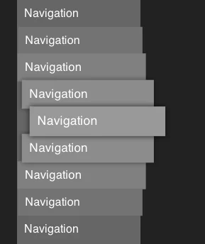
The primary point of contention identified by Underhill is the common practice of including the word "navigation" within a <nav> element’s label. In HTML5, the <nav> tag is a semantic landmark. When a screen reader encounters this tag, it automatically announces the element as a navigation region.
If a developer labels that element "Primary Navigation," the screen reader will read the announcement as: "Navigation, Primary navigation." This redundancy may seem trivial to a sighted user, but for someone navigating a site exclusively via audio feedback, it is a persistent, unnecessary interruption.
This principle of "semantic economy" extends beyond navigation menus. It is a fundamental rule of accessible content: do not describe the container or the medium if the technology already provides that context to the user.
Chronology of the Accessibility Evolution
The journey toward modern accessibility standards has been a decades-long transition from "visual-first" to "content-first" design.
- The Early Web (1995–2005): Accessibility was largely an afterthought, often limited to basic
alttext on images, which was frequently abused for keyword stuffing rather than descriptive utility. - The Rise of WCAG (2008–2015): The Web Content Accessibility Guidelines (WCAG) 2.0 shifted the focus toward perceivability, operability, and robustness. Developers began to adopt ARIA (Accessible Rich Internet Applications) labels to describe complex interactive elements.
- The "ARIA Overload" Phase (2016–2020): As developers sought to make the web more accessible, many fell into the trap of over-labeling. Fearful of "non-accessible" sites, developers began explicitly labeling everything, which led to the very verbosity issues currently being addressed.
- The Nuance Era (2021–Present): Today, the industry focus has pivoted toward usability. The goal is no longer just to make a site "readable" by a screen reader, but to make it efficient to navigate. Experts like Underhill and contributors at Piccalilli are now advocating for the removal of redundant labels to improve the flow of information.
Supporting Data: Why Conciseness Matters
The impact of redundant text on screen reader users is documented through user experience testing and behavioral patterns. According to research on cognitive load in assistive technology, screen reader users rely on a mental model of a page structure. When that structure is interrupted by verbose or repetitive labels, the time-to-task-completion increases significantly.
The "Alt-Text" Paradox
A classic example of this redundancy is found in image descriptions. Many legacy accessibility guides instructed developers to include the words "image of" or "photo of" in the alt attribute. However, modern screen readers announce "graphic" or "image" before reading the text provided. If the alt text says "Image of a sunset," the screen reader announces: "Image, Image of a sunset."
Cognitive Load and Efficiency
Research suggests that expert screen reader users often navigate at high speeds, sometimes setting their speech synthesis to several hundred words per minute. In this environment, every redundant syllable acts as a "speed bump." A clean, semantic structure allows users to scan pages with the same efficiency as a sighted user skimming a newspaper.
Implications for Web Standards and Design
The shift toward succinct labeling has profound implications for developers, designers, and content strategists.
1. Re-evaluating the Development Workflow
Developers must now treat "conciseness" as a core accessibility requirement, not a stylistic preference. This requires a shift in how we approach the use of aria-label and aria-labelledby. These tools should be reserved for elements that lack semantic meaning—such as custom-built buttons or complex dashboard widgets—rather than standard HTML landmarks.
2. The Role of the Designer
Designers play a critical role in this shift. By establishing a design system that inherently understands the semantic hierarchy of a page, designers can reduce the need for descriptive labels. If a header is properly marked as an <h1> or <h2>, the screen reader user will naturally understand its context without the need for an added label that describes the element as a "header."
3. The "Novel" Problem
As noted in recent technical discussions on CSS-Tricks, there is a persistent myth that "more is better" when it comes to accessible descriptions. On the contrary, accessibility thrives on clarity. A lengthy, novel-length description in an alt attribute or a long, descriptive label often causes users to lose their place in the navigation flow.
"Succinctness" should be the watchword. If an element can be understood in three words, it should not be described in ten.
Official Perspectives and Best Practices
Industry standards organizations, including the W3C (World Wide Web Consortium), have updated their guidance to emphasize that "less is often more."
- Best Practice 1: Audit for Redundancy. Developers should use screen reader testing tools (such as NVDA or VoiceOver) to listen to their own sites. If you hear a phrase repeated, it is time to simplify.
- Best Practice 2: Trust the Semantic HTML. If you are using a
<nav>element, trust that the browser will communicate that to the user. Use thearia-labelonly when you have multiple navigation regions (e.g., "Main Navigation" vs. "Footer Navigation") to distinguish between them. - Best Practice 3: Audit
altText. Remove descriptors like "image," "icon," or "picture" from youralttags. Focus strictly on the content and intent of the visual.
Conclusion: A More Human Web
The movement to strip away redundant labels is, at its heart, an act of empathy. It recognizes that users of assistive technology deserve the same respect for their time and cognitive energy as any other user.
By refining our approach to labeling—moving away from the "over-explaining" era and toward a more streamlined, semantic web—we create an environment that is not just "accessible" by legal standards, but enjoyable by human standards. The next time you find yourself adding an aria-label, take a moment to ask: "Does this add value, or is it just noise?"
In the balance between information and interruption, the most accessible choice is almost always the one that speaks the most clearly, using the fewest words possible. As the web continues to grow in complexity, our ability to keep the experience simple will remain our greatest contribution to a truly inclusive digital future.
Key Takeaways for Developers:
- Avoid "Navigation" in
<nav>labels: It is redundant; the browser handles the announcement. - Audit for Verbosity: Test with screen readers to identify where labels are repeating system announcements.
- Keep
altText Lean: Focus on the subject, not the medium. - Prioritize Semantic Structure: Use the right HTML tags, and the screen reader will do the heavy lifting for you.
- Quality over Quantity: A brief, accurate description is superior to a long, winding explanation.