Mastering Horizontal Movement: A Deep Dive into the CSS translateX() Function

In the ever-evolving landscape of front-end development, the ability to manipulate the position of elements with precision and performance is paramount. Among the most essential tools in a developer’s arsenal is the translateX() function, a cornerstone of the CSS Transforms Module. By allowing developers to shift elements horizontally along the X-axis without disrupting the document’s underlying layout, translateX() has become indispensable for everything from simple hover effects to complex, high-performance animations.
Main Facts: Understanding translateX()
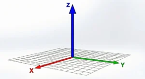
At its core, the translateX() function is a method used within the CSS transform property to reposition an element horizontally. When applied, it displaces an element to the left or the right of its original position. A positive value shifts the element to the right, while a negative value pulls it to the left.
The primary advantage of using translateX() over traditional layout properties like margin or top/left is its relationship with the browser’s rendering engine. Because transforms are often handled by the GPU (Graphics Processing Unit), they offer significantly smoother animations and transitions, avoiding the "reflow" or "repaint" costs associated with changing geometric layout properties.
The Syntax
The function follows a straightforward syntax:
transform: translateX(<length-percentage>);
This accepts either a <length> (e.g., px, em, rem, ch) or a <percentage>. It is vital to note that when a percentage is used, it is relative to the width of the element itself, not the width of its parent container. This makes translateX() exceptionally flexible for responsive design, as developers can slide elements out of view regardless of the viewport size.
Chronology: The Evolution of CSS Transforms
The history of translateX() is intrinsically linked to the broader evolution of the CSS Transforms Module. Before the standardization of transforms, developers relied heavily on position: relative combined with left or right offsets to move elements. These methods were computationally expensive because changing a layout property forced the browser to recalculate the positions of all surrounding elements—a process known as reflow.
- Early Web (Pre-2009): Layouts were largely static. Movement was achieved via absolute positioning, which frequently caused layout "jumping" and performance bottlenecks.
- The Rise of WebKit (2009-2012): Early versions of Safari and Chrome introduced vendor-prefixed transforms (
-webkit-transform). These were initially used to enable hardware-accelerated animations on mobile devices. - W3C Standardization (2012-Present): The CSS Transforms Module Level 1 moved through the W3C draft stages, eventually reaching widespread adoption.
translateX()became a standard, predictable way to handle spatial displacement. - Modern Era: Today,
translateX()is a staple in high-performance animation libraries (like GSAP) and frameworks, acting as the foundation for modern UI interactions.
Supporting Data: Performance and Layout Mechanics
The efficiency of translateX() stems from the concept of the "Compositor Layer." When an element is transformed, the browser creates a new layer for that element in the compositor. Instead of the CPU recalculating the entire page layout, the GPU simply shifts the pixels of that specific layer.
Layout Flow Preservation
One of the most critical facts for developers is that translateX() does not affect the document flow. If an element is shifted 100 pixels to the right, the empty space it originally occupied remains "reserved." Surrounding elements do not shift to fill the gap. This behavior is ideal for:
- Overlays and Modals: Moving elements over existing content without forcing a structural shift.
- Parallax Effects: Creating depth by moving elements at different speeds.
- Skeleton Loaders: Providing visual feedback during data fetching without layout thrashing.
Comparative Performance Metrics
In high-frequency animation scenarios, such as a 60fps scrolling marquee, the difference between margin-left and transform: translateX() is profound. Tests consistently show that translateX() animations maintain frame rates significantly better than property-based layout changes, which often trigger layout recalculations on every frame.
Official Responses and Best Practices
The CSS Working Group, in its ongoing maintenance of the CSS Transforms Module, emphasizes that developers should use transforms for visual effects rather than structural layout adjustments. The "official" stance, reflected in the draft specifications, is that while translateX() is powerful, it is a visual-only tool.
Addressing the "Hover Flickering" Problem
A recurring issue reported by developers involves using translateX() on :hover pseudo-classes. When an element is moved away from the cursor during a hover event, the cursor no longer "touches" the element. The browser then immediately exits the hover state, causing the element to snap back, which places it under the cursor again. This leads to a rapid, infinite "flicker" loop.
The Solution:
The industry-standard response is to decouple the interaction from the movement. Apply the :hover state to a stable parent container rather than the moving child element.
.button-container:hover .icon
  transform: translateX(10px);
By hovering over the container, the icon can safely move without losing the trigger zone.
Implications for Modern Web Design
The implications of mastering translateX() extend far beyond simple shifts. It is the bedrock of modern user interface responsiveness.
1. Advanced Navigation Systems
Modern mobile-first design often utilizes "off-canvas" navigation. By setting a sidebar to transform: translateX(-100%), developers can keep the menu hidden off-screen, pulling it into view with a smooth transition triggered by a JavaScript class toggle. This ensures that the menu doesn’t consume document space when inactive.
2. Infinite Marquees
The "marquee" effect—often seen on e-commerce sites to display brand logos—is a classic use case. By animating translateX(0) to translateX(-50%) inside an infinite loop, developers create a seamless visual conveyor belt. Because translateX() is GPU-accelerated, these banners run smoothly even on lower-end mobile devices.
3. Skeleton Loading Shimmers
Skeleton loaders have revolutionized the perceived performance of web applications. By using a pseudo-element (::after) with a linear-gradient and an infinite translateX animation, developers can create a "shimmer" effect that sweeps across the placeholder. This adds a level of polish that makes the application feel responsive and professional even while waiting for data from a server.
4. Avoiding Layout Thrashing
Perhaps the most significant implication is the ability to avoid layout thrashing. In complex, data-heavy dashboards, changing CSS properties that affect layout (like width, height, or padding) can lead to performance degradation. By opting for translateX() for all visual adjustments, developers ensure that their applications remain performant regardless of how much content is on the screen.
Conclusion
The translateX() function is far more than a simple movement utility; it is a vital tool for performance-oriented web development. By understanding its role in the compositor layer, its independence from the document flow, and the best practices for handling user interactions, developers can craft interfaces that are not only aesthetically pleasing but also technically robust.
As we continue to push the boundaries of what web browsers can achieve, the reliance on high-performance transforms like translateX() will only grow. Whether you are building a simple sidebar transition or a complex, animated data visualization, translateX() remains the industry standard for elegant, efficient horizontal motion.


