Beyond Redundancy: Crafting Lean, Accessible Experiences for the Modern Web
In the pursuit of web accessibility, developers and content creators often fall into the trap of over-explaining. While the intent—to ensure clarity for users relying on assistive technologies like screen readers—is noble, the result can often be a cluttered, repetitive experience that hampers efficiency. Recent discussions within the front-end development community, sparked by insights from accessibility advocates like Mark Underhill, have highlighted a critical need for restraint in labeling and descriptive text.
The core of the issue lies in understanding how screen readers parse semantic HTML. When developers insert redundant information into labels or alternative text, they aren’t helping the user; they are creating a linguistic "noise" that degrades the user experience. This article explores the nuances of accessible web design, the importance of conciseness, and the broader implications for inclusive digital environments.
Main Facts: The Anatomy of Redundancy
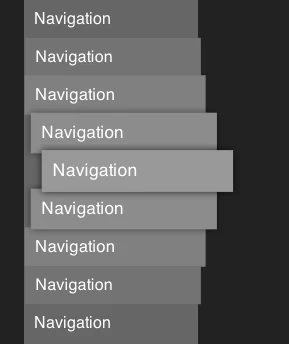
The primary subject of this discourse is the misuse of the <nav> element and its associated aria-label attributes. When a developer labels a navigation element as "Primary Navigation," the browser’s accessibility tree often interprets this in tandem with the semantic tag itself.
For a screen reader user, the experience becomes: "Navigation, Primary navigation." This redundancy is not merely a stylistic annoyance; it is a cognitive tax. Every time a screen reader announces an element, the user must process that information. When the labels are repetitive, the user is forced to filter out noise, which slows down the navigation process and increases the mental load required to move through a page.
Similarly, this principle extends to alternative text (alt text) for images. It is a common beginner error to describe an image as "Image of a sunset." Because the screen reader has already identified the element as an image, stating "Image" again is redundant. The goal of accessible design is to provide the essential information—the "what" and the "why"—without the clutter of the "how."
Chronology of Accessibility Standards
The evolution of web accessibility, driven largely by the Web Content Accessibility Guidelines (WCAG), has shifted from a focus on "compliance" to a focus on "usability."
- Early 2000s: The focus was primarily on ensuring that elements were "visible" to screen readers. If a site had a navigation bar, the priority was simply ensuring the screen reader could "see" it.
- Mid-2010s: As ARIA (Accessible Rich Internet Applications) roles became standard, developers began over-tagging elements. The fear of "missing" an accessibility requirement led to a culture of excessive labeling.
- Present Day: The current trend emphasizes semantic HTML over ARIA roles. We have moved into an era where "less is more." The focus is now on how assistive technology interprets the semantic weight of a document. By using the right tag (like
<nav>or<main>), the browser does the heavy lifting, rendering the need for verbose labels obsolete.
Supporting Data: The Cognitive Cost of "Wordiness"
While there are few large-scale academic studies specifically quantifying the "time-loss" of redundant labels, user testing sessions within the accessibility community provide compelling anecdotal and qualitative data.
Research conducted by organizations like the WebAIM (Web Accessibility in Mind) project suggests that screen reader users rely heavily on keyboard shortcuts to jump between landmarks. If every landmark is named with a redundant tag, the user’s navigation flow is interrupted.
Furthermore, data regarding "accessible name length" suggests that users prefer concise descriptions. A study regarding alt-text best practices indicates that users process descriptive text significantly faster when the length is kept under 125 characters, as it allows the screen reader to deliver the information in a single, fluid pass. When descriptions reach "novel" lengths, the user’s focus shifts from the content of the page to the endurance required to navigate it.
Official Responses and Expert Consensus
The front-end community has responded to these findings with a renewed focus on "minimalist accessibility." Industry experts, including those from Piccalilli and CSS-Tricks, have weighed in on the necessity of simplifying interactive controls.
The consensus is clear: Accessibility is not about adding more; it is about refining what is already there.
"We have to stop treating accessibility like a legal checklist," says one lead accessibility auditor. "When you stop thinking about labels as things you have to add and start thinking about them as the first thing a user hears, you start writing differently. You start writing for the human, not for the validator."
This shift in philosophy is gaining traction among major design systems. Modern component libraries are now stripping away unnecessary ARIA labels, opting instead for clean, semantic structures that rely on native browser behavior to provide context.
Implications: The Future of Inclusive UX
The implications of this movement toward lean accessibility are profound, affecting everything from developer training to the overall performance of web applications.
1. Developer Education and Training
The industry must move away from "cargo cult" accessibility—where developers copy-paste ARIA labels they don’t fully understand. Instead, training should focus on the why. Developers need to understand how the accessibility tree is constructed and how their code influences the "reading order" of a page.
2. User Experience (UX) Parity
The ultimate goal of accessibility is to provide an experience that is as seamless for a screen reader user as it is for a sighted user. When we remove redundancy, we move closer to this parity. A sighted user doesn’t see a giant label that says "NAVIGATION" above the navigation bar; they just see the navigation. By mirroring this experience, we provide a more intuitive interface for everyone.
3. SEO and Semantic Search
Interestingly, lean, semantic code also benefits search engine optimization (SEO). Search engines value clear, descriptive content. By focusing on semantic HTML—using <nav>, <main>, <header>, and <footer> correctly—developers provide search crawlers with the same clarity they provide to screen reader users.
4. Accessibility as a Design Language
We must begin to view accessibility not as an "add-on" but as a fundamental pillar of design. Just as we wouldn’t add a redundant "This is a button" label to a physical door handle, we shouldn’t add it to a digital button. The design itself, when executed correctly, implies its function.
Conclusion: A Call to Simplicity
The journey toward a truly accessible web is an iterative one. As we learn more about how assistive technologies interpret the modern web, our strategies must evolve. The current push to eliminate redundant labels is a sign of a maturing industry—one that is moving past the "do it because you have to" phase and into the "do it because it’s right" phase.
By embracing conciseness, prioritizing semantic HTML, and respecting the time of our users, we create digital environments that are not only accessible but genuinely enjoyable to navigate. We must resist the urge to fill every void with text and instead trust the power of clean, intentional code.
As you audit your own projects, consider the "Navigation, Primary navigation" example. If you find your labels are working harder than the content they describe, it’s time to prune. Your users—and the clarity of your code—will thank you for it.
Summary of Best Practices:
- Trust the Semantic Tag: If you use a
<nav>tag, the screen reader already knows it is a navigation area. You rarely need anaria-labelunless you have multiple navs on one page. - Alt Text is Contextual: Describe the intent or content of the image, not the fact that it is an image.
- Keep it Brief: Whether it is an
aria-label, a button description, or a link title, aim for brevity. If you can explain it in three words, don’t use ten. - Audit with Your Ears: Use a screen reader (such as NVDA or VoiceOver) to navigate your site. If you find yourself waiting for a machine to read redundant labels, it’s a clear sign that it’s time to simplify.
The web is a vast, complex space, but our contribution to it should be clear, lean, and above all, human-centric. By removing the unnecessary, we make room for the essential.