Rethinking Web UI/UX: Why the Traditional Three-State Dark Mode Toggle is Flawed
In the ever-evolving landscape of front-end web development and user interface (UI) design, few debates generate as much passionate micro-analysis as the implementation of light and dark mode toggles. For years, the standard convention for websites offering a theme switch has been a clumsy three-state selector: Light, Dark, and System.
However, prominent web standards expert and developer Lea Verou has sparked a widespread industry debate by challenging this paradigm. According to Verou, websites should abandon the ubiquitous three-state switch in favor of a streamlined, highly intuitive two-state user experience—or, ideally, rely entirely on native system preferences without cluttering permanent navigation bars.
This deep dive explores the core arguments of Verou’s proposal, the mechanics of modern color-scheme management, the cognitive psychology of interface clutter, and the broader implications for the future of web design.
Main Facts: The Core of the Debate
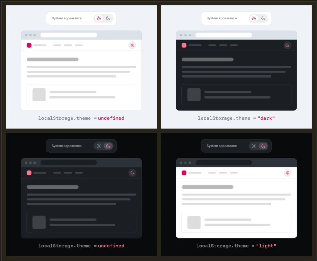
The fundamental thesis put forward by Lea Verou in her recent essays—"Dark Mode Toggles", followed by a comprehensive community response summary—is deceptively simple: A well-designed two-state control can effortlessly express all three necessary states.
Instead of forcing users to navigate a cluttered menu containing "Light," "Dark," and "System" options, websites should adopt a smarter, context-aware methodology:
- Default to the System: By default, a website should read the user’s operating system or browser-level preference (
prefers-color-scheme). No explicit manual toggle is required on initial load. - The Override Mechanism: If a user clicks the theme toggle, it applies a manual override (e.g., forcing light mode on a system-dark setup).
- Persistence: This preference is securely stored in the browser’s
localStoragefor future visits.
Verou argues that displaying a permanent "System" option in a primary navigation bar introduces unnecessary cognitive friction. Because theme-switching is inherently tangential to a user’s primary intent for visiting a website—whether that is reading an article, purchasing a product, or checking documentation—reducing interface noise is paramount. Less UI that accomplishes the same function is almost universally a superior design choice.
Chronology: How the Light/Dark Mode Dilemma Evolved
To understand why web developers settled on the three-state toggle in the first place, it helps to review the chronological timeline of color-scheme management on the web.
Phase 1: The Monolithic Light Era
For the first few decades of the commercial World Wide Web, default web styling relied on a black-text-on-white-background paradigm (or whatever stylesheet defaults the browser enforced). Web developers had little to no programmatic insight into a user’s environmental lighting or operating system theme choices.
Phase 2: The Rise of Native Dark Modes
As OLED screens and battery-saving initiatives gained prominence, operating systems like macOS, Windows, iOS, and Android introduced native system-wide dark modes. Browser vendors quickly followed suit, introducing the CSS media query prefers-color-scheme. This allowed websites to automatically adapt to a user’s dark or light operating system settings without requiring user intervention.
Phase 3: The Proliferation of Custom Toggles
While automatic system-matching was a massive leap forward, developers recognized that users often wanted granular control. A user might prefer a dark operating system for system UI comfort, but prefer a bright, high-contrast light mode when reading long-form technical documentation, or vice-versa.
To solve this, developers introduced manual toggles in site headers. Lacking a unified design standard, many teams opted for the literal approach: a dropdown menu or a three-icon button explicitly spelling out "Light," "Dark," and "System." This safely covered all edge cases, but sacrificed aesthetic minimalism.
Phase 4: The Verou Critique (Present Day)
Entering 2026, the developer community has begun to experience UI fatigue regarding these ubiquitous toggles. Verou’s critique marks a turning point, pushing the industry to re-evaluate whether explicit "System" states are actually necessary in persistent header menus, paving the way for leaner, smarter UI patterns.
Supporting Data and Technical Mechanics
To appreciate Verou’s two-state proposal, we must examine how modern browsers handle color preferences under the hood and how simple JavaScript combined with CSS variables can manage the transition.
The Mathematics of State Reduction
In a traditional tri-state configuration, the UI must render three distinct clickable targets, consume horizontal or vertical pixel space, and manage three potential JavaScript states:
- State A: Explicit Light Override
- State B: Explicit Dark Override
- State C: Inherit System Preference
In Verou’s optimized two-state model, the UI only ever needs to display what happens next or what is currently toggled. As Verou notes, once a user applies an override, the system automatically transitions from passive observation to active customization:
“[…] a good two state control can actually express all three states — users just need to apply the override the first time it becomes relevant.”
Consider the following scenario:
- Initial State: The user visits a site. The site checks the system preference (say, Light). The toggle simply acts as a switch to "Go Dark."
- The Divergence: If the operating system later switches to dark mode, but the user has pinned light mode, a divergence occurs. The user notices this shift only when their environment changes. At that exact moment, adjusting or resetting the preference takes a single click.
The localStorage Question
Critics of the two-state model often raise a technical edge case: What happens when a user toggles back and forth? If a user starts with a Light system preference, manually toggles to Dark, and then manually toggles back to Light, does the application store an explicit Light override, or does it clear the localStorage value to return to the dynamic system default?
According to Verou, this distinction largely dissolves under practical scrutiny. Theme switching is rarely a high-frequency, critical user journey. If a user toggles back to what happens to match their system setting, whether the underlying code stores a literal string ("light") or clears the storage key is an implementation detail that has virtually zero negative impact on the user experience.
Official and Community Responses
The publication of Verou’s initial thoughts on CSS-Tricks and her personal blog triggered a massive wave of discussion across developer platforms, notably on Bluesky and tech forums. The community response highlighted several nuanced perspectives on how users interact with modern web design.
The Browser-Level Preference Debate
One of the most compelling insights came from web developer Chris Coleman, who posted on Bluesky:
"All I ever wanted was for my OS to be dark, not every website I look at. It was a huge leap by the browser vendors to tie all web content to that system preference. Anyway, I think the light/dark preference should be in the browser, and what you propose seems perfectly in line with that."
This response strikes at a deeper philosophical friction point in modern web architecture. Many users do not want websites blindly dictating their visual theme purely because their OS desktop environment is set to dark mode.
When browsers automatically tie web content rendering to system preferences, it forces website maintainers to build custom toggles in the first place. Verou’s proposed two-state UI works harmoniously within this messy reality: it respects the developer’s need to offer an escape hatch without cluttering the screen with verbose tri-state menus.
When Are Three States Actually Appropriate?
To maintain fairness and thoroughness, Verou’s follow-up analysis explicitly outlines specific scenarios where a traditional three-state control is justified:
- Complex Application Dashboards: In heavy web applications (like Figma, VS Code in-browser, or enterprise dashboards) where user settings panels house deep user preferences, explicit radio groups for theme selection remain valid because users are actively inside a dedicated settings management view.
- Accessibility-First Interfaces: On sites catering heavily to users with low vision or specific photophobia, displaying all three options explicitly can reduce cognitive load for users who require strict, predictable visual control.
However, for persistent navigation headers on standard content sites, blogs, and marketing pages, the tri-state toggle remains overkill.
Implications for Web Designers and Developers
The shift toward streamlined, two-state color scheme toggles carries several major implications for the future of digital product design.
1. Reduction of Cognitive Dissonance
Every interactive element placed inside a website’s navigation bar demands a fraction of the user’s cognitive bandwidth. By stripping away redundant labels like "System (Light)" or "System (Dark)" and replacing them with a singular, intuitive icon switch, developers reduce visual clutter. This allows visitors to focus entirely on the core content of the page.
2. Cleaner Mobile and Responsive Layouts
Screen real estate on mobile devices is exceptionally precious. Fitting a three-state segmented control or a sprawling dropdown menu into a mobile hamburger menu is notoriously difficult. A streamlined two-state toggle requires minimal horizontal space—often just a single icon representing a sun or a moon—making responsive design cleaner and more robust.
3. Embracing "Zero UI" Philosophy
The ultimate conclusion of Verou’s argument points toward a "Zero UI" ideal: The best interface is often no interface at all.
If modern operating systems and browsers eventually evolve to allow granular, per-site preference management directly inside browser settings (as Coleman suggested), websites may be able to completely eliminate manual toggles from their navigation bars. Until that standard is universally adopted across all rendering engines, Verou’s two-state override model stands as the gold standard for balancing user autonomy with minimalist design principles.
Conclusion
Lea Verou’s critique of the traditional three-state dark mode toggle is much more than a nitpicky UI preference—it is a masterclass in thoughtful, user-centric engineering. By analyzing the actual intent of website visitors, developers can strip away redundant interface elements, rely intelligently on system defaults, and implement lightweight, friction-free override mechanisms using localStorage.
Whether applied to a personal developer blog, a corporate publication, or a digital portfolio, moving away from cluttered tri-state menus in favor of smart, two-state toggles (or eliminating them entirely when system defaults suffice) represents a major step forward in modern web design maturity.