The Evolution of the HTML <dialog> Element: A Comprehensive Guide to Modern Web Modals and Popovers
Nearly a decade after its initial introduction into the web ecosystem, the native HTML <dialog> element remains one of the most powerful yet surprisingly nuanced components in modern web architecture. While developers widely embrace its ability to streamline what was once a labyrinth of custom JavaScript frameworks and complex ARIA roles, mastering its nuances—ranging from accessibility configurations and backdrop styling to state animations and scrolling behaviors—requires a deliberate and comprehensive look.
This deep dive serves as an authoritative guide for modern front-end engineers, detailing how to properly mark up, style, animate, and deploy the native <dialog> element while understanding its relationship with adjacent web standards like the Popover API.
Main Facts: The Anatomy of a Native Web Dialog
At its core, the HTML <dialog> element is designed to represent a dialog box or other interactive component, such as a dismissible alert, inspector, or sub-window. Despite its straightforward syntax, developers often encounter unexpected edge cases because a dialog can function either as a non-modal popup or a true attention-grabbing modal.
Basic Markup and Initialization
The foundational structure of a native dialog requires very little code:
<button id="dialog-button">Open Dialog</button>
<dialog id="dialog">...</dialog>
By default, the element does not open automatically. While a developer can manually apply the open boolean attribute directly within the HTML (<dialog open>...</dialog>), this is rarely the desired production behavior. Instead, programmatic control is typically handled via JavaScript methods:

const dialogButton = document.querySelector('#dialog-button');
const dialog = document.querySelector('#dialog');

dialogButton.addEventListener('click', () =>
  dialog.show();
);
However, developers must exercise caution: invoking the .show() method treats the element as a standard pop-up rather than a true modal. In contrast, invoking .showModal() activates a robust modal state characterized by three essential features:
- Backdrop Generation: It automatically renders a customizable backdrop behind the element.
- Viewport Centering: It automatically positions the dialog precisely in the center of the browser viewport.
- Keyboard Dismissal: It automatically listens for the
Esckey to close the modal.
const dialogButton = document.querySelector('#dialog-button');
const formDialog = document.querySelector('#dialog');

dialogButton.addEventListener('click', () =>
  formDialog.showModal();
);
Chronology & Evolution: From JavaScript Workarounds to Invoker Commands
The journey of the <dialog> element reflects the broader evolution of web standards—moving from heavy reliance on third-party JavaScript libraries toward robust, declarative, browser-native capabilities.
1. The Script-Dependent Era
In the early days of its adoption, closing a dialog required explicitly querying DOM nodes and writing event listeners for the .close() method:
const formButton = document.querySelector('#dialog-button');
const formDialog = document.querySelector('#dialog');
const formClose = document.querySelector('#dialog-close');

formButton.addEventListener('click', () =>
  formDialog.showModal();
);

formClose.addEventListener('click', () =>
  formDialog.close();
);
Web developers quickly realized that while .close() worked reliably, the lack of a symmetrical .closeModal() method was a minor API quirk. To bypass JavaScript entirely, developers soon adopted a declarative HTML form submission method:
<dialog id="dialog">
  <form method="dialog">
    <button type="submit">Close dialog</button>
  </form>
</dialog>
2. The Modern Horizon: Invoker Commands
Looking ahead at evolving browser capabilities, the introduction of invoker commands aims to completely eliminate boilerplate JavaScript for opening and closing dialogs. Utilizing the command and commandfor attributes, developers can bind buttons directly to dialog targets declaratively:

<button command="show-modal" commandfor="my-dialog">Show Dialog</button>

<dialog id="my-dialog">
  <p>This dialog is controlled via native invoker commands.</p>
  <button command="close" commandfor="my-dialog">Close Dialog</button>
</dialog>
For applications requiring state observation, JavaScript can still listen to these commands cleanly:
const dialogs = document.querySelectorAll("dialog");

dialogs.forEach(dialog =>
  dialog.addEventListener("command", event =>
    if (event.command == "show-modal")
      // Logic executed when the modal is shown
     else if (event.command == "close")
      // Logic executed when the modal is closed

  );
);
Supporting Data & Technical Nuances
Implementing dialogs in production environments requires careful attention to accessibility, state-based CSS styling, and scroll management.
Accessibility and Button Labeling
A common pitfall occurs when developers style close buttons using simple symbols or graphic assets, such as an "X":
<dialog id="dialog">
  <button id="dialog-close">X</button>
</dialog>
Screen readers struggle to interpret isolated punctuation correctly. To ensure inclusive design, engineers should combine visually hidden text with explicitly hidden iconography:
<dialog id="form-dialog">
<button id="form-close">
<span class="visually-hidden">Close modal</span>
<span aria-hidden="true">×</span>
</button>
</dialog>Furthermore, developers must consider initial focus states. When a modal opens, focus automatically shifts to the first focusable element inside the dialog—frequently the close button. If a user rapidly hits the Space key, they might inadvertently close the dialog before reading its contents. To mitigate this, consider assigning initial focus to a specific form field or link using the tabindex attribute if necessary.

Innate Inertness and the Top Layer
When a modal dialog is opened via .showModal(), the background content automatically becomes inert. This means text selection, button clicking, keyboard focus, and background form inputs are entirely disabled without requiring manual developer configuration of the inert attribute.
Popovers activated via .show(), however, do not trigger this inert behavior, acting more like tooltips that sit alongside standard document flow.
Styling Architecture: Backdrops, Borders, and Scrolling
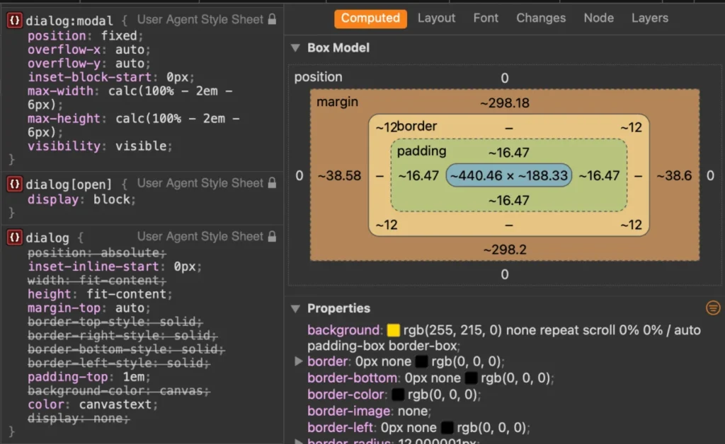
The default styling of a native <dialog> features a stark white background paired with a heavy black browser-default border. Customizing these attributes requires selecting the element in its active state:
dialog
  background-color: transparent;
  border: none;

  &[open]
    background-color: gold;
    border-radius: 12px;
The ::backdrop Pseudo-Element
The native backdrop can be targeted using the ::backdrop pseudo-element. Because browser defaults are often excessively subtle, developers frequently introduce custom background colors, transparencies, or filters:
dialog::backdrop
  background-color: rgba(0, 0, 0, 0.6);
  backdrop-filter: blur(4px);
Scroll Management
A notorious challenge with modals is preventing background content from scrolling while the dialog is active. Because a dialog is not inherently a scroll container, modern implementations leverage the overscroll-behavior property alongside modern Chrome updates (Chrome 144+):

dialog
  overflow: hidden;
  overscroll-behavior: contain;

  &::backdrop
    overscroll-behavior: contain;
Alternatively, a widely supported CSS approach relies on the :has() pseudo-class to lock body scrolling whenever an open dialog is detected in the DOM:
body:has(dialog[open])
  overflow: hidden;
Animating Dialogs: The Power of @starting-style
Historically, animating dialogs as they enter and exit the DOM was notoriously difficult because elements transitioning from display: none to an active state could not easily calculate initial keyframes. The modern @starting-style at-rule solves this problem, enabling smooth opacity and transform transitions:
@starting-style
  dialog:open
    opacity: 0;
    transform: scale(0.95);


dialog
  opacity: 0;
  transform: scale(0.95);
  transition: opacity 0.3s ease-in-out, transform 0.3s ease-in-out, display 0.3s ease-in-out allow-discrete;

  &[open]
    opacity: 1;
    transform: scale(1);
Dialog vs. Popover: Choosing the Right API
A frequent architectural debate centers on whether to utilize the Dialog API or the Popover API. While their syntax and behavior can appear superficially similar, their underlying accessibility semantics diverge significantly.
- Choose a Dialog when: You are building components that demand user attention, require focus trapping, necessitate an inert background, or function as traditional modal windows and forms.
- Choose a Popover when: You are building lightweight UI elements like tooltips, dropdown menus, or contextual selectors that should not disrupt background user interaction or require automatic focus management.
Implications and Future Outlook
The native HTML <dialog> element has matured into an indispensable cornerstone of modern web development. By replacing brittle JavaScript libraries with declarative, accessible, and performant browser primitives, engineers can deliver resilient user experiences across all devices. As upcoming features like invoker commands and enhanced discrete animations achieve universal baseline support, the future of web-based overlays is lighter, cleaner, and more accessible than ever before.