
Mastering Depth: A Deep Dive into the CSS translateZ() Function
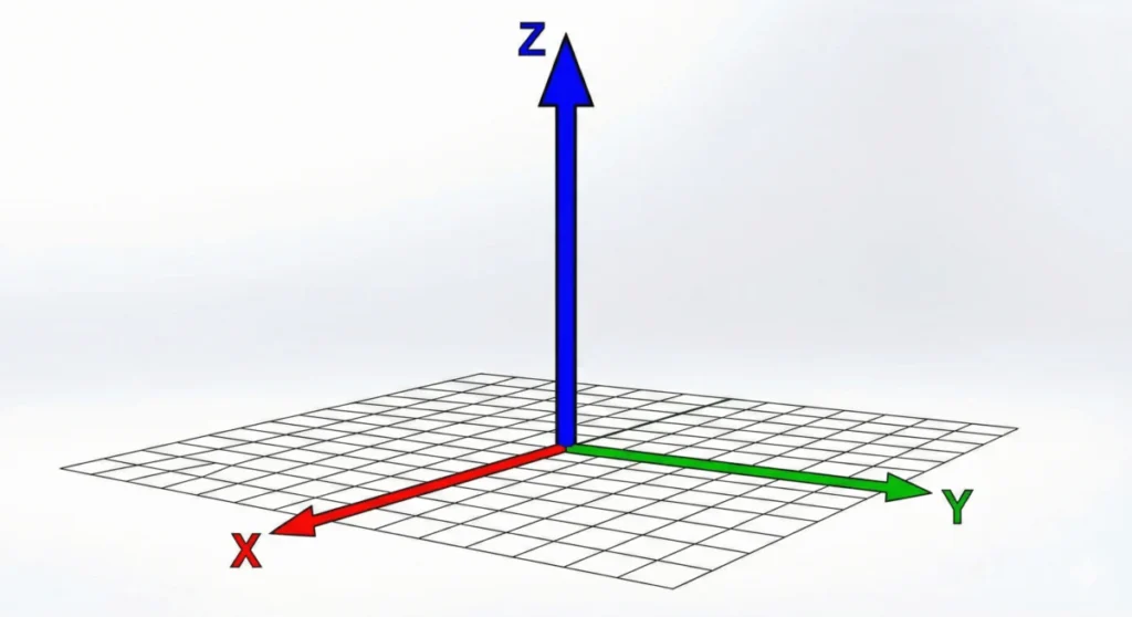
In the evolution of web design, the leap from two-dimensional layouts to three-dimensional environments represents a significant milestone. While modern browsers render elements on a flat, 2D plane by default, the CSS translateZ() function provides the gateway to the third dimension. By shifting elements along the Z-axis—the imaginary line running perpendicular to your screen—developers can introduce authentic depth, parallax effects, and sophisticated spatial hierarchies into their interfaces.
However, translateZ() is frequently misunderstood. It is not a scaling tool, nor is it a simple visual gimmick. It is a fundamental component of the CSS Transform Module Level 2, capable of both artistic visual flair and high-performance hardware acceleration.
The Core Mechanism: How translateZ() Functions
At its most basic level, the translateZ() function is a CSS transform that moves an element along the Z-axis in 3D space. When you provide a positive value, the element is pushed closer to the viewer; a negative value pushes it further away, "into" the screen.
The Essential Requirement: Perspective
Crucially, translateZ() cannot function in isolation. Because the browser’s default rendering engine operates in a 2D coordinate system, moving an object along the Z-axis initially yields no visible change. To perceive the movement, you must establish a "viewing distance" using either the perspective property or the perspective() function.
Without defining a perspective, the element simply stays in its flat, default position. Think of the perspective value as the distance between the "camera" (the user) and the "Z=0" plane. A smaller value (e.g., 400px) creates a dramatic, fish-eye-like distortion, while a larger value (e.g., 1500px) provides a more subtle, realistic depth.
Chronology and Evolution of 3D Transforms
The journey of translateZ() is tied to the maturation of the CSS Transforms specification.
- Early Web (Pre-2010): Web animation was largely limited to JavaScript-heavy libraries or simple 2D CSS transitions. Depth was achieved through static images or complex hacks.
- The Transform Revolution (2011–2014): With the introduction of the CSS 3D Transforms module, browsers began supporting hardware-accelerated transforms.
translateZ()emerged as a way to trigger GPU-accelerated compositing layers. - Standardization (2015–Present): The CSS Transform Module Level 2 formalized the syntax and interaction between
perspective,transform-style, andtranslateZ(). Today, it is a stable, performant feature supported by every modern rendering engine.
Supporting Data: Perspective vs. Scale
A common point of confusion for front-end developers is the difference between translateZ() and the scale() function.

When an element moves closer via translateZ(100px), it appears larger because it is physically closer to the viewer’s "eye." Conversely, scale(1.5) simply increases the rendering dimensions of the element without changing its position in 3D space.
Key Technical Differences:
- Spatial Context:
translateZ()modifies an object’s coordinates in 3D space;scale()modifies the dimensions of the object in its current 2D plane. - Occlusion: Because
translateZ()moves an object, it can change the stacking order or "z-index" behavior in a 3D context, allowing for objects to pass in front of or behind one another in ways that standard 2D scaling cannot replicate. - Performance:
translateZ()is handled by the GPU, whereas excessive scaling can sometimes force the browser to re-paint the element, depending on the browser’s optimization engine.
Official Specifications and Implementation
The translateZ() function is formally defined in the W3C CSS Transform Module Level 2. The syntax is straightforward:
transform: translateZ(<length>);Argument Guidelines
The function accepts any valid CSS <length> unit, including px, rem, em, and vh.
- Positive Values: Move the element toward the user, increasing its perceived size.
- Negative Values: Move the element away from the user, decreasing its perceived size.
Implementation Best Practices
To create a true 3D scene, developers should utilize the transform-style: preserve-3d property on a parent container. Without this, the parent will "flatten" the children, rendering the 3D transforms moot.
.scene
  perspective: 1000px; /* Sets the viewing distance */


.parent
  transform-style: preserve-3d; /* Tells the browser to keep 3D children in 3D */


.child
  transform: translateZ(200px);
Implications: The "GPU Hack" and Performance
Beyond aesthetics, translateZ() has become a vital tool in the performance engineer’s toolkit. By applying transform: translateZ(0) to an element, developers effectively tell the browser to promote that element to its own "layer" on the Graphics Processing Unit (GPU).
Why the GPU Matters
Rendering complex animations on the CPU can lead to "jank"—dropped frames and stuttering. The CPU is excellent at general-purpose logic but struggles with the massive, parallel calculations required for smooth, high-frequency animation. The GPU, however, is designed specifically for these tasks.

By using translateZ(0), you force the browser to treat the element as a static texture that can be moved and composited by the GPU. This is particularly useful for:
- Preventing Flickering: Fixing rendering artifacts during CSS animations.
- Smooth Scrolling: Optimizing fixed headers or parallax elements.
- Complex Transforms: Reducing the load on the browser during heavy layout recalculations.
A Note of Caution: While this is a powerful performance tool, it should not be used indiscriminately. Creating too many GPU layers (sometimes called "layer explosion") can consume excessive VRAM, leading to memory issues on mobile devices.
Troubleshooting Common Pitfalls
Even experienced developers encounter issues when implementing 3D transforms. If your translateZ() effect isn’t working, check these common culprits:
- Missing Perspective: Did you define a
perspectivevalue on the parent? Without it, there is no "depth of field," and the movement is mathematically correct but visually invisible. - Flattened Context: If you have nested 3D elements, ensure the parent has
transform-style: preserve-3d. By default, browsers useflat, which collapses children into the parent’s plane. - Order of Operations: In a combined transform string (e.g.,
transform: perspective(800px) translateZ(100px)), the order matters. Theperspectivefunction must come before thetranslateZfunction.
Future Outlook
As we move toward more immersive web experiences, the role of translateZ() will only grow. From advanced 3D product configurators to complex data visualizations, the ability to manipulate the Z-axis is no longer an "extra" but a standard requirement for high-end web interfaces.
The specification continues to evolve to ensure that these 3D transformations are performant, accessible, and consistent across all devices, from desktop browsers to mobile headsets. By mastering translateZ(), developers are not just adding depth to a website; they are unlocking the full potential of the browser as a true 3D rendering environment.
Whether you are seeking to add subtle, professional-grade depth to a card UI or looking to optimize your animation performance through GPU acceleration, translateZ() remains one of the most versatile and essential tools in the CSS arsenal.








