Mastering Vertical Motion: A Comprehensive Guide to CSS translateY()

In the modern landscape of web development, creating interfaces that feel fluid, responsive, and tactile is no longer a luxury—it is a baseline requirement. Among the vast array of tools available to front-end engineers, the CSS translateY() function stands out as a fundamental utility for achieving precise vertical motion. By allowing developers to shift elements along the Y-axis without disrupting the document flow, it serves as the backbone for everything from subtle micro-interactions to complex, state-driven UI animations.
Main Facts: The Anatomy of translateY()
The translateY() function is a core component of the CSS transform property. At its simplest, it instructs the browser to displace an element vertically from its current position. Whether you are nudging a button upward by a few pixels or sliding a navigation menu into view from the bottom of the viewport, translateY() provides a declarative way to manipulate the rendering of an element.
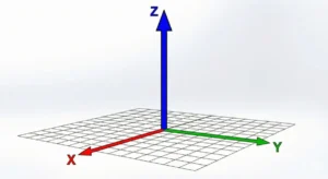
The function accepts a single argument: a <length-percentage>.
- Positive values shift the element downward.
- Negative values shift the element upward.
Unlike traditional layout properties like margin or top/left offsets, translateY() operates in the "composition" layer of the browser’s rendering pipeline. This is a critical distinction, as it allows the browser to perform these shifts using GPU acceleration, ensuring that animations remain buttery smooth even on low-powered devices.
Chronology: The Evolution of CSS Transforms
To understand the current ubiquity of translateY(), one must look at the historical trajectory of CSS. In the early 2000s, moving elements required heavy reliance on position: absolute combined with top or left values. This approach was notoriously performance-heavy, as every change to these properties forced the browser to recalculate the layout of the entire page—a process known as a "reflow."
- The Pre-Transform Era: Developers used table-based layouts or absolute positioning to achieve simple movements, which often led to jittery animations.
- The Introduction of Transforms: The CSS Transforms Module Level 1, developed by the W3C, introduced a standardized way to rotate, scale, skew, and translate elements. This was a paradigm shift, as it allowed for "composite-only" animations.
- Standardization: As the draft moved through the W3C process, browser vendors (WebKit, Gecko, Blink) rapidly adopted the syntax, standardizing the
transformproperty across the board. - Modern Maturity: Today,
translateY()is a staple of modern web standards, supported universally across all evergreen browsers, from Chrome and Firefox to Safari and Edge.
Supporting Data: Performance and Layout Implications
The primary technical advantage of translateY() over layout-based movement lies in how it interacts with the browser’s rendering engine. When you change a property like margin-top, the browser must perform a "Layout" (calculating the geometry of elements) and a "Paint" (filling in pixels) before the frame can be displayed.
In contrast, when you apply transform: translateY(), the browser calculates the element’s new position during the "Composite" phase. Because the element is moved as a layer, the browser does not need to re-flow the rest of the document.
Technical Performance Comparison
| Property | Layout Required | Paint Required | GPU Accelerated |
|---|---|---|---|
margin-top |
Yes | Yes | No |
top |
Yes | Yes | No |
translateY() |
No | No | Yes |
This data confirms that for high-frequency interactions, such as scroll-linked animations or hovering, translateY() is the objectively superior choice for maintaining a steady 60 frames per second (FPS).
Practical Implementations: Beyond the Basics
1. The "Fade-In" Slide Effect
One of the most common design patterns in modern dashboards is the sliding entry. By combining opacity with translateY(), we can create a sophisticated entry effect that feels professional.
.stat-card
  opacity: 0;
  transform: translateY(50px);
  transition: opacity 0.8s ease-out, transform 0.8s ease-out;


.dashboard.active .stat-card
  opacity: 1;
  transform: translateY(0);
This ensures that the card doesn’t just appear out of nowhere; it emerges with a sense of weight and motion, guiding the user’s eye to the new content.
2. Animated Form Labels
The "Material Design" style of input fields has become a standard in user experience. Using translateY() allows developers to transform a static placeholder into a floating label when the input is focused.
input:focus ~ label
  transform: translateY(-32px) scale(0.8);
  color: #6200ee;
This interaction provides immediate feedback to the user, confirming that the system has registered their intent to interact with the specific field.
Implications: Addressing Common Pitfalls
While powerful, translateY() is not without its traps. The most notorious issue involves "hover-flickering."
The Flickering Loop
If a developer attaches a translateY() effect directly to an element’s :hover state, they may inadvertently create a self-defeating loop. If the element moves far enough, it may shift away from the user’s cursor. Once the cursor is no longer over the element, the :hover state is removed, the element snaps back to its original position, the cursor finds the element again, and the animation restarts.
The Professional Solution:
Always apply the hover trigger to a parent container. By keeping the target area static, you ensure the interaction remains stable regardless of how much the child element moves.
/* Avoid this */
.button:hover  transform: translateY(-20px);

/* Do this */
.container:hover .button  transform: translateY(-20px);
Accessibility Considerations
When using animations, it is imperative to respect the user’s system preferences. If a user has "Reduced Motion" enabled in their OS settings, heavy animations can cause discomfort.
@media (prefers-reduced-motion: reduce)
  .stat-card, .label
    transition: none;
    transform: none;
Official Perspectives and Future Standards
The CSS Working Group continues to refine the transform specifications. While the original translateY() function remains the industry standard, we are seeing the rise of individual transform properties (translate, scale, rotate). These individual properties allow developers to manipulate these values independently without needing to manage the long-hand syntax of the transform string.
Despite these advancements, translateY() remains the most widely understood and compatible method for vertical displacement. It has transitioned from a cutting-edge CSS trick to a foundational element of web development.
Conclusion
The translateY() function is more than just a way to move things up and down; it is a gateway to high-performance, accessible, and meaningful motion design on the web. By understanding the underlying rendering mechanics—specifically how it avoids expensive reflows—developers can create interfaces that feel responsive and professional.
As we look toward the future of web standards, the principles established by translateY() will undoubtedly continue to influence how we build the next generation of digital experiences. Whether you are building a simple landing page or a complex, reactive dashboard, mastering the vertical shift is an essential step toward professional-grade front-end development.


