
The Dawn of Scroll-Triggered Animations: A New Era for Web Interactivity
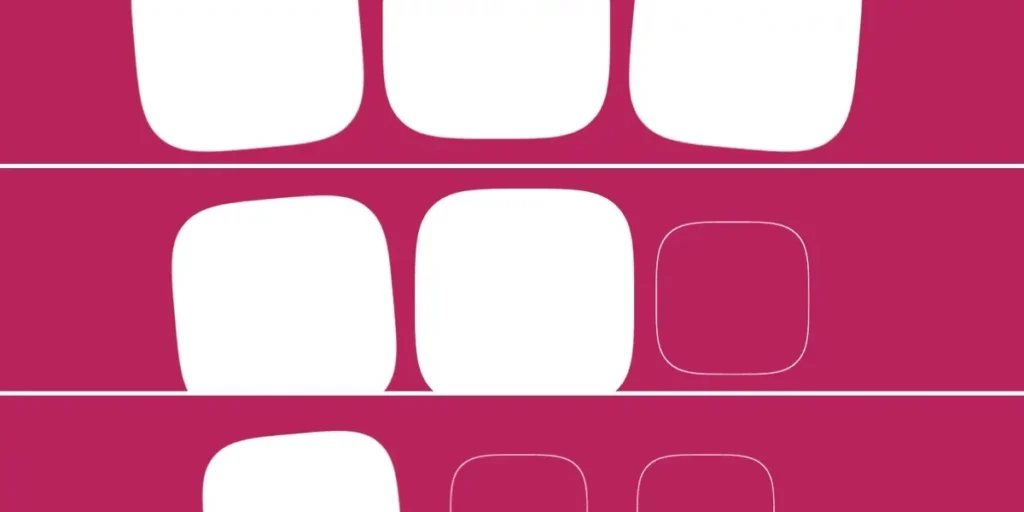
In a significant milestone for web standards and browser interoperability, Google Chrome has officially shipped support for scroll-triggered animations in version 146. This development marks the first time a browser has implemented a native CSS-based solution for triggering animations based on scroll position, effectively bridging a long-standing gap between static web design and complex, event-driven user interfaces.
For years, developers have relied on JavaScript—specifically the Intersection Observer API—to detect when an element enters the viewport to initiate animations. While effective, this approach often introduces performance overhead, layout shifts, and the complexity of managing script-based listeners. With the arrival of Chrome 146, the power to orchestrate these visual cues now sits firmly within the realm of CSS, promising a more performant and declarative future for front-end development.
The Technical Shift: Scroll-Driven vs. Scroll-Triggered
To understand the magnitude of this update, one must distinguish between two similar but fundamentally different concepts: scroll-driven animations and scroll-triggered animations.
Scroll-Driven Animations
Scroll-driven animations, which have been gaining traction in the CSS ecosystem, synchronize the progress of an animation directly with the scrollbar’s position. By using animation-timeline: scroll() or animation-timeline: view(), the animation becomes a reflection of the user’s scroll speed and distance. In this model, the animation has no duration in time; it is tied entirely to spatial progress. If the user stops scrolling, the animation halts exactly at that frame.
Scroll-Triggered Animations
Scroll-triggered animations function differently. They treat the scroll position merely as a "triggering event." Once the scroll threshold is surpassed, the animation plays for a fixed, time-based duration (e.g., 300ms), independent of how fast the user is scrolling. This is the CSS equivalent of an "Intersection Observer" event. It provides the polish of a CSS animation without the "stuck-in-place" feel of scroll-driven timelines, allowing for seamless, fluid motion that feels both responsive and autonomous.
Chronology of the Implementation
The road to this implementation has been a collaborative effort within the CSS Working Group.
- Initial Drafting: The concept emerged from the need to move away from heavy JavaScript dependencies for simple UI interactions like "fade-in-on-scroll."
- Specification Development: The W3C’s Animation Triggers specification laid the groundwork for defining how triggers should interact with existing animation properties.
- Chrome 146 Rollout: Following experimental phases in canary builds, Chrome 146 integrated
timeline-triggerandanimation-triggerinto the stable engine, making it available to millions of users worldwide.
Supporting Data: How the Mechanics Work
At the heart of this feature is the decoupling of the "timeline" from the "action." Developers now use two primary properties to control these animations: timeline-trigger and animation-trigger.
Defining the Trigger
The timeline-trigger property uses a dashed identifier (a custom name) to link a specific scroll zone to an animation. For instance:
.square
  animation: fade-bg-in 300ms;
  timeline-trigger: --trigger view() entry 100% exit 0%;
This snippet tells the browser to monitor the element. When the bottom edge enters the viewport (entry 100%), the trigger --trigger becomes active.
Defining the Action
The animation-trigger property then dictates how the browser should respond to that trigger:
.square
  animation-trigger: --trigger play-forwards;
The keyword play-forwards initiates the animation. By layering these properties, developers can control complex state changes—such as playing an animation when a user scrolls down and reversing it when they scroll back up—using only a few lines of declarative CSS.
The "Lock-in" vs. "Back-and-Forth" Paradigms
One of the most powerful aspects of this new syntax is the ability to choose how an element behaves once the animation completes.
- The Lock-in Method (
play-once): This is ideal for one-time visual flourishes. When combined withanimation-fill-mode: forwards, the animation plays to completion and remains in its final state, never to be re-triggered. This is perfect for entrance animations that should not distract the user if they scroll back up. - The Back-and-Forth Method (
play-forwards play-backwards): This creates a more dynamic experience. If the user scrolls past an element, it animates in; if they scroll back, it animates out. Because the browser handles the state, there is no "flash" or jumpy transition, providing a professional, high-end feel to page layouts.
Implications for Web Development
The arrival of scroll-triggered animations has profound implications for the design and maintenance of modern web applications.
1. Performance Gains
By offloading scroll-tracking to the browser’s internal rendering engine, we bypass the main-thread bottleneck often caused by JavaScript-based intersection observers. This leads to smoother frame rates, especially on low-power mobile devices.
2. Design System Scalability
The decoupled nature of timeline-trigger and animation-trigger means that developers can build modular, reusable animation logic. Using CSS variables and functions like sibling-count() and sibling-index(), teams can create stagger effects that automatically adjust to the number of elements on the page without writing custom JavaScript for every instance.
3. Complexity vs. Utility
While the feature is powerful, it is not without its learning curve. Critics argue that combining dashed idents, timeline ranges, and multiple animation-action keywords creates a "high-cognitive-load" environment. The distinction between animation-range (for scroll-driven) and timeline-trigger (for scroll-triggered) is subtle, and developers will need to invest time in understanding these nuances to avoid "animation soup."
Expert Perspectives and Future Outlook
Industry experts are cautiously optimistic. While the consensus is that native browser support is a "win" for the web platform, the complexity of the current spec suggests that widespread adoption will take time.
"It’s a powerful toolset," says one lead front-end engineer. "But the real challenge will be documentation and best practices. If developers don’t understand how to properly clean up triggers, we could see a rise in ‘animation fatigue’ on sites where elements are constantly firing off movements as users scroll."
Looking ahead, the community is awaiting support from other major browser vendors, such as Firefox and Safari. Without cross-browser consistency, developers will still need to use "progressive enhancement" strategies—providing basic fallbacks for users on browsers that do not yet support these new CSS properties.
Conclusion
Chrome 146 has opened the door to a new generation of interactive web design. By moving the logic of scroll-triggered animations from the script layer to the style layer, the web becomes more performant, more accessible, and significantly more expressive.
For now, the responsibility lies with the developer community to experiment, document, and refine these patterns. As we move away from the "JavaScript-everything" era, these new CSS primitives offer a glimpse of a web that is as fluid and responsive as a native application, yet as accessible and lightweight as the documents it was built to display. The future of the web isn’t just about what we see; it’s about how we move through it—and thanks to these new CSS features, that movement is about to get a whole lot smoother.








