
The Evolution of CSS Geometry: Why border-shape is the Frontier of Web Design
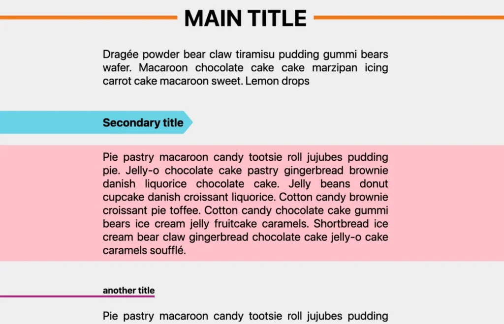
For years, web developers have treated CSS shapes like an elaborate puzzle—often requiring a chaotic combination of clip-path, mask, box-shadow hacks, and pseudo-elements just to achieve basic decorative effects. The struggle is well-documented: if you wanted a non-rectangular border, you were forced to sacrifice the native behavior of the border property.
However, a new wave of CSS specifications is changing the landscape. Following the recent arrival of the shape() function and the corner-shape property, we are now standing at the precipice of a new era with the introduction of border-shape. This isn’t just another incremental update; it is a fundamental shift in how we style the boundaries of the web.

Main Facts: A New Tool for the Modern Stylist
At its core, border-shape is a property designed to decouple the physical boundaries of an element from its rectangular box. While clip-path has served us well by cutting away portions of an element, it is inherently destructive—it clips the entire box, including any borders or shadows applied to it.
The border-shape property changes this dynamic. It accepts the same values as clip-path, including the powerful shape() function, but it applies the geometry to the element’s border box. This means that borders, outlines, and box-shadows now follow the path defined by the developer. By using this property, the "nightmare" of applying borders to complex shapes—which previously required layering multiple SVGs or using heavy SVG stroke properties—is effectively solved.

The Mechanics of the Property
The specification allows for two distinct modes of operation:
- Stroke Mode (Single
<basic-shape>): The border acts as a stroke along the defined path, with its width dictated by the standardborder-widthproperty. - Fill Mode (Two
<basic-shape>s): The border is rendered in the region between an outer path and an inner path. This provides unprecedented precision for creating frames, cutouts, and custom-shaped containers.
Chronology: The Road to border-shape
To understand why border-shape is so significant, one must look at the recent timeline of CSS shape evolution.

- The
clip-pathEra: For a decade,clip-pathwas the industry standard for creating non-rectangular layouts. While powerful, it was restrictive because it lacked support for border decorations that could conform to the clipped edge. - The Rise of
shape(): Recently, theshape()function arrived, providing a more readable and accessible way to write SVG path data directly within CSS. It removed the friction of using externalpath()data for simple shapes. - The
corner-shapeDebut: Shortly thereafter,corner-shape(round, scoop, bevel, notch, squircle) gave developers granular control over element corners. It proved that browsers could handle dynamic, non-rectangular border calculations. - The Present: We are now in the early stages of
border-shapeadoption. While currently limited to experimental builds in Chromium browsers, the property is already being stress-tested by design-focused developers who are eager to move away from legacy workarounds.
Supporting Data: Complexity vs. Efficiency
The primary argument for border-shape is the reduction of "CSS bloat." Traditionally, creating a "jagged" or "blob-shaped" element with a thick border required the following:
- A container element.
- An SVG
<path>to clip the element. - A secondary element or pseudo-element to mimic the border (often requiring complex transformations).
- Maintenance of two separate geometries (one for the clip, one for the border).
With border-shape, the code is reduced to:

.shape
  border: 10px solid #ff4757;
  border-shape: path("M10 80 C 40 10, 65 10, 95 80 S 150 150, 180 80");
This is not merely a syntactic convenience; it is a performance win. By allowing the browser’s rendering engine to calculate the border path natively, we reduce the DOM overhead and ensure that animations—such as hover-states on borders—remain buttery smooth.
Official Responses and Browser Implementation
The W3C CSS Working Group has positioned border-shape within the CSS Borders Module Level 4. The consensus among browser engineers is that the current approach to clipping is insufficient for modern design requirements.

However, developers must note that support is strictly limited to Chromium-based browsers at this stage. Safari and Firefox are still evaluating the implementation details, particularly regarding how border-shape interacts with legacy box-shadow rendering. While it is not yet "Baseline" across all major browsers, the industry sentiment is overwhelmingly positive, with designers treating it as a "must-have" feature for the next generation of web design frameworks.
Implications: A Design Renaissance
The implications for web design are profound. We are moving toward a web where the "boxy" aesthetic—a direct byproduct of the CSS Box Model—is finally optional.

1. Breaking the Box Model
For years, the "Box Model" dictated that all borders must be rectangular. border-shape effectively breaks this rule without breaking the layout. Content can now flow into shapes that were previously restricted to vector graphics software like Adobe Illustrator or Figma.
2. Dynamic, Interactive Shapes
Because border-shape is a CSS property, it is animatable. We can transition between different shapes, animate the border-width to create "pulsing" effects, or create interactive "cutout" frames that respond to user mouse movements. The ability to use inset() alongside custom paths allows for complex "reveal" animations that were previously impossible to achieve without heavy JavaScript libraries.

3. The End of "Hack" Culture
The developer community has long relied on sites like CSS-Tricks or CSS-Loaders to find workarounds for common UI needs. With border-shape, many of these "hacks"—such as the infamous "hand-drawn" border or the "squishy" loader—become native features. This shift will likely lead to a standard set of design patterns, making the web more visually consistent and accessible.
4. Accessibility and Performance
By moving away from images and SVG overlays, we are creating more accessible UIs. Screen readers and assistive technologies benefit from native CSS structures, and page load times are improved by avoiding unnecessary assets.

Final Thoughts: The Path Forward
The border-shape property represents the maturation of CSS as a design tool. It is no longer just about positioning boxes; it is about creating high-fidelity, custom-shaped digital environments that are performant and maintainable.
As we look toward the future, the integration of border-shape with other upcoming CSS features—like container queries and scroll-driven animations—will allow for a new level of responsiveness. We are not just building pages anymore; we are sculpting them. While we wait for full cross-browser support, now is the time for developers to experiment, build, and push the limits of what this new property can do. The era of the "rectangular web" is ending, and the era of the "shaped web" has only just begun.








