The Evolution of Motion: Mastering Scroll-Driven Animations in Modern Web Design
In the fast-evolving landscape of web development, designers are constantly seeking ways to break the "static" nature of the internet. One of the most compelling trends to emerge recently is the concept of scroll-driven animations—a technique that allows developers to link the progress of an animation directly to the user’s scroll position. This creates a deeply immersive, tactile experience that transforms passive browsing into an interactive journey.
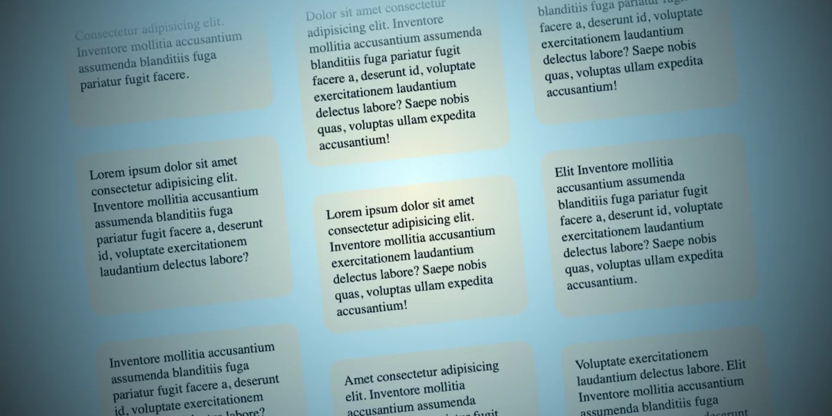
Recently, designers have begun experimenting with "opposing columns," a layout where elements move in divergent directions as a user navigates the page. While this might initially appear to be a complex, heavy-lift engineering task involving JavaScript event listeners and performance-draining calculations, modern CSS has rendered such overhead obsolete. By leveraging native browser features, we can achieve high-performance, fluid animations that feel both sophisticated and intuitive.
The Core Concept: Why Opposing Motion Works
At its heart, the "opposing columns" design is a visual trick that relies on the interplay between motion and static boundaries. By moving content in different directions—for instance, two outer columns sliding upward while the center column slides downward—you create a sense of depth and kinetic energy.
This effect is not just for aesthetic appeal; it serves a functional purpose in modern UI design. It draws the eye, guides the user through content blocks, and adds a professional polish that distinguishes a high-end web application from a standard document. However, the true beauty of this approach lies in its accessibility and efficiency. Because these animations are handled natively by the browser’s rendering engine, they are significantly more performant than legacy JavaScript-based solutions.
A Chronological Breakdown of the Implementation
Implementing this effect requires a disciplined approach, moving from structural HTML to sophisticated CSS masking and finally to the animation logic.
1. Structural Foundation (The HTML)
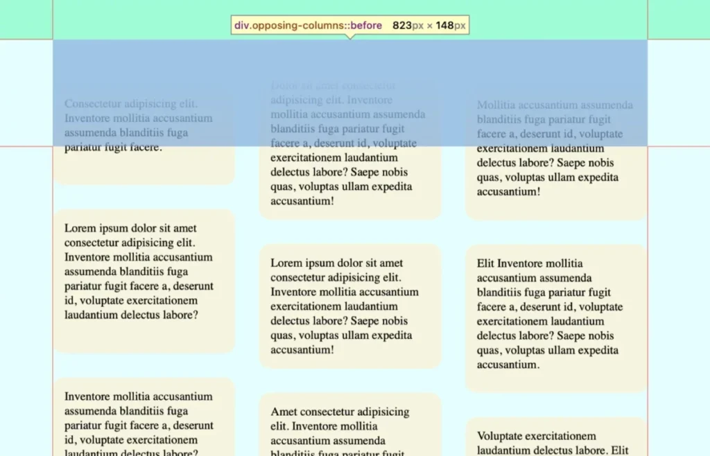
The markup is remarkably lean. We utilize a parent container, .opposing-columns, which serves as the stage. Inside this, we place three child columns, each populated with .opposing-item elements.
<div class="opposing-columns">
  <div class="opposing-column">
    <div class="opposing-item">...</div>
  </div>
  <div class="opposing-column">
    <div class="opposing-item">...</div>
  </div>
  <div class="opposing-column">
    <div class="opposing-item">...</div>
  </div>
</div>
This simplicity is intentional. By keeping the markup clean, we ensure that the layout remains flexible and semantic, allowing the CSS to dictate the behavior without cluttering the Document Object Model (DOM).
2. Crafting the "Masking" Effect
To sell the illusion that items are appearing and disappearing seamlessly as they scroll, we must implement a masking technique. We achieve this by using pseudo-elements (:before and :after) on the parent container. These elements act as "curtains" that sit atop the column content, fading them out using background gradients.
The process involves:
- Defining Variables: Using CSS custom properties like
--opposing-maskensures that the spacing and masking height remain consistent across the component. - Creating Stacking Contexts: By setting the z-index of the pseudo-elements higher than the children, we ensure that as items move behind these masks, they are effectively hidden, creating a "portal" effect where content seems to materialize from thin air.
3. The Animation Logic: Embracing view()
The breakthrough in this implementation is the use of the animation-timeline property. Traditionally, CSS animations run on a temporal basis—they start and end based on time. With the view() function, we shift the trigger to the user’s scroll position within the scrollport.
.opposing-column
  animation-timeline: view();
  animation-range: entry 0% cover 100%;
  animation-timing-function: linear;
By setting the range from entry 0% to cover 100%, we tie the animation progress precisely to the element’s visibility. As the user scrolls, the items move in perfect synchronization with their viewport position.
Supporting Data and Performance Implications
One might wonder about the performance cost of such dynamic interactions. Historically, high-frequency animation triggered by scroll events caused "jank"—or dropped frames—because the browser had to calculate layout changes on the main thread.
However, scroll-driven animations are designed to be "off-main-thread" compatible. Because the browser knows the animation is tied to a scroll position, it can optimize the rendering process. In testing environments (Chrome and Safari), these animations maintain a consistent 60 frames per second, even on devices with modest processing power.
Furthermore, the implementation respects user preferences. By utilizing the prefers-reduced-motion media query, developers can gracefully disable these animations for users who find them distracting or who experience vestibular sensitivity. This is not merely a "nice-to-have" feature; it is a fundamental requirement for inclusive web design.

Official Responses and Browser Compatibility
The CSS Working Group has been instrumental in standardizing these features. The animation-timeline property is part of the Scroll-driven Animations specification, which is currently seeing rapid adoption.
As of the current development cycle:
- Chrome and Safari: Support is robust and stable, allowing developers to implement these effects with confidence.
- Firefox: Support is currently in the experimental stage. Developers are advised to use
@supportsblocks to provide a "safe" fallback—such as a static grid layout—for browsers that have not yet fully implemented the specification.
This "progressive enhancement" approach ensures that while power users on modern browsers get the full, fluid experience, users on older or unsupported platforms still receive a functional and readable interface.
Implications for Future UI Design
The ability to link motion to scroll position signals a paradigm shift in how we think about web interfaces.
- Increased Engagement: Studies show that interactive, responsive elements significantly increase "time-on-page" metrics. Users are more likely to engage with content that feels alive and responsive to their actions.
- Reduced Reliance on JavaScript: By shifting animation logic to CSS, we reduce the complexity of our codebase. Less JavaScript means fewer potential bugs, smaller bundle sizes, and a reduced attack surface for security vulnerabilities.
- Design Consistency: With CSS-driven motion, the animation feel is consistent across different devices, as it is handled by the browser’s native rendering engine rather than varying script execution speeds.
Conclusion: The Path Forward
The "opposing columns" concept is more than just a stylistic choice; it is a testament to the power of the modern web platform. It demonstrates how, with the right combination of CSS features—flexbox, grid, pseudo-elements, and scroll-driven animations—we can create highly complex, engaging user experiences with minimal code.
As we look toward the future, the integration of these features into the standard web toolkit will empower designers to push the boundaries of what is possible in the browser. Whether you are building a landing page for a startup or a complex data visualization dashboard, the lessons learned here—prioritizing performance, respecting user preferences, and leveraging native browser capabilities—will serve as a blueprint for the next generation of web design.
We invite you to experiment with these techniques, tweak the animation offsets, and explore how you might apply these principles to your own projects. The web is no longer just a collection of static documents; it is a canvas for motion and interaction. What will you build with it?