
The Modern Web Developer’s Guide to the HTML <dialog> Element: From Basics to Advanced Animations and Accessibility
Nearly a decade after its initial introduction to the web platform, the native HTML <dialog> element remains one of the most deceptively nuanced features in modern web architecture. While developers frequently implement it for pop-ups, alerts, and modal interfaces, its underlying mechanics—spanning state management, focus trapping, semantic accessibility, and complex styling rules—often send engineers scrambling back to documentation.
This comprehensive technical retrospective explores the full lifecycle of the <dialog> element, evaluating foundational implementation steps, emerging declarative standards, advanced CSS styling techniques, and the critical architectural distinctions between dialogs and popovers.
Main Facts: What is the HTML <dialog> Element?
The native <dialog> element is an interactive HTML component designed to represent a configurable sub-window, alert box, or modal overlay. Crucially, it provides native browser-level support for behaviors that developers previously had to script manually, including:
- Focus Management: Automatic focus shifting upon opening and focus trapping while active.
- Top Layer Rendering: Rendering on the browser’s top layer to ensure elements stack correctly above all other content.
- Inert Background Subtrees: Built-in mechanisms to render background content non-interactive (
inert) when displayed as a modal. - Keyboard Accessibility: Native handling of the
Esckey to dismiss the dialog.
Despite these powerful defaults, utilizing the element effectively requires understanding the distinct separation between standard pop-ups and full modals, managing custom CSS pseudo-classes, and avoiding common accessibility pitfalls.
Chronology and Evolution of Dialog Standards
To understand where the <dialog> element stands today, it helps to review its historical development and the incremental web standards that have elevated its capabilities:
- 2014–2016: The
<dialog>element specification lands in browsers, initially facing slow cross-browser adoption and requiring extensive polyfills, particularly for Safari and older versions of Internet Explorer/Edge. - 2020–2022: Universal modern browser support is finally achieved across Chrome, Safari, Firefox, and Edge, establishing the element as a baseline web standard.
- 2023–2024: The introduction of advanced CSS capabilities—such as the
@starting-stylerule and the:openpseudo-class—finally brings smooth, native entry and exit transitions to dialog elements without heavy JavaScript orchestration. - 2025–2026 (Present): Emerging web specifications like Invoker Commands (
commandandcommandforattributes) begin rolling out experimentally, promising fully declarative opening and closing without a single line of JavaScript. Concurrently, layout upgrades like extendedoverscroll-behaviorproperties solve long-standing background-scrolling challenges.
Foundational Markup and Initialization
At its simplest, a dialog requires a basic structural declaration paired with a trigger element:
<button id="dialog-button">Open Dialog</button>
<dialog id="dialog">
  <p>This is a native dialog container.</p>
</dialog>
By default, this element remains closed. While developers can technically force it open via the boolean open attribute (<dialog open>), this is rarely practical for dynamic interfaces. Instead, developers rely on JavaScript control methods, which bifurcate into two distinct behaviors: show() and showModal().

The show() Method vs. showModal()
Invoking dialog.show() treats the element as a lightweight pop-up rather than a true modal.
const dialogButton = document.querySelector('#dialog-button');
const dialog = document.querySelector('#dialog');

dialogButton.addEventListener('click', () =>
  dialog.show(); // Treats the dialog as a pop-up
);
Key characteristics of show():
- Does not generate a backdrop.
- Does not automatically center the element in the viewport.
- Does not trigger the native
inertbehavior on the background page content. - Does not listen to the
Esckey by default.
Conversely, invoking dialog.showModal() transforms the element into a true modal experience:
dialogButton.addEventListener('click', () =>
  dialog.showModal(); // Treats the dialog as a modal
);
Key characteristics of showModal():
- Renders an interactive backdrop (
::backdrop). - Automatically positions the element dead-center in the viewport.
- Triggers background inertness, completely locking out user interaction, text selection, and focus on underlying document elements.
- Listens for the
Esckey to cleanly dismiss the component.
Supporting Data: Managing State and Dismissal Mechanisms
Closing a dialog can be handled programmatically or declaratively. Programmatically, developers use the .close() method:
const dialogButton = document.querySelector('#dialog-button');
const formDialog = document.querySelector('#dialog');
const formClose = document.querySelector('#dialog-close');

dialogButton.addEventListener('click', () =>
  formDialog.showModal();
);

formClose.addEventListener('click', () =>
  formDialog.close();
);
Interestingly, while the opening method differentiates between show() and showModal(), the closing method uses a singular .close() regardless of how the dialog was initiated.
Declarative Closing via HTML Forms
For developers seeking a JavaScript-free approach, forms nested within a dialog can handle dismissal natively by setting the form method to dialog:

<dialog id="dialog">
  <form method="dialog">
    <button type="submit">Close Dialog</button>
  </form>
</dialog>
Submitting this form closes the dialog automatically while triggering standard form-submission events if required.
The Future: Invoker Commands
As the web platform evolves toward more declarative HTML capabilities, Invoker Commands are emerging to eliminate boilerplate JavaScript event listeners entirely. By utilizing command and commandfor attributes, developers can wire up triggers natively:
<button command="show-modal" commandfor="my-dialog">Show Dialog</button>

<dialog id="my-dialog">
  <p>Controlled entirely via declarative attributes.</p>
  <button command="close" commandfor="my-dialog">Close Dialog</button>
</dialog>
For applications that still require event tracking, developers can listen to these commands cleanly via JavaScript:
const dialogs = document.querySelectorAll("dialog");

dialogs.forEach(dialog =>
  dialog.addEventListener("command", event =>
    if (event.command == "show-modal")
      // Handle modal open event
     else if (event.command == "close")
      // Handle modal close event

  );
);
Official Responses, Accessibility, and Usability Guidelines
Accessibility experts and browser vendors emphasize that the utility of a dialog is deeply tied to its inclusive design implementation.
Button Labeling and Screen Readers
A common pitfall involves labeling close buttons with simple symbols like an "X" or unlabelled SVG icons:
<!-- Anti-pattern for screen readers -->
<button id="dialog-close">X</button>
Screen readers will often announce this awkwardly or unclearly. Best practices dictate pairing visual icons with visually hidden text while utilizing aria-hidden on the decorative asset:
<button id="form-close">
<span class="visually-hidden">Close modal</span>
<span aria-hidden="true">×</span>
</button>Initial Focus Considerations
By default, when a modal opens, focus shifts directly to the first focusable element inside the dialog (often the close button). While efficient, this can introduce minor usability snags—such as users accidentally hitting the Space key and prematurely closing the dialog. If the dialog contains rich form fields or primary action links, developers should consider explicitly assigning initial focus via the tabindex attribute to guide the user experience more deliberately.

Advanced CSS Styling and Animation Techniques
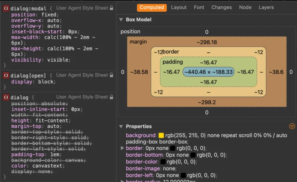
Default user-agent stylesheets for the <dialog> element provide a basic white background and a heavy black border. Modern CSS allows for complete visual overhauls, though developers must keep specific pseudo-classes and rendering behaviors in mind.
Targeting the Open State
To apply custom styles, developers should target the element specifically in its [open] attribute state or via the :modal pseudo-class:
dialog
  background-color: transparent;
  border: none;

  &[open]
    background-color: #ffffff;
    border-radius: 16px;
    box-shadow: 0 20px 25px -5px rgb(0 0 0 / 0.1);
Styling the Backdrop
The underlying overlay can be styled using the ::backdrop pseudo-element. To avoid a jarring visual shift, developers frequently combine background coloration with CSS blur filters:
dialog::backdrop
  background-color: rgba(0, 0, 0, 0.5);
  backdrop-filter: blur(4px);
Fixing Background Scroll Jank
When a modal opens, removing default scrollbars can cause background content to shift horizontally. Utilizing scrollbar-gutter prevents this layout thrashing:
dialog
  &[open]
    scrollbar-gutter: stable;
Furthermore, preventing background page scrolling while a modal is active has historically required locking body overflows via JavaScript or :has() selectors:
body:has(dialog[open])
  overflow: hidden;
However, recent browser implementations support overscroll-behavior directly on non-scrollable containers, allowing for a cleaner, entirely CSS-driven containment strategy:
dialog
  overflow: hidden;
  overscroll-behavior: contain;

  &::backdrop
    overscroll-behavior: contain;
Smooth Entry and Exit Animations
Historically, animating dialogs open and closed was notoriously difficult because elements transitioning from display: none cannot easily interpolate keyframes. Today, combining CSS transitions with the @starting-style at-rule resolves this limitation:

@starting-style
  dialog:open
    opacity: 0;
    transform: scale(0.95);


dialog
  opacity: 0;
  transform: scale(0.95);
  transition: opacity 0.3s ease, transform 0.3s ease, overlay 0.3s ease allow-discrete, display 0.3s ease allow-discrete;

  &[open]
    opacity: 1;
    transform: scale(1);
Implications: Dialog vs. Popover API
A frequent architectural debate centers on whether to implement the Dialog API or the Popover API. While both utilize top-layer rendering, their underlying accessibility semantics differ significantly.
| Feature | Dialog API (<dialog>) |
Popover API (popover) |
|---|---|---|
| Primary Use Case | Modals, alerts, user confirmation prompts requiring focused attention. | Tooltips, dropdown menus, non-modal contextual pickers. |
| Background Inertness | Automatic (inert applied to background content for modals). |
None (background remains fully interactive). |
| Focus Trapping | Automatic (focus is kept within the dialog bounds). | Manual (developer must manage focus flow). |
| Dismissal Behavior | Manual or via Esc key (for modals). |
Light-dismiss built-in (clicking outside closes the popover). |
Architectural Takeaway: Choosing the wrong API creates severe accessibility debt. Developers building interactive widgets that require user interruption and focus isolation must default to the <dialog> element. Conversely, lightweight floating elements like menus or contextual tooltips should leverage the Popover API to maintain smooth, non-disruptive user workflows.
Conclusion
The HTML <dialog> element has matured from an experimental specification into an indispensable pillar of resilient web development. By mastering its dual initialization modes (show vs. showModal), adopting declarative closing patterns, leveraging modern CSS features like @starting-style, and respecting critical accessibility boundaries, engineers can build robust, fluid, and highly inclusive modal experiences that will stand the test of time.








