
Mastering Depth: A Deep Dive into the CSS translateZ() Function
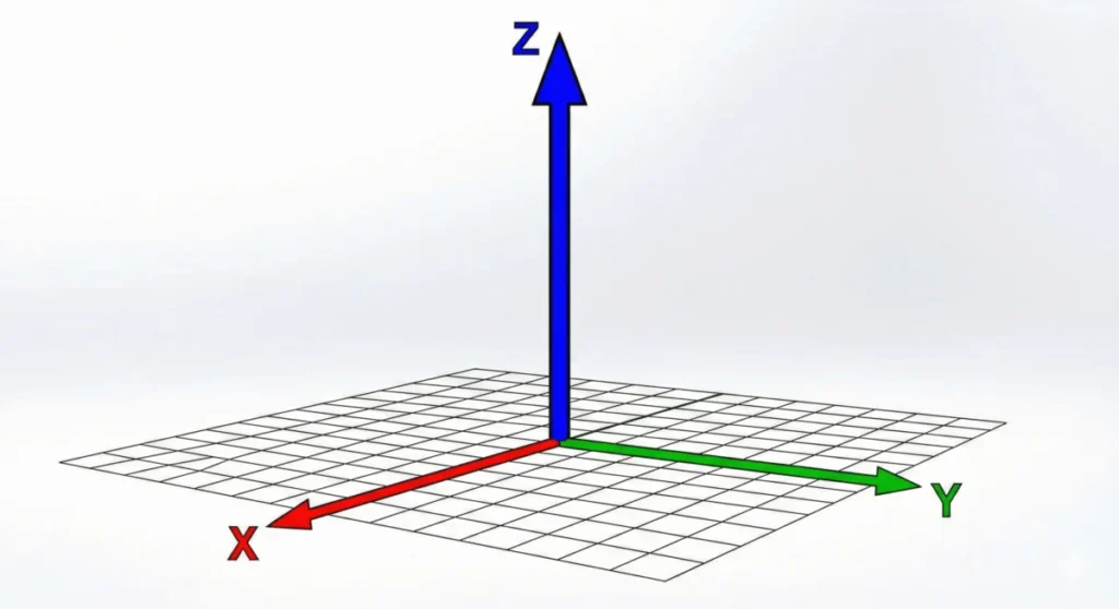
In the evolution of web design, the leap from two-dimensional layouts to three-dimensional space represents one of the most significant milestones in user interface development. At the heart of this transformation lies the CSS translateZ() function—a powerful tool that allows developers to manipulate elements along the Z-axis, effectively introducing the concept of depth to the browser’s flat canvas.
While often misunderstood as a simple scaling tool, translateZ() is a sophisticated piece of browser rendering logic that fundamentally alters how we perceive elements on a screen. This article explores the mechanics, implications, and performance-boosting capabilities of this essential CSS feature.
The Main Facts: Defining translateZ()
At its core, translateZ() is a CSS transform function defined in the CSS Transform Module Level 2 specification. Its primary purpose is to shift an element along the Z-axis—the imaginary line that runs perpendicular to your screen, extending from the background toward the viewer.
The Mechanics of Depth
When you apply translateZ(100px) to an element, you are essentially pulling that element 100 pixels closer to the "camera" (the viewer). Unlike translateX() or translateY(), which move elements laterally, translateZ() interacts with the browser’s 3D rendering engine.
A critical distinction must be made: translateZ() is not a scaling tool. While an element moved closer to the viewer appears larger, its actual width and height properties remain unchanged. The perceived increase in size is an optical illusion created by the browser’s perspective projection. If you were to rotate the element on the Y-axis, you would observe that the element remains its original size, only occupying a different spatial coordinate in the 3D scene.
Chronology: The Evolution of 3D on the Web
The journey of translateZ() and 3D transforms was not always possible in standard web browsers.
- The Pre-3D Era: Early CSS relied exclusively on 2D transforms (
rotate,scale,skew). Developers seeking depth were forced to use complex JavaScript libraries or layered raster images to simulate 3D space. - The Introduction of 3D Transforms: As part of the CSS3 initiatives, browser vendors began implementing the
transformproperty to include 3D functions. This allowed for native GPU acceleration, a massive shift from CPU-heavy rendering. - Standardization: The CSS Transform Module Level 2 solidified the behavior of these functions, ensuring that browsers like Chrome, Firefox, Safari, and Edge interpret Z-axis movement consistently.
- Modern Optimization: In recent years, the industry has shifted from using
translateZ()purely for visual effects to using it as a "performance hack," cementing its place in the modern developer’s toolkit for hardware-accelerated animations.
Supporting Data: Understanding Perspective and Projection
A common point of frustration for developers is applying translateZ() and seeing absolutely no result. This occurs because, by default, browsers flatten all content onto a 2D plane. Without a "perspective" defined, the browser cannot calculate how an object should look when it moves along the Z-axis.

Perspective vs. perspective()
To visualize depth, you must provide the browser with a focal point. This is achieved in two ways:
- The
perspectiveProperty: Applied to a parent container, this sets the distance between the user and the Z=0 plane. A value likeperspective: 800pxcreates a standard, natural-looking depth. - The
perspective()Function: This is applied directly to the element as part of thetransformstring. It is more localized, allowing for specific 3D effects on individual elements.
Important Note on Syntax:
When using the perspective() function, order matters. It must be declared before the translateZ() function.
- Correct:
transform: perspective(800px) translateZ(100px); - Incorrect:
transform: translateZ(100px) perspective(800px);
Official Responses: The Role of the GPU
Why do developers frequently use translateZ(0) or translateZ(1px) in their CSS code, even when they have no intention of moving an element in 3D space? The answer lies in how modern browsers handle the "Compositor Layers."
According to web performance documentation and browser engine specifications (such as Chromium’s rendering architecture), the CPU is responsible for the layout and painting of the page. However, the GPU (Graphics Processing Unit) is significantly faster at moving pixels around.
By applying a 3D transform—even a negligible one like translateZ(0)—you are signaling to the browser that this element should be promoted to its own compositor layer. This tells the browser: "This element might change, so render it on the GPU." This prevents the "flickering" or "jitter" often seen in complex CSS transitions and animations. It is a highly effective, low-effort optimization strategy that keeps animations smooth at 60 frames per second (FPS).
Implications: The Do’s and Don’ts
As with any powerful tool, there are implications for how translateZ() is utilized in professional web projects.
1. Avoid Over-Optimization
While translateZ(0) improves performance, applying it to every element on a page can have the opposite effect. Each promoted layer consumes GPU memory. Overusing this technique on hundreds of elements can lead to memory exhaustion and browser crashes, especially on mobile devices with limited RAM.

2. Semantic Clarity
translateZ() should be used primarily for spatial positioning in 3D interfaces (like card flips, carousel depth, or parallax effects). For simply enlarging an element, scale() is the semantically correct choice. Misusing translateZ() for scaling can introduce unwanted perspective distortion that is difficult to debug later.
3. Maintaining the preserve-3d Context
When building complex 3D scenes, ensure that the parent element has transform-style: preserve-3d; applied. Without this, the browser flattens the children of the parent, effectively negating the depth you have carefully crafted.
Future Perspectives: CSS Transform Module Level 3
As we look toward the future, the CSS Working Group continues to refine these specifications. While translateZ() remains a stable and widely supported feature, we are seeing a move toward more robust animation APIs. However, the fundamental relationship between the viewport, the perspective, and the Z-axis remains a cornerstone of the browser’s rendering engine.
Developers should continue to monitor the CSS Working Group Drafts for updates. As browsers evolve to handle increasingly complex interfaces—including those designed for Virtual Reality (VR) and Augmented Reality (AR) on the web—the ability to accurately manipulate depth will become even more vital.
Conclusion
The translateZ() function is more than just a CSS property; it is a gateway to the third dimension on the web. Whether you are creating an immersive 3D experience or simply trying to optimize your animations by tapping into the power of the GPU, understanding how Z-axis translation works is essential for every front-end developer.
By respecting the need for perspective, understanding the nuances of GPU layer promotion, and choosing the right tool for the job—be it scale() or translateZ()—you can elevate your web projects from flat documents to interactive, three-dimensional experiences that feel as responsive and fluid as native applications.








