The Art of Conciseness: Rethinking Web Accessibility Labels for Screen Reader Users
In the evolving landscape of web development, the pursuit of accessibility—or A11y—has moved from a secondary consideration to a core pillar of professional front-end engineering. However, as standards improve, developers are discovering that more is not always better. A growing movement among accessibility advocates argues that "verbose" coding practices, while well-intentioned, can inadvertently hinder the user experience for those relying on assistive technologies like screen readers.
The current discourse centers on a deceptively simple question: How much context is too much? Specifically, industry experts are calling for a purge of redundant descriptors within navigation labels and alt-text, arguing that precision is the ultimate form of inclusivity.
Main Facts: The Redundancy Trap
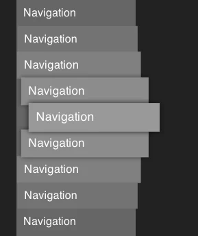
The core issue lies in the way assistive technologies (AT) announce elements on a webpage. When a screen reader encounters a <nav> element, it identifies the role of the container. If a developer assigns a label—such as aria-label="Primary Navigation"—the screen reader will announce, "Navigation, Primary Navigation."
This creates a stutter in the user’s workflow. The screen reader identifies the element as a navigation landmark, and then immediately repeats the word "navigation" because it was hard-coded into the label.
Mark Underhill, a prominent voice in the accessibility community, recently highlighted this in his technical blog, TemperTemper. "There’s no need to include the word ‘navigation’ in your <nav> labels," Underhill writes. "It’s unnecessarily repetitive for screen reader users."
This is not merely a stylistic choice; it is a matter of cognitive load. For a user navigating a site exclusively through audio output, every extra word represents a second of processing time. When multiplied across a complex site with multiple navigation blocks, these redundancies add up, transforming a streamlined experience into a tedious exercise in listening to the obvious.
Chronology: The Evolution of Accessible Markup
The shift toward minimalist labeling follows a broader timeline of web standards maturation:
- Early 2000s: The "Wild West" of web accessibility. Developers were primarily concerned with getting content to render at all. Alt-text was often ignored or misused, leading to the early W3C guidelines that mandated descriptive text for all images.
- 2010–2015: The rise of WAI-ARIA (Web Accessibility Initiative – Accessible Rich Internet Applications). As web applications became more complex, developers were given tools to label dynamic elements. In their enthusiasm, many over-labeled, leading to the current "over-tagging" phenomenon.
- 2016–2020: The audit era. Accessibility audits became standard in enterprise development. However, these audits often relied on automated tools that checked for the presence of labels rather than the quality of them, encouraging developers to stuff labels with keywords to satisfy "accessibility score" requirements.
- 2021–Present: The "User-First" movement. Current discourse has pivoted toward the lived experience of screen reader users. Developers are now moving beyond the automated checklist to focus on the cadence, brevity, and efficiency of the audio output.
Supporting Data: Why "Less is More"
Data from user testing groups and accessibility research firms suggest that screen reader users often prefer a "scan-heavy" approach to information retrieval.
According to research from platforms like CSS-Tricks and accessibility-focused publications like Piccalilli, the goal of a screen reader user is to move through the page as quickly as possible. When an element is labeled "Primary Navigation," the screen reader identifies it as a landmark. Adding "Navigation" to the name creates an "announcement loop."
Furthermore, the same logic applies to alt text. Many junior developers fall into the trap of writing "Image of a cat" in the alt attribute. Because the browser and the screen reader already announce the element as an "image," the user hears: "Image: Image of a cat." This redundancy provides zero utility while significantly degrading the speed at which a user can scan a page.
Best Practices for Succinct Labeling
- Navigation: Use specific identifiers like "Main," "Footer," or "Sidebar" instead of "Main Navigation."
- Images: Describe the function or content of the image. If the image is a decorative photo of a sunrise, describe the "bright orange sunrise over a mountain range" rather than stating it is an image.
- Length: Keep labels under three words where possible. If a description requires a novel, utilize the
longdescattribute or a link to a full description.
Official Perspectives and Expert Consensus
Industry experts are increasingly vocal about the dangers of "accessibility bloat." Andy Bell, a lead designer and developer, notes that we should treat accessible names with the same rigor we treat UX copy.
"If we wouldn’t write it on the screen for a sighted user, we shouldn’t force a screen reader user to hear it," says one industry lead. The consensus among accessibility consultants is that "accessible code" should be invisible. It should support the user’s intent without drawing attention to its own presence.
The W3C (World Wide Web Consortium) continues to emphasize the importance of context. In their updated documentation, they advise that "the label should be descriptive, not redundant." They specifically caution against using the element’s role in the name, as the AT will handle the role identification automatically.
Implications: The Future of Accessible Design
The movement toward leaner, more efficient labeling has significant implications for how we train the next generation of web developers.
1. The Death of the "Checkbox" Mentality
Developers are being encouraged to move away from automated testing tools that reward the existence of ARIA labels. Instead, professional development should prioritize manual testing using tools like NVDA or VoiceOver. By putting on the headphones, developers learn immediately that their "helpful" labels are actually distracting clutter.
2. Semantic HTML Over ARIA
This shift reinforces the importance of using semantic HTML. When a developer uses a <nav> tag, they don’t need an aria-label unless they have multiple nav elements on a single page. If they do have multiple, the label should distinguish the type of nav (e.g., "Main" vs "Utility"), not repeat the word navigation. This reinforces the principle: "The first rule of ARIA is don’t use ARIA if you can use native HTML."
3. Cognitive Load and Inclusivity
Accessibility is not just for the visually impaired. It includes neurodivergent users, those with learning disabilities, and anyone using a device in a distracting environment. Succinct, clear labels help reduce cognitive load for all users. By stripping away the unnecessary, we make the web more efficient for everyone.
4. Professionalism in Code
Writing clean, minimal code is a hallmark of a senior developer. "Accessibility bloat" is now being categorized as a form of "code smell." Just as redundant comments in JavaScript are discouraged, redundant ARIA labels are becoming a sign of an amateur approach to front-end architecture.
Conclusion
The evolution of web accessibility is moving toward a more nuanced, empathetic approach. It is no longer enough to simply "make it accessible"; we must strive to make the experience seamless. By removing redundant navigation labels and trimming the fat from our alt text, we show respect for the user’s time and intelligence.
The goal is a web where the technology recedes into the background, leaving the user with a clean, navigable, and delightful experience. It is a reminder that in the world of software development, the most powerful tool in our arsenal is often the delete key. By choosing to say less, we are, in effect, saying much more to the users who need it most.
As we continue to iterate on the standards of the modern web, let us remember the golden rule of accessibility: "Love your user’s experience enough to keep it simple."