
The Modern Web Developer’s Masterclass: Mastering the HTML <dialog> Element, Accessibility, and Advanced CSS Styling
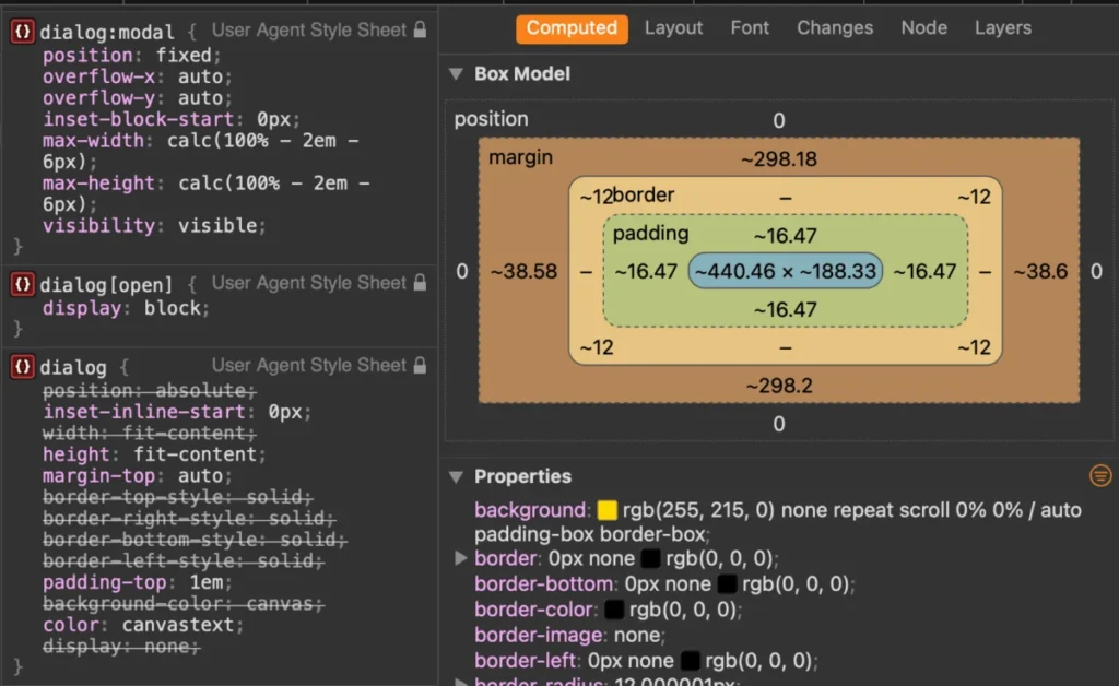
Nearly a decade after its introduction to the web specification landscape, the native HTML <dialog> element remains one of the most deceptively nuanced components in modern web architecture. While developers frequently implement it for simple pop-ups or alerts, unlocking its full potential requires a deep dive into its application programming interfaces (APIs), accessibility (a11y) tree implications, and the latest modern CSS styling breakthroughs.
This comprehensive guide serves as an exhaustive technical reference for frontend engineers seeking to leverage native browser features over heavy JavaScript component libraries, ensuring future-proof, accessible, and performant web applications.
Main Facts: The Anatomy of a Native Web Dialog
At its core, the <dialog> element provides a native mechanism for creating modal and non-modal dialog boxes, pop-ups, and lightboxes directly within the HyperText Markup Language specification. By relying on the browser’s internal user agent (UA) styles and built-in accessibility semantics, developers can bypass cumbersome third-party JavaScript libraries.

- Modal vs. Non-Modal States: Invoking a dialog via
.show()treats it as a non-modal pop-up, allowing interaction with the rest of the document. Conversely, using.showModal()elevates the element to the top layer, renders a customizable backdrop, and automatically triggers native inertness on background content. - Declarative Control: Modern HTML specifications introduce features like invoker commands (
commandandcommandforattributes), allowing developers to open and close dialogs entirely without JavaScript. - Top Layer Rendering: Modal dialogs automatically reside in the browser’s top layer, breaking out of standard CSS stacking contexts (
z-index) to guarantee they sit above all other page content. - Styling Evolution: Recent enhancements in CSS—including the
::backdroppseudo-element, the:openand:modalpseudo-classes,@starting-style, and modern scroll-containment properties—have turned dialog styling from a frustrating chore into a creative playground.
Chronology: From Experimental Spec to Baseline Status
Understanding how the <dialog> element evolved provides crucial context for why certain styling and behavioral patterns exist today.
- Initial Specification and Introduction (Mid-2010s): The
<dialog>element was introduced to HTML Living Standards, offering a standardized way to build dialogs natively. However, early adoption was hindered by inconsistent browser support and missing styling hooks, forcing developers to rely on libraries like Bootstrap or React portals. - The JavaScript API Era: Standard methods like
show(),showModal(), andclose()became universally supported across evergreen browsers, allowing developers to handle state changes programmatically without manipulating custom CSS classes. - The Backdrop and Pseudo-Class Revolution: Browsers adopted the
::backdroppseudo-element, giving developers styling control over the dimmed area behind modals. Later, pseudo-classes like:modaland:opensolved long-standing specificity battles in CSS. - Modern Enhancements (2024–2026): Recent browser updates introduced game-changing capabilities. Safari’s adoption of the
:openpseudo-class and Chrome’s integration ofoverscroll-behavioron non-scrollable containers in Chrome 144 have closed the gap on smooth, native modal UX. Simultaneously, experimental invoker commands have brought fully declarative dialog handling closer to production reality.
Supporting Data: Technical Implementation Guide
To implement robust dialogs, developers must master both JavaScript manipulation and modern CSS orchestration.
1. Marking Up and Controlling State
The basic markup pairs a trigger button with the dialog element itself:

<button id="dialog-button">Open Dialog</button>
<dialog id="dialog">
  <form method="dialog">
    <p>Are you sure you want to proceed?</p>
    <button value="cancel">Cancel</button>
    <button value="confirm" autofocus>Confirm</button>
  </form>
</dialog>
To control this programmatically via JavaScript, developers must use .showModal() for true modal behavior:
const dialogButton = document.querySelector('#dialog-button');
const formDialog = document.querySelector('#dialog');

dialogButton.addEventListener('click', () =>
  formDialog.showModal();
);
For a zero-JavaScript approach, the upcoming invoker commands specification allows declarative bindings directly in markup:
<button command="show-modal" commandfor="my-dialog">Show Dialog</button>
<dialog id="my-dialog">
  <button command="close" commandfor="my-dialog">Close Dialog</button>
</dialog>
2. Advanced CSS Styling: Backdrops, Borders, and Scroll Containment
Styling the <dialog> element requires targeting its active states properly. Because default styles apply a stark white background and a heavy black border, custom styling should target the :open or :modal states:
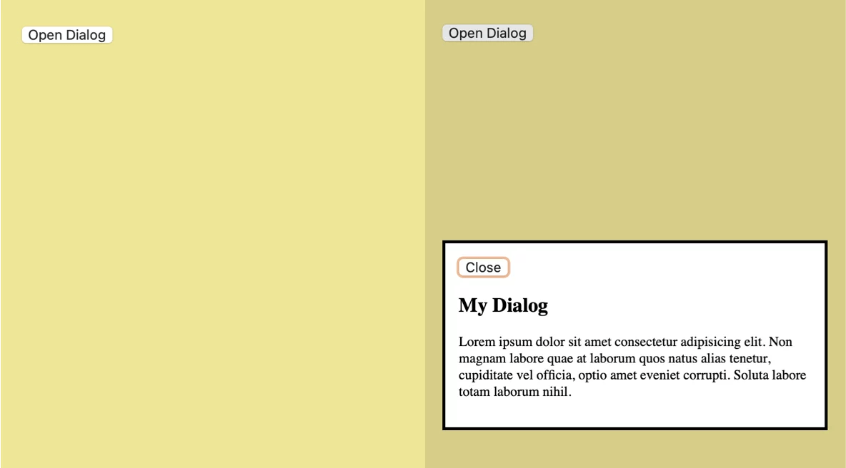
dialog
  background-color: transparent;
  border: none;
  padding: 0;
  max-width: 600px;
  width: 90vw;
  overflow: hidden;
  overscroll-behavior: contain;
  transition: opacity 0.4s ease-in-out, transform 0.4s ease-in-out;
  transform: translateY(-20px);
  opacity: 0;

  &[open]
    opacity: 1;
    transform: translateY(0);


  &::backdrop
    background-color: rgba(0, 0, 0, 0.6);
    backdrop-filter: blur(4px);
    overscroll-behavior: contain;
    transition: backdrop-filter 0.4s ease-in-out, background-color 0.4s ease-in-out;


@starting-style
  dialog:open
    opacity: 0;
    transform: translateY(-20px);

    &::backdrop
      background-color: rgba(0, 0, 0, 0);
      backdrop-filter: blur(0px);
Official Responses & Expert Insights: Dialog vs. Popover APIs
As native web components expand, architects frequently debate whether to use the Dialog API or the Popover API. According to accessibility and frontend architecture expert Zell Liew, developers cannot treat these APIs as interchangeable.
"After extensive research, I discovered that the Popover API and Dialog API are wildly different in terms of accessibility. If you’re trying to decide which to use, you must look closely at user intent and accessibility requirements."
Accessibility Comparison
- Popovers lack built-in focus trapping, automated
inerthandling for background content, and automatic return-focus behavior when closed. Developers utilizing popovers must manually manage screen reader announcements and keyboard navigation traps via JavaScript. Furthermore, popovers require explicit, carefully selected ARIA roles. - Dialogs (Modals) natively manage focus trapping, automatically render background content
inert, close upon pressing theEsckey, and sit securely within the browser’s top layer.
Therefore, structural alerts, confirmation prompts, and data-entry forms belong inside a <dialog>, whereas lightweight tooltips, menus, and contextual overlays are better suited for the Popover API.

Implications for Modern Web Architecture
The maturation of the HTML <dialog> element—bolstered by modern CSS features like @starting-style and overscroll-behavior—has profound implications for frontend engineering:
- Reduced Bundle Sizes: By replacing third-party modal libraries (such as React Modal, Vue Final Modal, or heavy UI kit dependencies) with native browser primitives, teams can significantly shrink JavaScript payloads and improve Time to Interactive (TTI).
- Standardized Accessibility: Accessibility compliance becomes more robust. Because user agent stylesheets and browser engines handle focus management and inertness natively, the margin for human error in custom JavaScript focus traps is eliminated.
- Performance and Fluid Animations: Leveraging
@starting-stylealongside native CSS transitions allows high-performance, jank-free open and close animations without relying on complex JavaScript requestAnimationFrame loops or timeout hacks.
Ultimately, mastering the native <dialog> element empowers developers to write cleaner, faster, and more resilient codebases that respect user preferences and platform standards for years to come.