
Mastering the Art of Motion: A Comprehensive Guide to Animating CSS Border Images for Modern User Interfaces
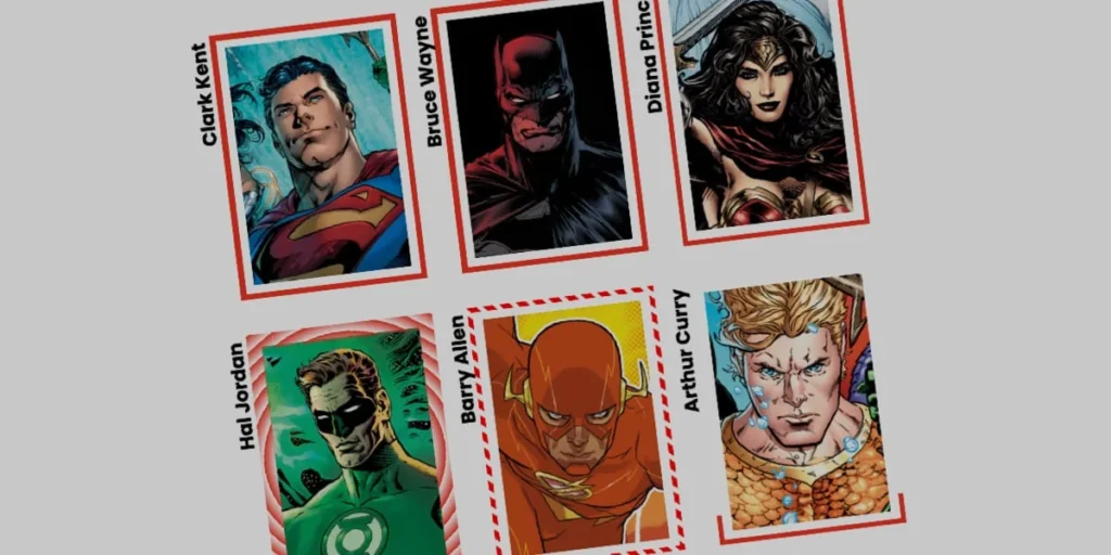
SAN FRANCISCO — In the ever-evolving landscape of front-end development, certain tools become foundational fixtures of the web design toolkit. Among them is the CSS border-image property—a mature, highly capable feature that has long served developers seeking to move beyond traditional, static borders like solid, dashed, or dotted lines. While web professionals have traditionally taken this property for granted, recent design discourse has sparked a renaissance in how developers approach border styling.
As demonstrated in recent explorations by industry veterans like Andy Clarke, who revisited the versatility of border-image, the property is far from obsolete. In fact, when combined with modern CSS capabilities, it serves as a gateway to extraordinary visual creativity.
Yet, static artistic borders are only the beginning. By bridging border-image with the robust animation capabilities of CSS Houdini custom properties, developers can construct fluid, dynamic user interfaces where borders actively draw themselves, shift in geometry, and react organically to user interactions. This deep dive examines the core mechanics, advanced implementation strategies, and broader implications of animating CSS border images.
Main Facts: The Intersection of border-image and CSS Houdini
The primary technical hurdle in animating gradients and border images has historically been the impossibility of direct interpolation. By default, browsers cannot smoothly transition (interpolate) between percentage-based stops in a gradient or shift complex layout properties dynamically because they lack a defined numerical path to animate along.
This limitation was effectively shattered with the widespread adoption of CSS Custom Properties and the CSS Properties and Values API (commonly referred to as CSS Houdini). By explicitly registering custom properties with a designated syntax, developers can instruct the browser to treat variables like <percentage>, <angle>, or <number> as animatable values.
Key technical components driving these animated border effects include:
border-image-source: Accepts images or gradients (such aslinear-gradientorconic-gradient) to render across an element’s bounding box.border-image-slice: Determines how an image is divided into regions, controlling how the source scales or repeats across the border segments.border-image-widthandborder-image-outset: Dictate the physical thickness of the border and push it away from the core element, respectively, preventing unwanted overlapping with internal content.@propertyAt-Rule: The backbone of the animation, allowing custom properties (such as--pfor percentage or--afor angle) to support smooth, hardware-accelerated transitions.
Chronology: The Evolution of Border Styling and Dynamic UIs
To understand the significance of animated border images, it helps to examine how border manipulation has evolved within the web standards timeline:
- The Early Web (Pre-CSS3): Borders were strictly structural and geometric. Developers relied on solid colors, basic styling attributes, or complex nested HTML tables with sliced PNG images to achieve custom visual frames.
- The Introduction of CSS3: The introduction of border-radius and the initial specification of
border-imageallowed developers to use raster images or basic gradients as borders without relying on bulky markup hacks. However, these implementations remained strictly static. - The Rise of CSS Preprocessors and Workarounds: As design trends shifted toward minimalism and glowing neon indicators, developers leaned heavily on pseudo-elements (
::beforeand::after), box-shadows, and complex clip-paths to simulate animated or gradient borders. While effective, these methods frequently bloated the DOM and complicated maintenance. - The Advent of CSS Houdini and Modern Custom Properties: With the standardization of the
@propertyrule, developers gained the ability to animate variables directly within the stylesheet. This breakthrough eliminated the need for JavaScript-heavy scroll or hover listeners for simple visual effects, bringing complex vector-like animations entirely into CSS.
Supporting Data: Architectural Implementation and Code Breakdown
Implementing an animated border image requires a methodical approach, pairing standard layout structures with precise variable registrations.
1. The Markup Foundation
The HTML footprint remains remarkably lean. For demonstration purposes, a standard container element housing localized content is all that is required:
<div class="card">
  <strong>Bruce Wayne</strong>
</div>
The primary visual asset—such as a background portrait—is applied directly via standard CSS background properties, separating the content layer from the dynamic styling layer.
2. Establishing Base Styles and Linear Gradients
To set up a linear gradient border that can later be manipulated, developers must define the longhand properties of border-image individually for granular control:
.card
  width: 150px;
  aspect-ratio: 0.69;
  position: relative;
  background: center/90% no-repeat;
  background-image: url("batman.jpg");

  /* Creates a linear gradient source */
  border-image-source: linear-gradient(-45deg, red 0%, transparent 0%);

  /* Controls how the gradient is carved */
  border-image-slice: 1;

  /* Sets the physical thickness and spacing of the border */
  border-image-width: 5px;
  border-image-outset: 5px;
By configuring both the red and transparent color stops to initiate at 0%, the browser immediately defaults to displaying the transparent layer across the bounding box, rendering the border invisible until triggered.
3. Animating via Registered Custom Properties
Because direct animation of gradient percentages is natively unsupported, developers must register a custom property to handle the transition state:
@property --p
  syntax: "<percentage>";
  initial-value: 0%;
  inherits: false;
This registered property is then integrated into the linear gradient source. When a user hovers over the element, the custom property updates from 0% to 100%, effectively drawing the border into existence:
.card
  border-image-source: linear-gradient(-45deg, red var(--p), transparent 0%);
  transition: --p 0.4s ease-in-out;

  &:hover
    --p: 100%;
4. Advanced Variations: Conic Gradients and Tiling
The creative potential scales exponentially when shifting from linear gradients to conic variants combined with tiling parameters. By using border-image-repeat: round, the browser automatically scales and repeats sliced regions without awkward clipping:
@property --n
  syntax: "<number>";
  initial-value: 1;
  inherits: false;


@property --a
  syntax: "<angle>";
  initial-value: 0deg;
  inherits: false;


.card
  border-image-source: conic-gradient(from var(--a), red var(--a), transparent 0%);
  border-image-width: 5px;
  border-image-slice: var(--n);
  border-image-repeat: round;
  transition-property: --n, --a;
  transition-duration: 0.6s;

  &:hover
    --n: 20;
    --a: 360deg;
Official Responses and Industry Perspectives
While the technical implementation is robust, web standards experts note both the immense power and the inherent limitations of relying on border-image for interactive design.
During discussions within the CSS working groups and community developer forums, design engineers have weighed border-image against alternative architectural patterns, such as CSS masking techniques championed by layout experts like Temani Afif.
- The Curvature Limitation: A primary critique of
border-imageis that it does not naturally conform to rounded corners (border-radius). When an element utilizes a border radius alongside a border image, the image renders straight along the box model’s outer edges rather than bending smoothly around the curved arc. For sharp-edged cards, dashboards, and geometric UI components, this limitation is entirely negligible. However, for pill-shaped buttons or circular avatars, alternative solutions like CSS masks or layered pseudo-elements remain necessary. - Efficiency and Performance: Advocates for
border-imageemphasize its superior efficiency. Because the browser handles the replication and slicing natively across all four borders automatically, developers write significantly less boilerplate code compared to multi-layered pseudo-element workarounds. Furthermore, hardware acceleration via registered custom properties ensures that frame rates remain consistently high, even during complex hover interactions.
Implications: The Future of Interactive Design Systems
The mastery of animated CSS border images carries profound implications for modern design systems and user experience (UX) engineering.
- Reduced Dependency on JavaScript: By shifting complex micro-interactions—such as loading states, glowing active cards, and self-drawing framing—entirely into native CSS, applications reduce their reliance on JavaScript animation libraries. This results in faster initial load times, smaller bundle sizes, and improved runtime performance on low-powered mobile devices.
- Enhanced Visual Hierarchy: Subtle, purposeful motion directs user attention precisely where it is needed. Dynamic borders can indicate focus states, signal active form validation, or elevate interactive dashboard cards upon cursor entry, contributing to a more intuitive and responsive digital environment.
- Design System Scalability: Because these effects rely on scalable custom properties, design system architects can easily expose configuration tokens (such as transition duration, angle speed, and color stops). This allows product teams to theme and deploy complex interactive components across enterprise applications with minimal code duplication.
As browser support for CSS Houdini and advanced property registration continues to solidify, techniques once reserved for experimental side projects are rapidly becoming production-grade standards. For front-end developers willing to experiment outside traditional boundaries, the animated border image stands out as a versatile, high-performance tool ready to elevate the next generation of web interfaces.








