
Mastering the Native HTML <dialog> Element: A Comprehensive Guide to Modern Web Modals
Nearly a decade after its initial introduction to the web ecosystem, the native HTML <dialog> element remains one of the most powerful yet nuanced building blocks in modern web architecture. While developers frequently implement it for alerts, pop-ups, and immersive modals, the subtle mechanics of its state management, accessibility requirements, backdrop styling, and entrance animations often require a quick trip to search engines.
This deep dive explores the mechanics of the native <dialog> element, covering everything from core markup and closing mechanisms to advanced CSS styling, scrolling behavior, state transitions, and its architectural relationship with the Popover API.
Main Facts: What is the Native <dialog> Element?
The HTML <dialog> element is a native web component designed to represent a dialog box or other interactive component, such as a dismissible alert, inspector, or sub-window. Before its native implementation, developers relied on complex third-party JavaScript libraries or heavily customized <div> structures prone to accessibility failures, focus-trapping bugs, and z-index wars.
Key characteristics of the native <dialog> element include:
- Built-in Accessibility: Native modals automatically trap keyboard focus within the dialog bounds and restore focus to the triggering element upon closure.
- Inert Backgrounds: When opened as a modal, the underlying page content is automatically rendered
inert, disabling all user interaction, text selection, and pointer events outside the dialog. - Top Layer Rendering: Modals sit on the browser’s top layer, ensuring they render above all other page content without requiring manual
z-indexmanipulation. - Declarative and Scripted Control: It supports both JavaScript-driven API methods (
show(),showModal(),close()) and emerging declarative HTML features.
Chronology: From Basic Markup to Modern Declarative Features
1. Basic Markup and Initialization
At its core, implementing a dialog requires a triggering mechanism and the dialog container itself:

<button id="dialog-button">Open Dialog</button>
<dialog id="dialog">...</dialog>
By default, the dialog is closed. While developers can technically add the open attribute directly in the HTML (<dialog id="dialog" open>), this is rarely useful outside of static templates. Instead, JavaScript handles dynamic invocation.
2. The Critical Difference: show() vs. showModal()
Developers must choose carefully between the two primary JavaScript opening methods:
show(): Treats the dialog as a standard pop-up rather than a true modal. It does not generate a backdrop, does not center itself automatically, and does not close via theEsckey. It also leaves the background content active and interactive.showModal(): Invokes a true modal experience. It automatically generates a backdrop, centers the element in the viewport, traps focus, makes background content inert, and listens for theEsckey to dismiss the dialog.
const dialogButton = document.querySelector('#dialog-button');
const formDialog = document.querySelector('#dialog');

dialogButton.addEventListener('click', () =>
  formDialog.showModal();
);
3. Closing Mechanisms
To close a dialog via user interface elements, developers can invoke the .close() method via JavaScript:
const formClose = document.querySelector('#dialog-close');

formClose.addEventListener('click', () =>
  formDialog.close();
);
Interestingly, while the browser provides showModal(), there is no explicit closeModal() method—the generic .close() method handles both modal and non-modal states seamlessly.
Alternatively, developers can use a completely JavaScript-less, declarative approach by nesting a form with method="dialog" inside the element:

<dialog id="dialog">
  <form method="dialog">
    <button type="submit">Close dialog</button>
  </form>
</dialog>
4. The Evolution of Invoker Commands
Looking toward the future of web standards, browser vendors are experimenting with invoker commands to open and close dialogs entirely declaratively through new HTML attributes (command and commandfor):
<button command="show-modal" commandfor="my-dialog">Show Dialog</button>

<dialog id="my-dialog">
  <button command="close" commandfor="my-dialog">Close Dialog</button>
</dialog>
Developers can also listen to these commands using JavaScript event listeners to execute side effects whenever a dialog is shown or hidden:
const dialogs = document.querySelectorAll("dialog");

dialogs.forEach(dialog =>
  dialog.addEventListener("command", event =>
    if (event.command == "show-modal")
      // Dialog was shown modally
     else if (event.command == "close")
      // Dialog was closed

  );
);
Supporting Data: Accessibility, Styling, and State Management
Button Labeling and Screen Readers
A common design pattern is utilizing an "X" or an SVG icon for close buttons. However, screen readers cannot interpret raw symbols reliably. To ensure accessibility while maintaining minimalist visual design, developers should visually hide descriptive text while hiding the decorative icon from assistive technologies:
<button id="form-button">Open Dialog</button>

<dialog id="form-dialog">
  <button id="form-close">
    <span class="visually-hidden">Close modal</span>
    <span aria-hidden="true">×</span>
  </button>
</dialog>
Styling the Backdrop
The default user-agent styling for the ::backdrop pseudo-element provides a subtle tinted background, which is often too faint for high-contrast interfaces. Developers can customize this layer using the ::backdrop selector:
dialog::backdrop
  background-color: rgba(0, 0, 0, 0.6);
  backdrop-filter: blur(4px);
Overriding User-Agent Styles
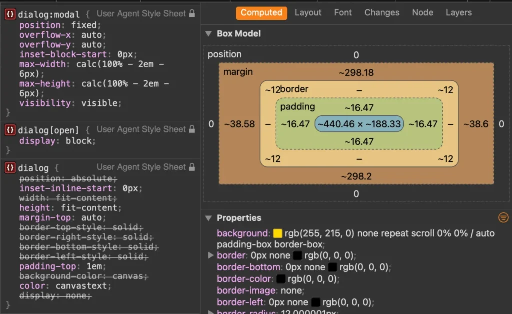
Browsers assign default styles to the <dialog> element, including a white background, a thick black border, and centering margins. Customizing these requires targeting the element in its [open] state or leveraging the higher-specificity :modal pseudo-class:

dialog
  border: 0;

  &[open]
    background-color: #fefefe;
    border-radius: 12px;
    box-shadow: 0 20px 25px -5px rgba(0, 0, 0, 0.1);
Additionally, to prevent layout shifts caused by disappearing scrollbars when a modal opens, apply scrollbar-gutter: stable;:
dialog
  &[open]
    scrollbar-gutter: stable;
Preventing Page Scrolling
By default, opening a modal does not lock the background page’s scroll position. While developers historically achieved this by toggling overflow: hidden; on the <body> via JavaScript using :has() selectors:
body:has(dialog[open])
  overflow: hidden;
Modern browser engines (such as Chrome 144+) allow the use of overscroll-behavior directly on the dialog and backdrop combined with hidden overflow:
dialog
  overflow: hidden;
  overscroll-behavior: contain;

  &::backdrop
    overscroll-behavior: contain;
Official Responses & Industry Standards: Dialog vs. Popover
As the web platform expands, developers frequently debate whether to use the Dialog API or the Popover API. According to accessibility audits and web standards research compiled by engineers like Zell Liew, the two APIs serve fundamentally different use cases despite their similar visual presentation.
The Accessibility Divide
- Popovers lack innate accessibility affordances. They do not automatically trap keyboard focus, nor do they make background content
inert. Developers implementing popovers must manually manage focus states, keyboard navigation, and screen reader announcements. Furthermore, popovers require explicit, developer-assigned accessible roles. - Dialogs handle focus management, inert background subtrees, top-layer rendering, and
Esc-key dismissal natively out of the box.
The Golden Rule: Use a <dialog> when building interactive experiences that require user attention and focus restriction (such as confirmation prompts, forms, and critical alerts). Use the Popover API for lightweight, non-modal UI components like tooltips, dropdown menus, and floating preference panels that allow users to interact freely with the rest of the page.

Implications: Animating Entrances and Exits
Adding smooth entry and exit animations to dialogs requires overcoming browser rendering quirks because elements are assigned display: none when closed. Simply applying a transition to the opacity will fail unless developers explicitly define a starting style using the @starting-style at-rule:
@starting-style
  dialog:open
    opacity: 0;
    transform: scale(0.95);


dialog
  opacity: 0;
  transform: scale(0.95);
  transition: opacity 0.3s ease, transform 0.3s ease;
  overflow: hidden;
  overscroll-behavior: contain;

  &[open]
    opacity: 1;
    transform: scale(1);
While the View Transitions API is popular for page navigation, modal dialogs residing in the top layer make poor candidates for full view transitions due to unreliable old/new state pairings upon closure. Sticking to standard CSS transitions and @starting-style rules yields the most robust, predictable animation results across modern browser engines.
Conclusion
The native HTML <dialog> element has matured into a robust, accessible, and highly flexible cornerstone of modern web design. By understanding its underlying state mechanics, leveraging modern CSS features like :has(), ::backdrop, and @starting-style, and choosing the correct API for modal versus popover workflows, developers can build faster, more maintainable, and universally accessible web applications.








