
The Evolution of Motion: Mastering Scroll-Driven Animations in Modern Web Design
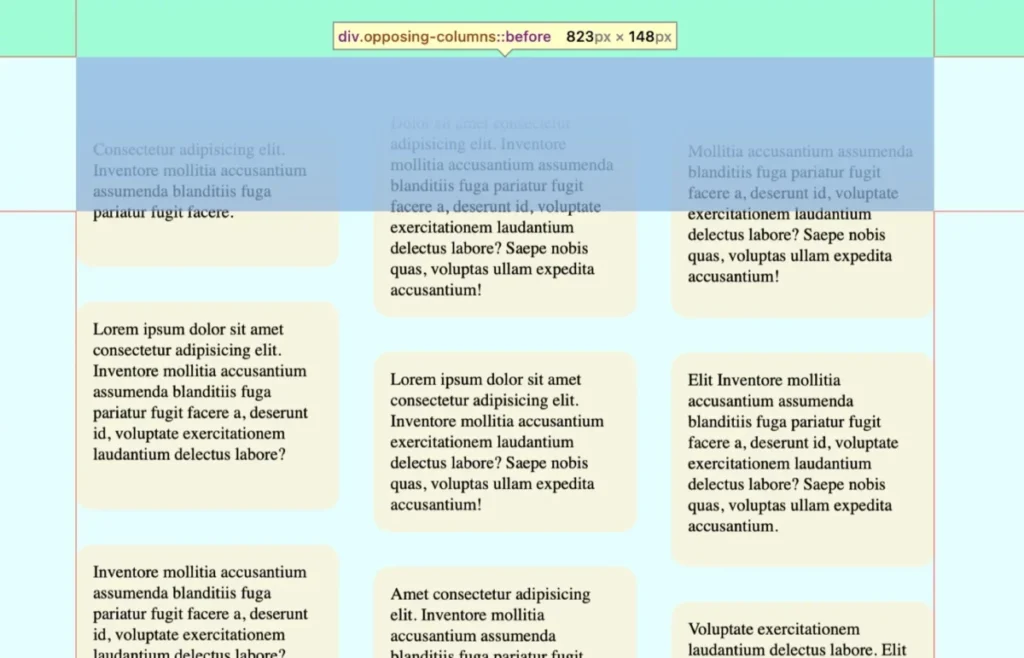
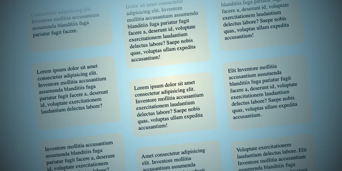
In the fast-paced world of front-end development, the line between static content and interactive storytelling continues to blur. Designers are constantly searching for subtle, performant ways to breathe life into interfaces without compromising accessibility or page performance. One of the most compelling developments in this space is the "opposing column" scroll effect—a sophisticated visual technique where columns of content slide in conflicting vertical directions as a user navigates down a page.
While such an effect might once have required heavy JavaScript libraries, complex scroll listeners, or taxing main-thread calculations, the arrival of Scroll-Driven Animations (SDA) in CSS has revolutionized the approach. This article explores the technical mechanics, the implementation strategy, and the broader implications of using modern browser primitives to create fluid, high-performance motion on the web.
Main Facts: The Mechanics of Scroll-Driven Motion
The core concept behind opposing scrolling columns is deceptively simple: synchronize the movement of UI elements directly to the user’s scroll position. By tethering an animation’s progress to the scroll container rather than a time-based duration, developers can create a seamless, reactive experience that feels physically connected to the user’s input.
Key technical pillars of this implementation include:
animation-timeline: The primary property that dictates how an animation progresses, shifting it from a temporal state to a scroll-based state.view(): A function that tracks an element’s visibility within the scrollport, allowing for precise control over when an animation begins and ends based on the element’s position on the screen.- CSS Masking: Utilizing pseudo-elements (
::beforeand::after) combined with linear gradients to create a "fading" effect, providing the illusion that items are materializing and disappearing into the page background.
By offloading this logic to the browser’s rendering engine, the effect remains hardware-accelerated, ensuring that the movement remains fluid even on lower-end devices.
Chronology: From JavaScript Hacks to Native CSS
For years, implementing scroll-linked animations was a significant technical hurdle. In the early 2010s, developers relied on window.onscroll listeners. This approach, while effective in theory, was notoriously performance-heavy. Because scroll events fire at an extremely high frequency, they often triggered layout thrashing and forced browser repaints, leading to "janky" scrolling and significant battery drain.
The Rise of Intersection Observer
The introduction of the IntersectionObserver API improved matters by allowing developers to detect when elements entered the viewport without manual event listeners. However, this still required a JavaScript-centric approach. The animation state was still being managed by scripts, which meant it was susceptible to being blocked by long-running main-thread tasks.
The Era of Native Scroll-Driven Animations
The current phase, defined by the CSS Scroll-Driven Animations specification, represents the "final form" of this technique. By moving the animation state into the CSS layer, browsers can now optimize the rendering of these animations in the compositor thread. This separates the animation logic from the main thread, resulting in consistent, buttery-smooth animations that don’t stutter, even when the rest of the site is busy loading data or processing scripts.
Supporting Data: Implementation Strategy
To achieve the opposing column effect, the structure must be rigid enough to support the layout but flexible enough to animate.
1. The Markup Foundation
The HTML is intentionally minimalist. By wrapping items in a parent container (.opposing-columns), we establish a clear relationship between the parent scroll area and the moving child elements.
<div class="opposing-columns">
  <div class="opposing-column">
    <div class="opposing-item">...</div>
  </div>
  <!-- Additional columns follow the same structure -->
</div>
2. Styling the Masking Effect
The "disappearing" effect is achieved through CSS gradients applied to pseudo-elements. By placing these elements at the top and bottom of the container with a higher z-index, we create a visual buffer zone. Using a background-color variable that matches the body background ensures that items fade into the void seamlessly.
3. Defining the Animation Ranges
The power of animation-range cannot be overstated. By setting animation-range: entry 0% cover 100%, we instruct the browser to map the animation progress exactly to the moment the column enters the scrollport and finishes when it is fully obscured. This creates a linear, predictable movement that feels native to the page flow.
Official Responses and Accessibility Standards
A primary concern with high-motion design is accessibility. According to the W3C Web Content Accessibility Guidelines (WCAG), content that moves, blinks, or scrolls automatically must provide users with a way to stop, pause, or hide that content.
The implementation outlined here adheres to these standards by utilizing the prefers-reduced-motion media query. Developers should always include a fallback:

@media (prefers-reduced-motion: reduce)
  .opposing-column
    animation: unset;
    &::before, &::after  content: unset;
By explicitly disabling the animations for users who have requested reduced motion, the design remains inclusive, ensuring that the visual flair does not cause discomfort or distraction for users with vestibular disorders.
Implications: The Future of Web Storytelling
The shift toward native scroll-driven animations has profound implications for the web design industry.
Enhanced Performance and Energy Efficiency
By minimizing the use of JavaScript for animation state management, sites can achieve significantly better performance scores. This is not merely a stylistic improvement; it is a sustainability imperative. Efficient code consumes less CPU, which directly correlates to lower energy consumption on mobile devices.
Democratization of Advanced Design
Historically, high-end, motion-heavy websites were the domain of specialized creative agencies with the budget for complex custom JavaScript engines. With native CSS implementations, these sophisticated interaction patterns are now accessible to individual developers and small teams. This lowers the barrier to entry for high-quality, narrative-driven web design.
Progressive Enhancement and Browser Support
While Chrome and Safari have led the charge in supporting these features, Firefox support remains in the pipeline. The use of @supports (animation-timeline: view()) is a vital practice for developers. It allows for "feature-gating," where the enhanced experience is provided to supporting browsers, while a simplified, static, or naturally flowing layout is provided as a fallback.
The Shift in Designer-Developer Collaboration
Finally, this technology changes the conversation between designers and developers. Instead of designers handing over complex video mockups that are impossible to replicate, they can now collaborate on "animation tokens"—specific timing functions, ranges, and easing values that translate directly into the code. The result is a tighter feedback loop and a final product that matches the creative vision with pixel-perfect precision.
Conclusion
The opposing column scroll effect is more than just a passing design trend; it is a testament to the maturation of the CSS language. By moving from "simulating" motion to "native" motion, we have entered an era where the browser is a canvas that responds naturally to the user’s movement. As support for these features grows, we can expect to see a new generation of websites that feel less like documents and more like immersive, living digital experiences. Whether you are building a product portfolio or a high-end marketing site, mastering these scroll-driven primitives is an essential step in modernizing your design toolkit.








