
The Future of Web Interactivity: Mastering Scroll-Driven Animations
In the rapidly evolving landscape of front-end development, the line between static web design and cinematic user experience is blurring. For years, designers relied on heavy JavaScript libraries—like GSAP or ScrollMagic—to achieve smooth, scroll-triggered visual effects. Today, however, a shift is occurring. Modern CSS is empowering developers to build complex, performant, and responsive animations natively.
One such technique, which has gained significant traction among UI/UX professionals, involves the creation of "opposing columns"—a layout where multiple vertical stacks of content move in different directions as the user scrolls the page. This article explores the technical architecture, the implementation strategy, and the broader implications of this design trend.
The Genesis of the Concept: Why Motion Matters
The "opposing columns" concept was born out of a desire to break the monotony of the traditional, linear vertical scroll. By forcing content columns to move in opposite directions—some upward, some downward—designers can create a sense of depth and layered navigation that keeps users engaged.
Initially, many designers dismissed the idea as overly complex or performance-heavy. However, the introduction of the CSS animation-timeline property has turned this "silly idea" into a robust, accessible design pattern. By tying animation progress directly to the browser’s scroll port, developers can create organic movements that feel physically anchored to the user’s interaction with the page.
Technical Chronology: Building the Effect
To achieve this effect, developers must navigate a precise sequence of implementation steps. The architecture relies on three distinct layers: the markup structure, the masking illusion, and the scroll-linked animation engine.
Phase 1: Structuring the DOM
The foundation is deceptively simple. Using a parent container (.opposing-columns) as a flexbox-based wrapper, developers house multiple child columns. Each column, in turn, contains the specific items—images, logos, or text blocks—that will be animated. Keeping the markup clean is essential for accessibility and maintainability, ensuring that screen readers and search engines interpret the content correctly regardless of the visual motion.
Phase 2: The Masking Illusion
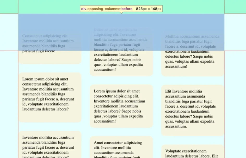
The secret to the "disappearing" items as they move past the container boundaries is not opacity, but CSS masking. By utilizing before and after pseudo-elements on the parent container, developers can create a "fade-out" zone.
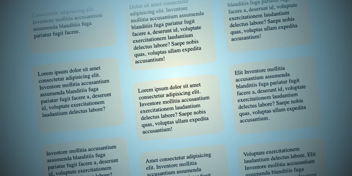
By applying a linear gradient that transitions from the page’s background color to transparent, items appear to sink behind a layer of "invisibility" as they exit the viewport. This creates a polished, professional finish that feels far more natural than a sudden cut-off at the edge of a container.
Phase 3: Implementing Scroll-Driven Animations
The core of the technology lies in the view() function within the animation-timeline property. Unlike traditional animations that run on a temporal clock, view() tracks an element’s entry and exit from the scroll port.
By setting animation-range: entry 0% cover 100%, developers can dictate exactly when the motion begins and ends. This ensures that the animation is perfectly synced with the user’s scrolling speed, providing a tactile, responsive experience.
Supporting Data and Technical Nuances
To maintain performance and accessibility, several key considerations must be integrated into the CSS:
- Responsive Scaling: The layout is restricted to larger screens (
width >= 50rem) to prevent clutter on mobile devices, where vertical space is at a premium. - Performance Optimization: By leveraging GPU-accelerated transforms (
translateY), the animation avoids layout reflows, ensuring a smooth 60fps experience even on mid-range devices. - Variable Management: Using CSS variables for masks and animation names allows for rapid iteration and global style updates. For instance, creating a variable like
--opposing-maskensures that the gradient fade and the container spacing remain perfectly aligned.
Addressing Accessibility
A critical pillar of modern web development is the prefers-reduced-motion media query. The implementation discussed here includes a failsafe: if a user has indicated a preference for reduced motion at the system level, the animation and masks are disabled entirely. This ensures that the design does not cause discomfort to users with vestibular disorders while maintaining the site’s overall functionality.
Official Perspectives and Browser Compatibility
As of the current writing, the support for scroll-driven animations is a "living" standard. Chromium-based browsers (Chrome, Edge, Opera) and Safari have led the charge in implementing these features. However, Firefox support remains in development.
Industry experts recommend using the @supports (animation-timeline: view()) rule. This allows developers to serve a "progressive enhancement" model:
- For supporting browsers: The full, immersive, scroll-driven experience is enabled.
- For non-supporting browsers: A fallback experience—such as a static grid or a simple CSS animation that runs on a standard time loop—is triggered.
This approach ensures that no user is left with a broken layout, even if their browser has yet to adopt the latest W3C specifications.
Implications for Web Design
The rise of scroll-driven animations signals a broader shift in the digital agency world. We are moving away from "page-flipping" interactions toward a "scrolling-as-exploration" paradigm.

1. Enhanced User Engagement
By creating a "living" page, designers can guide the user’s eye more effectively. Opposing columns create a sense of curiosity, encouraging the user to continue scrolling to see what comes next, thereby increasing dwell time on the page.
2. Reduced JavaScript Dependency
The most profound implication is the reduction of the "JavaScript tax." For years, complex animations were a primary cause of performance bottlenecks. By moving this logic into the browser’s rendering engine via CSS, we are creating faster, lighter, and more secure web applications.
3. Future-Proofing
As the Web Components standard and CSS Houdini continue to mature, techniques like this will become the baseline for web design. Developers who adopt these methods today are positioning themselves at the forefront of a new era of native, high-performance web interactivity.
Conclusion: The Path Forward
The "opposing columns" effect is more than just a stylistic choice; it is a testament to the power of modern CSS. It demonstrates that with enough creativity and a firm grasp of the latest browser APIs, we can achieve high-fidelity experiences that were once the domain of specialized animation software.
The challenge now shifts from can we do it? to how should we use it? Designers must be careful to use these effects to enhance—not distract from—the core content of their websites. When used thoughtfully, scroll-driven animations can transform a standard marketing page into a narrative journey.
As you experiment with these techniques, consider how the interplay of motion and scroll can tell your brand’s story more effectively. Whether you are building a product showcase or a portfolio site, the tools for immersive design are now at your fingertips—quite literally. What will you build next?








