
Web Animation Evolution: Chrome 146 Introduces Scroll-Triggered Animations
The landscape of front-end web development is undergoing a significant transformation. With the official release of Chrome 146, Google has introduced a long-anticipated feature: native scroll-triggered animations. This addition marks the first time a browser has implemented a standard way to trigger CSS animations based on an element’s entry into the viewport, effectively bringing the functionality of JavaScript’s Intersection Observer API directly into the CSS engine.
For years, developers have relied on heavy JavaScript libraries—such as AOS (Animate On Scroll) or ScrollMagic—to handle the simple task of firing an animation when a user scrolls to a specific part of a page. Chrome 146 changes the calculus, offering a declarative, high-performance alternative that simplifies the developer experience while enhancing browser-level optimization.
The Chronology of Modern CSS Animation
The progression toward this moment has been steady. Historically, CSS animations were "fire and forget"—they began the moment an element was rendered or a class was toggled.
- The Era of JavaScript Dependency: Developers used
scrollevent listeners to calculate element positions, often leading to "jank" and performance bottlenecks due to excessive reflows and repaints. - Intersection Observer (2016): The introduction of the Intersection Observer API allowed developers to detect when an element entered the viewport efficiently. However, it still required significant boilerplate code.
- Scroll-Driven Animations (2023/2024): CSS introduced
animation-timeline: scroll(), which allowed animations to progress in lockstep with the scrollbar. While powerful, this meant the animation had no fixed duration; it was tied to the user’s scroll speed. - Scroll-Triggered Animations (2026): Chrome 146 finalizes the stack by allowing an animation to have a fixed duration, triggered only when a specific scroll threshold is crossed.
Understanding the Mechanics: Triggers vs. Timelines
It is vital to distinguish between scroll-driven and scroll-triggered animations, as they solve different UX challenges.
In scroll-driven animations, the animation state is mapped to the scroll position. If you scroll slowly, the animation crawls; if you scroll fast, it zooms. It has no internal clock. Conversely, scroll-triggered animations function like a traditional CSS animation—once the trigger condition is met, the animation runs to completion based on its defined duration (e.g., 300ms).
The Syntax of Activation
The magic lies in the timeline-trigger property. By utilizing timeline-trigger: --trigger view() entry 100% exit 0%;, developers can define precisely when an element should react.
entry 100%: The animation begins when the bottom edge of the element fully enters the scrollport.exit 0%: The animation ceases or untriggers when the top edge leaves the scrollport.
By pairing this with animation-trigger: --trigger play-forwards;, the browser creates a bridge between the document’s scroll state and the CSS animation engine.
Supporting Data and Technical Nuances
The implementation of these animations relies on a sophisticated system of "animation actions" and "fill modes." A common pitfall for early adopters is the "flash" effect—where an animation plays, but the element reverts to its original state because animation-fill-mode was not properly configured.
The "Lock-in" vs. "Back-and-Forth" Methods
To ensure a polished user experience, developers have two primary strategies:
- The Lock-in Method: By using
animation-trigger: --trigger play-once;alongsideforwardsas a fill mode, the element animates only the first time it hits the threshold and remains in that state permanently. This is ideal for reveal-on-scroll effects. - The Back-and-Forth Method: By declaring
play-forwards play-backwards, the animation becomes reversible. If the user scrolls back up, the animation plays in reverse, creating a seamless, fluid interaction that feels reactive to the user’s presence rather than a static event.
Advanced Staggering with sibling-count()
One of the most impressive capabilities of this new system is the ability to handle complex, staggered layouts without manually writing delays for every child element. By utilizing sibling-count() and sibling-index(), developers can dynamically calculate the delay:
--stagger-interval: calc(300ms / sibling-count());
--animation-delay: calc(sibling-index() * var(--stagger-interval));
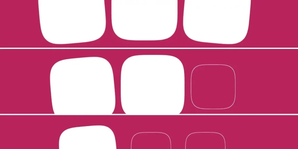
This ensures that in a grid of squares, each one animates in sequence, creating a professional "waterfall" effect with minimal code.
Official Responses and Industry Outlook
The web development community, particularly those active in the W3C CSS Working Group, has lauded the move toward declarative triggers. However, there is a lingering sentiment of caution.
"The power here is undeniable," says one lead browser engineer. "By offloading these calculations from the main JavaScript thread to the browser’s compositor, we are essentially making the ‘animate-on-scroll’ pattern free in terms of performance cost. However, the complexity of the API is non-trivial."
Critics point out that the learning curve for "timeline ranges" and "dashed idents" is steep. For a junior developer, understanding the difference between entry, exit, and contain ranges requires a shift in mental modeling that may take time to permeate the industry.
Implications for Web Design
The implications for UI/UX design are profound. We are moving toward a web that feels more "alive." Because these animations are now native, we can expect:
- Lower Battery Consumption: By eliminating the need for
scrollevent listeners, mobile devices will consume significantly less power when browsing image-heavy, animation-rich sites. - Design System Standardization: Large organizations can now bake these animations into their design systems. Instead of distributing a custom JavaScript animation package, companies can simply distribute a CSS stylesheet, ensuring consistency across all browsers as they implement the specification.
- Reduced Bloat: The shift away from massive animation libraries like GreenSock (for simple reveals) will result in smaller bundle sizes and faster Time to Interactive (TTI) metrics.
Final Thoughts on the Future
While Chrome 146 is a landmark release, the ecosystem is still in its infancy. As with many new CSS features, the true test will be cross-browser support. As Firefox and Safari move toward implementing the Animation Triggers specification, we will likely see these patterns become the industry standard.
For now, the advice to developers is clear: experiment with the play-forwards and play-backwards actions, learn to love the view() function, and prepare for a future where the web is more performant and reactive than ever before. While the syntax may feel complex today, it is a small price to pay for the elimination of one of the web’s most persistent performance bottlenecks.








