
The Evolution of Motion: Mastering Scroll-Driven Animations in Modern Web Design
In the fast-evolving landscape of web development, the boundary between static content and interactive storytelling continues to blur. Designers and developers are increasingly tasked with creating immersive experiences that feel reactive to user behavior. One of the most compelling frontiers in this space is the implementation of scroll-driven animations—a technique that transforms the act of scrolling from a passive navigation task into a narrative-driven event.
Recently, a sophisticated design concept has emerged, featuring columns of content moving in opposing directions, synchronized with the user’s scroll position. This article explores the technical orchestration behind this effect, detailing how modern CSS features can achieve high-fidelity motion without the need for heavy JavaScript libraries.
Main Facts: The Intersection of Scroll and State
At its core, the "opposing columns" effect is a masterclass in CSS layout and timing. By leveraging modern browser APIs, developers can now link animation playback directly to the vertical scroll progress of an element within the viewport.
The primary components of this architecture include:
- A Parent Container: A flexbox-based wrapper that acts as the anchor for the animation.
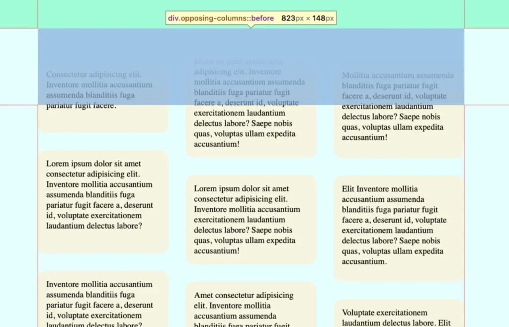
- CSS Pseudo-elements: Used strategically to create a "masking" effect, giving the illusion that content items are fading into existence or vanishing as they cross the viewport boundaries.
- Scroll-Driven Timelines: The technical backbone, specifically the
view()function, which allows the browser to track an element’s entry and exit from the scrollport.
The result is a fluid, synchronized movement where outer columns might rise while a central column descends, creating a mesmerizing parallax-like effect that feels organic and responsive.
Chronology: Building the Effect Layer by Layer
To replicate this effect, one must follow a structured development path, prioritizing layout stability before introducing complex motion.
Phase 1: Structural Foundations
The markup is intentionally lightweight. A parent container (.opposing-columns) houses three child columns, each populated by a series of items. This semantic simplicity is essential for performance; by keeping the DOM tree shallow, we ensure that browser rendering engines can focus on the intensive task of recalculating positions during scroll events.
Phase 2: The Masking Illusion
A critical challenge in this design is ensuring content doesn’t simply "cut off" at the edge of the container. Instead, we want a graceful exit. By applying background-color variables to the document and utilizing :before and :after pseudo-elements on the parent container, we create "masking zones."
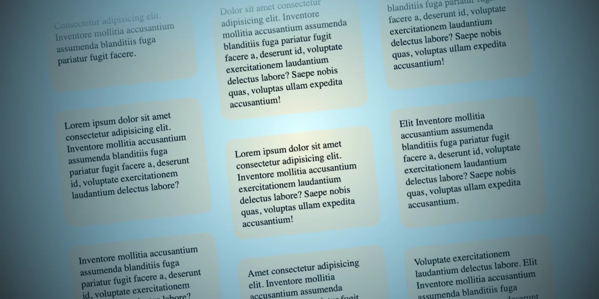
By applying linear-gradient patterns to these pseudo-elements, the items effectively slide underneath a gradient that matches the document’s background. This creates a soft fade-in/fade-out effect at the top and bottom of the container, hiding the precise moment the elements leave the visible frame.
Phase 3: Defining the Motion
The animation logic relies on three distinct @keyframes. By creating subtle offsets in the translation values for each column, the design achieves a layered depth.
- Column 1: Translates upward.
- Column 2: Translates downward.
- Column 3: Translates upward with a modified velocity, creating a staggered, non-uniform rhythm.
Supporting Data and Browser Compatibility
While the implementation is remarkably efficient, developers must acknowledge the current state of the web ecosystem. As of mid-2026, the animation-timeline property and the view() function have strong support in Chromium-based browsers (Chrome, Edge, Opera) and Safari.
However, Firefox support remains a work in progress. For production environments, it is best practice to wrap these features in an @supports block. This allows developers to serve a static, accessible version of the content to non-supporting browsers while delivering the "enhanced" experience to users with modern browsers.
Key Performance Metrics:
- Reduced Motion: Ethical design requires respecting user preferences. The implementation includes a
prefers-reduced-motion: reducemedia query, which strips the animations and masks entirely for users who have indicated a preference for limited motion, ensuring inclusivity. - Memory Footprint: Because these animations are handled via the browser’s native compositor thread, they consume significantly fewer system resources than scroll-triggered JavaScript animations, which often suffer from "main thread jank."
Official Responses and Industry Standards
The rise of the W3C’s Scroll-driven Animations specification has been welcomed by the developer community as a long-awaited native solution to a historically "hacked" problem. Previously, developers relied on libraries like GSAP or ScrollMagic to calculate scroll positions via JavaScript, which often led to performance bottlenecks.
By standardizing these behaviors in CSS, the industry is moving toward a more sustainable model where animation is a first-class citizen of the browser’s engine. Leaders in the design space suggest that this shift will lead to more complex storytelling on the web, as the barrier to entry for high-end motion design continues to drop.
Implications for Future Web Design
The implications of this technology are profound. As we look toward the next generation of web interfaces, the "opposing columns" technique serves as a blueprint for several emerging trends:

1. The Death of "Heavy" JavaScript
As more animation logic moves into the CSS layer, the need for large JavaScript bundles decreases. This leads to faster page load times, better Core Web Vitals, and a more seamless experience on low-powered mobile devices.
2. Narrative-First Design
Scroll-driven animations allow for a "linear narrative" where the user dictates the pacing of the visual story. This is particularly effective for marketing landing pages, data visualizations, and digital magazines, where guiding the user through a specific sequence of information is paramount.
3. Accessibility as a Design Constraint
The ease with which we can now implement @media (prefers-reduced-motion) means that accessibility is no longer an afterthought. It is becoming an integral part of the development cycle. Future iterations of the spec will likely provide even more granular control over how animations react to different input devices, further refining the balance between aesthetic flair and user comfort.
4. Browser-Native Interoperability
With the standardization of animation-timeline, we are seeing a convergence in how different browsers handle scroll-linked effects. This reduces the fragmentation that has plagued web development for decades, allowing designers to focus on creativity rather than troubleshooting cross-browser compatibility for basic motion.
Conclusion
The "opposing columns" concept is more than just a visually appealing design trend; it is a demonstration of the power of modern web standards. By offloading complex animations to the browser’s compositor thread and utilizing native CSS syntax, developers can build experiences that are both performant and deeply engaging.
As browser support continues to solidify, we can expect to see these techniques become a standard component of the web designer’s toolkit. Whether you are building a personal portfolio, a corporate landing page, or a complex data dashboard, the ability to weave motion into the fabric of the scroll is an essential skill for the modern web professional.
How will you integrate these principles into your next project? The canvas of the web is constantly expanding—now, it’s just a matter of how you choose to make it move.








