
Mastering Depth: A Comprehensive Guide to CSS translateZ()
In the evolving landscape of web design, the transition from flat, two-dimensional interfaces to immersive, three-dimensional experiences has been marked by the sophisticated use of the CSS Transform Module. Among the most potent tools in a front-end developer’s arsenal is the translateZ() function. While it may appear deceptively simple, it serves as the cornerstone for creating depth, managing 3D spatial relationships, and even optimizing high-performance hardware acceleration.
Main Facts: Defining translateZ()
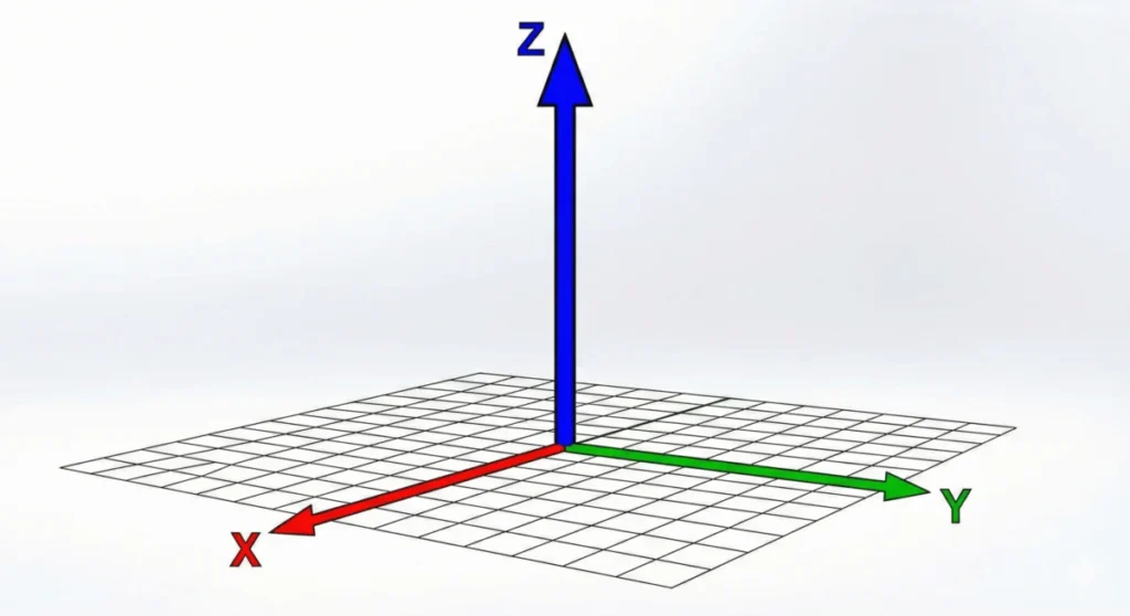
At its core, translateZ() is a CSS function used within the transform property to reposition an element along the Z-axis—the imaginary line that runs perpendicular to the screen, extending from the background toward the viewer.
When you apply a positive value (e.g., translateZ(100px)), the element moves closer to the user’s viewport. Conversely, a negative value pushes the element further away, deeper into the virtual background. It is critical to understand that translateZ() is not a scaling tool. When an element moves along the Z-axis, it may appear to grow or shrink, but this is a byproduct of the perspective projection—a visual illusion of proximity rather than a modification of the element’s actual dimensions or resolution.
To utilize this function effectively, the browser requires a "perspective" context. Without defining a perspective property on a parent container or a perspective() function on the element itself, the browser remains in a 2D rendering mode, rendering any Z-axis movement invisible to the user.
Chronology: The Evolution of 3D in CSS
The journey of translateZ() is inextricably linked to the broader history of the CSS Transform Module.
- The Early Web (Pre-2010): Web design was primarily static. The
transformproperty existed only in its infancy, mostly relegated to 2D rotation and skewing. Depth was simulated purely through CSS box-shadows or background image gradients. - The Introduction of 3D Transforms (2012): As hardware capabilities grew, the W3C introduced the CSS Transforms Module Level 3 (now part of Level 2 specifications). This era introduced the
perspectiveproperty, allowing developers to break the "flat" ceiling of the browser. - The Hardware Acceleration Boom (2015–2018): Developers began to realize that triggering a 3D transform—even a zero-pixel one like
translateZ(0)—forced the browser to promote an element to its own "compositor layer." This discovery shiftedtranslateZ()from a purely visual tool to a vital performance optimization technique, as it offloaded rendering tasks from the CPU to the GPU. - The Modern Era (2020–Present): With the standardization of the CSS Transform Module Level 2,
translateZ()has become a standard, highly supported feature in every modern browser, serving as the bedrock for parallax effects, 3D card flips, and complex spatial UI design.
Supporting Data: The Mechanics of Perspective
To understand why translateZ() requires the perspective property, one must visualize the "Camera" metaphor used by browsers.

The Perspective Property vs. The Function
The perspective property is applied to the parent of the 3D-transformed elements. It establishes a "vanishing point" for the entire scene, dictating the intensity of the depth effect. For example, a perspective of 500px creates a dramatic, fish-eye-like distortion when an element is moved, whereas 2000px creates a subtle, more natural depth.
The perspective() function, however, is a localized transform. It applies only to the specific element it is declared upon. A common pitfall for developers is the order of operations: transform: translateZ(100px) perspective(500px) will fail to produce the desired effect because the transform functions are applied from left to right. The perspective must be established before the translation: transform: perspective(500px) translateZ(100px).
Managing 3D Spaces with transform-style
When dealing with nested elements, the transform-style: preserve-3d property becomes essential. By default, child elements are flattened into the 2D plane of their parent. Setting preserve-3d allows the children to exist within the same 3D coordinate system as the parent, enabling complex, multi-layered animations that retain their relative spatial positioning.
Official Responses and Standards
The W3C, through the CSS Working Group, continues to maintain the CSS Transform Module Level 2 as the authoritative source for these functions. The specification defines translateZ() as a <length> type, accepting units such as px, em, rem, or vw.
According to the official spec, the browser calculates the "projection" of the element based on the distance between the user’s virtual "eye" (the viewer) and the Z-plane. This mathematical model ensures that as elements move closer via translateZ(), the browser correctly calculates the focal length, resulting in the characteristic "growth" of the element. The W3C emphasizes that this behavior is distinct from scale(), which modifies the coordinate space itself, whereas translateZ() modifies the position within that space.
Implications for Modern Web Development
The utility of translateZ() extends far beyond simple aesthetics. Its implications for the modern web are profound, particularly in two key areas:

1. Performance Optimization
One of the most widely used "hacks" in the industry is the application of will-change: transform or transform: translateZ(0) to elements that are subject to frequent animation. By doing so, the developer signals to the browser that this element is likely to change. The browser then promotes this element to a hardware-accelerated compositor layer. This move effectively prevents "layout thrashing" and stuttering, as the GPU handles the movement rather than the main thread, resulting in butter-smooth 60fps animations.
2. Immersive UI/UX Design
In contemporary UI, translateZ() is the engine behind "depth-of-field" effects. Designers use it to create card interfaces that appear to "pop out" of the screen when hovered over. By combining translateZ() with a subtle transition, developers can create a tactile experience that mimics physical objects. This enhances user engagement, providing visual feedback that an object is interactive, simply by changing its perceived distance from the user.
3. Managing Visual Complexity
As web applications grow in complexity, managing the "z-index" can become a nightmare of overlapping contexts. While z-index manages the stacking order (what is on top of what), translateZ() manages the physical spatial distance. This allows developers to create complex 3D scenes—such as a carousel that spins in 3D space—where elements can move behind or in front of one another based on their actual Z-coordinate, rather than relying solely on the rigid stacking context of CSS.
Conclusion: A Tool of Infinite Potential
The translateZ() function is a testament to the maturation of CSS as a layout and animation engine. It bridges the gap between the flat, document-based origins of the web and the interactive, high-fidelity applications of today.
Whether you are implementing a high-performance animation to reduce CPU load or crafting an immersive, 3D-oriented user interface, mastering the Z-axis is no longer optional for the serious front-end engineer. By understanding the underlying physics of perspective, the distinction between scaling and translation, and the critical role of hardware acceleration, developers can move beyond the screen’s glass surface to create truly three-dimensional web experiences. As we look toward the future of web standards, the continued refinement of 3D transforms suggests that the browser will only become a more capable engine for spatial storytelling.








