Rethinking the Dark Mode Toggle: Why Web Design’s Tri-State Clutter Is Getting Reconsidered
In the ever-evolving landscape of web development and User Interface (UI) and User Experience (UX) design, few debates generate quite as much granular passion as the humble dark mode toggle. For years, the standard convention for websites offering a choice between light and dark aesthetics has settled into a predictable pattern: a tri-state control presenting users with options for "Light," "Dark," and "System."
However, a recent critique spearheaded by prominent web standards advocate and developer Lea Verou is challenging this status quo. Verou argues that the ubiquitous three-state widget is frequently an unnecessary piece of cognitive clutter. Instead, she advocates for a streamlined, intelligent two-state approach—or, in many cases, dispensing with persistent UI toggles entirely in favor of native system defaults.
This discussion has quickly expanded across the developer community, sparking deep conversations about interface minimalism, user intent, browser-level controls, and the psychological impact of digital design choices.
Main Facts: Stripping Away the Excess
At the core of the debate is a fundamental question of interface efficiency: Why force users to manually select a "System" preference when a well-designed, two-state control can seamlessly handle all three necessary scenarios?
According to Verou’s framework, the mechanics of modern color-scheme management can be drastically simplified:
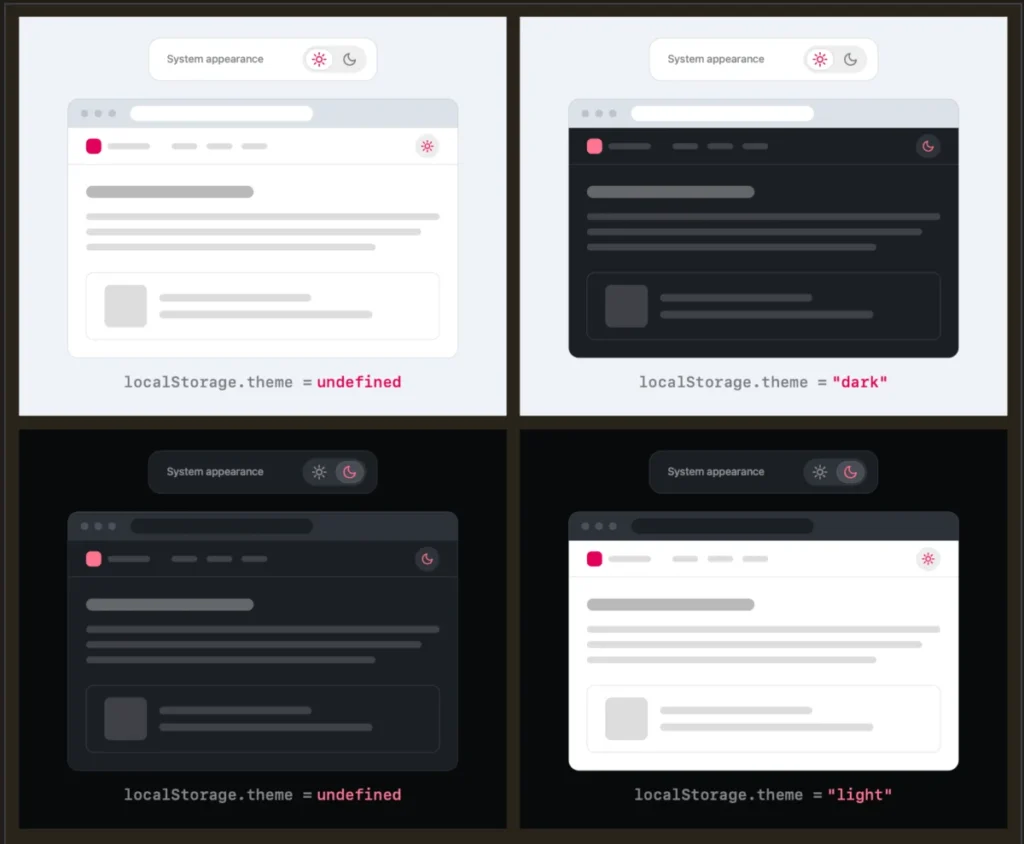
- No User Preference: The website gracefully falls back to the visitor’s underlying operating system or browser settings.
- User Override: If a user explicitly wants to force a specific mode (e.g., choosing light mode while their OS is set to dark, or vice versa), a single click on a two-state toggle applies that override.
- Persistence: That preference is stored locally—typically using browser mechanisms like
localStorage—so that future sessions remember the user’s explicit choice.
The primary realization driving this UX philosophy is that theme switching is rarely a user’s primary intent when visiting a website. Content, navigation, and core tasks take precedence. When a website clutters its persistent header or navigation bar with a multi-option dropdown or a complex sun-moon-monitor icon trio, it introduces cognitive dissonance.
Furthermore, Verou’s guidance specifically targets persistent UI—elements that remain stubbornly visible in a site’s header or navigation bar across every page. When a non-essential utility occupies prime visual real estate, it risks distracting visitors from the primary reason they came to the site in the first place.
Chronology: How the Dark Mode Debate Evolved
To understand how we arrived at the tri-state toggle, it helps to look at how dark mode evolved from an operating system novelty into an expected web standard.
The Rise of Native Dark Modes (2018–2020)
As major operating systems—including macOS, Windows, iOS, and Android—introduced system-wide dark modes, web browsers quickly followed suit. Developers gained access to CSS media queries like prefers-color-scheme, allowing websites to automatically match a user’s operating system environment without requiring any manual interaction on the webpage itself.
The Era of the Tri-State Widget (2020–2025)
As websites began adopting custom styling options, developers wanted to give users granular control. Fearing that locking a user into either a strict light or dark theme would alienate visitors whose preferences conflicted with the site’s default, the industry gravitated toward the tri-state selector. Users were routinely given explicit buttons or dropdowns reading: Light | Dark | System. While seemingly accommodating, this added visual weight to headers and navigation bars universally.
The Pushback and Verou’s Proposals (August 2026)
In August 2026, web developer and CSS expert Lea Verou published a seminal blog post titled Dark Mode Toggles, critiquing the overuse of these three-state options. She demonstrated that a simple two-state mechanism could achieve the exact same functional outcome without wasting UI space.
Shortly after, following vibrant community feedback across developer forums and social platforms like Bluesky, Verou published a follow-up summary addressing edge cases, state persistence, and the philosophical boundaries of when tri-state controls might—or might not—still be appropriate.
Supporting Data and UX Mechanics: Analyzing the Scenarios
To appreciate why a two-state control is sufficient, one must examine how users interact with color schemes over time.
When a user lands on a website for the first time, three primary scenarios exist:
- Scenario A: The user has no strong opinion, and their system preference matches the site’s default. Result: Zero interaction needed.
- Scenario B: The user has no strong opinion, but their system preference conflicts with the site’s default. Result: The site respects the system preference automatically via CSS media queries.
- Scenario C: The user has a specific preference that contradicts their current system settings (e.g., they prefer a light web browser even if their OS dark mode is active). Result: The user clicks the override toggle once.
Once the override is applied, it is saved to localStorage. From that point forward, the website respects the explicit choice.
Critics of the two-state model often raise theoretical edge cases: What happens if a user toggles back and forth? If a user starts with a light system preference, manually switches to dark, and later wants to return to the system default, does the toggle handle this gracefully?
Verou dismisses these anxieties as largely overblown, noting that theme-switching is fundamentally tangential to user intent:
"Remember, this control is entirely tangential to the actual user goal for visiting the website. Even if their intent were to pin light instead of reverting to System (light), this is something they would only notice once these diverge, i.e. the OS switches to dark. At that point, fixing it is a single click away. It’s such an easy fix, that there is no point in dwelling on it further."
Official Responses and Community Perspectives
The design community has responded to Verou’s proposals with a mix of validation, nuanced debate, and broader critiques of how browsers handle content styling.
The Browser-Level Argument
One of the most compelling insights sparked by the discussion came from developer Chris Coleman, who posted on Bluesky:
"All I ever wanted was for my OS to be dark, not every website I look at. It was a huge leap by the browser vendors to tie all web content to that system preference. Anyway, I think the light/dark preference should be in the browser, and what you propose seems perfectly in line with that."
This perspective highlights a deeper architectural friction in modern web design: the assumption that a user’s operating system preferences should dictate the visual presentation of every individual document rendered on the web. If browsers eventually provided granular, native management of color schemes per site or globally within user settings, the need for individual websites to host custom toggle widgets would evaporate entirely.
When Are Three States Actually Appropriate?
While Verou heavily champions the two-state (or zero-state) model, her analysis does carve out specific, narrow exceptions where a tri-state control remains justifiable. According to her documented guidelines, a three-state control is appropriate when:
- High-Stakes Persistence: The application is a complex dashboard or productivity tool where users spend hours managing multi-device environments and need explicit, transparent control over app-specific inheritance rules.
- Distinct Contexts: The interface serves specialized software requirements where manual overrides are part of frequent, active workflow adjustments rather than passive viewing.
Outside of these specific conditions, however, the default assumption should lean toward minimalism.
Implications for Future Web Design
The conversation ignited by Lea Verou’s UI critique carries several significant implications for designers, developers, and product managers moving forward.
1. The Death of Mindless Convention
For years, UI designers have mindlessly copied pattern libraries, adding dark mode toggles simply because "best practices" dictated that every modern site needed one. This debate forces teams to audit their interfaces with intentionality. If a toggle is rarely used or adds visual noise to a clean editorial layout, it should be ruthlessly evaluated or removed.
2. Trusting CSS and the System
Web developers are being reminded of the power of native platform features. Modern CSS provides robust tools like color-scheme and @media (prefers-color-scheme: dark) that handle the heavy lifting natively. When developers trust the browser to do its job, codebases become leaner, performance ticks upward, and maintenance overhead shrinks.
3. Elevated Focus on User Intent
Ultimately, this UI philosophy centers on respecting the user’s time and attention. By reducing visual clutter in navigation bars and headers, websites clear away unnecessary friction, allowing visitors to focus on what truly matters: reading content, purchasing products, or utilizing applications without distraction.
Whether web designers completely abandon the tri-state toggle overnight or gradually shift toward streamlined, context-aware interfaces, the dialogue has successfully challenged the industry to look beyond default habits and design with genuine purpose.