
Unleashing the Power of Modern CSS: A Comprehensive Guide to Animating border-image with Custom Properties
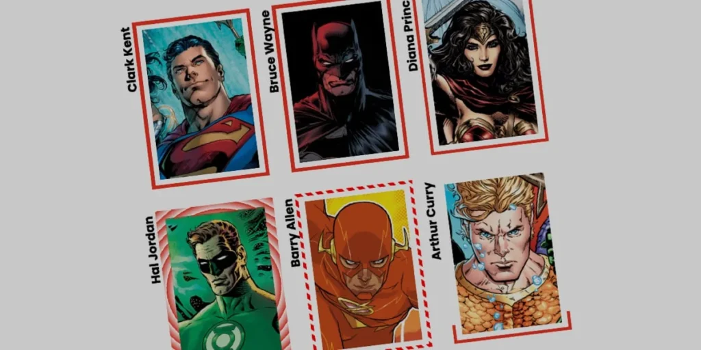
In the ever-evolving landscape of front-end development, certain cascading style sheet (CSS) features are so deeply embedded in our daily routines that we rarely stop to appreciate their underlying sophistication. The border-image property is a prime example. Long established within the web standards ecosystem, it has quietly enabled developers to replace mundane, solid, or dashed borders with rich visual assets and complex gradients.
However, static beauty is often just the baseline for modern user interface (UI) design. As web applications demand increasingly dynamic, tactile, and responsive feedback loops, developers are finding novel ways to push CSS specifications beyond their original intent. Recent technical explorations—most notably inspired by design visionary Andy Clarke and advanced layout experimentation by layout engineer Temani Afif—have breathed new life into border-image.
By combining the structural efficiency of border-image with the interpolation power of CSS Houdini custom properties, developers can now craft fluid, high-performance border animations that mimic the illusion of a border "drawing itself" around an element. This article explores the architectural foundations, technical hurdles, and advanced implementation strategies required to animate CSS border images effectively.
Main Facts: The Intersection of border-image and CSS Houdini
At its core, the border-image property allows a developer to specify an image—or more commonly in modern workflows, a CSS gradient—to be used as the border of an element, superseding traditional border-color styles.
While alternative layout techniques exist, such as utilizing complex CSS masking layers to achieve animated borders (a technique heavily championed by Temani Afif), border-image remains exceptionally efficient. It automatically maps and replicates design patterns across all four sides of a box simultaneously. Furthermore, the border-image-slice property functions analogously to background-size, allowing specific segments of an image or gradient to scale dynamically across the bounding box.
Despite these advantages, animating border-image historically presented a formidable engineering challenge: browsers cannot natively interpolate or transition between disparate gradient stops or angles out of the box. Traditional CSS properties evaluate gradients as static images rather than numerical values, meaning smooth hover transitions or state changes were virtually impossible without heavy JavaScript intervention.
The breakthrough arrives via the CSS Properties and Values API (part of CSS Houdini). By explicitly registering custom properties using @property, developers can define specific data types (such as <percentage>, <angle>, or <number>), assign initial states, and instruct the browser to treat these variables as interpolatable values. When integrated with border-image-source and its longhand properties, these custom variables unlock fluid, performant, GPU-accelerated border animations driven entirely by native CSS.
Chronology: The Evolution of Border Styling and Animation
To understand the significance of modern border animations, it is helpful to trace the chronological evolution of border styling on the web:
- The Early Web (Late 1990s–2000s): Borders were strictly utilitarian. Developers relied on solid, dotted, dashed, or double lines mapped to single, flat hexadecimal colors. Creating custom visual borders required intricate multi-layered HTML structures and slice-and-dice raster image hacks.
- The Introduction of CSS3 (2011–2015): The CSS Backgrounds and Borders Module Level 3 introduced
border-image, finally allowing vector-based or raster graphics to wrap around element boxes. While revolutionary for static UI design, it lacked dynamic interactivity, as browsers treated the rendered images as non-animatable entities. - The Rise of CSS Preprocessors and Workarounds (2015–2020): Frustrated by static limitations, developers devised complex workarounds using pseudo-elements (
::beforeand::after), box-shadow manipulations, and absolute positioning to simulate glowing or animated borders. While visually appealing, these methods frequently bloated the Document Object Model (DOM) and introduced rendering bottlenecks. - The Advent of CSS Houdini and Custom Properties (2020–Present): With the widespread adoption of the
@propertyrule across modern rendering engines, the barrier to animating complex CSS values crumbled. Developers could now explicitly define the syntax and initial values of custom variables, enabling direct transitions on gradients, angles, and layout metrics without relying on JavaScript event loops.
Supporting Data: Technical Anatomy of a Border Animation
Implementing a dynamic, animated border image requires orchestrating several interrelated CSS longhand properties. To demonstrate this, consider a standard UI component—such as a user profile card containing a background portrait of a comic book icon.
1. The HTML and Base Layout Structure
The structural markup remains pristine and lightweight, completely devoid of presentational clutter:
<div class="card">
  <strong>Bruce Wayne</strong>
</div>
The corresponding base styles establish a fixed aspect ratio and position a high-resolution background image directly inside the .card element:
.card
  width: 150px;
  aspect-ratio: 0.69;
  position: relative;
  background: center / 90% no-repeat;
  background-image: url("batman.jpg");
2. Harnessing Longhand Properties
To maintain absolute clarity over how individual rendering rules affect the final output, developers should leverage longhand properties rather than the shorthand border-image declaration.
.card
  /* Establishes a linear color gradient source */
  border-image-source: linear-gradient(-45deg, red 0%, transparent 0%);

  /* Carves the gradient into manageable 1px structural slices */
  border-image-slice: 1;

  /* Sets the physical thickness of the border */
  border-image-width: 5px;

  /* Pushes the border outward to prevent visual collision with the background */
  border-image-outset: 5px;
In this configuration, both the red and transparent color stops are initialized at 0%. Because the browser processes transparent second, it claims the starting position, causing the gradient to render as entirely transparent by default.
3. Overcoming Gradient Limitations with Houdini
Because standard CSS cannot natively transition gradient percentages, we register a custom property to act as the interpolating bridge:
@property --p
  syntax: "<percentage>";
  initial-value: 0%;
  inherits: false;
We then bind this registered variable directly to our linear gradient source:
.card
  border-image-source: linear-gradient(-45deg, red var(--p), transparent 0%);
  border-image-slice: 1;
  border-image-width: 5px;
  border-image-outset: 5px;
  transition: --p 0.4s ease-in-out;

  &:hover
    --p: 100%;
When a user hovers over the card, the custom variable --p smoothly transitions from 0% to 100%. The browser calculates the intermediate percentage steps, effectively making the red color expand across the gradient until the border appears to seamlessly draw itself around the element.
Official Responses and Standards Perspective
From a standards perspective, the implementation of @property and dynamic border-image transitions represents a major victory for the World Wide Web Consortium (W3C) and browser engine vendors (including Chromium, WebKit, and Gecko).
Historically, rendering engines restricted CSS transitions strictly to pre-approved data types (such as lengths, colors, and opacities) to protect CPU threads from runaway layout recalculations. By introducing the CSS Houdini initiative, working groups have successfully shifted performance-critical computation workloads directly to the GPU compositor thread.
Browser engineering teams have reported minimal performance overhead when transitioning registered custom properties, provided that the properties are properly typed and restricted using strict syntax definitions (such as <percentage> or <angle>). This standardization ensures that advanced visual effects—once exclusive to canvas rendering or heavy JavaScript animation libraries—can now execute reliably and natively within the stylesheet.
Implications for Modern Web Architecture and UI Design
The implications of mastering animated border-image properties extend far beyond aesthetic novelty. They fundamentally alter how front-end engineers approach scalable UI component design.
Performance Optimization
By replacing JavaScript-driven canvas animations or complex multi-element DOM wrappers with pure CSS solutions, web applications achieve significantly lower memory footprints. Native CSS transitions execute smoothly on the compositor thread, preventing main-thread layout thrashing and ensuring high frames-per-second (fps) performance even on low-end mobile devices.
Maintainability and Scalability
Using registered custom properties (@property) alongside modular CSS components allows design systems to expose predictable, tokenized animation hooks. Developers can easily alter animation speeds, gradient angles, and border thicknesses across entire design frameworks simply by updating variable maps, rather than rewriting complex keyframe animations for every unique component instance.
Advanced Variations: Conic Gradients and Tiling
The technique is not restricted to simple linear gradients. By employing conic-gradient alongside advanced slicing and tiling properties—such as border-image-repeat: round—developers can create complex, rotating color wheels and geometric patterns that scale and tile seamlessly across dynamic bounding boxes:
@property --n
  syntax: "<number>";
  initial-value: 1;
  inherits: false;


@property --a
  syntax: "<angle>";
  initial-value: 0deg;
  inherits: false;


.card
  border-image-source: conic-gradient(from var(--a), red var(--a), transparent 0%);
  border-image-width: 5px;
  border-image-slice: var(--n);
  border-image-repeat: round;
  transition-property: --n, --a;
  transition-duration: 0.6s;

  &:hover
    --n: 20;
    --a: 360deg;
Conclusion
The convergence of border-image, registered custom properties, and modern browser rendering optimizations marks a maturity milestone for CSS. Tasks that once required cumbersome structural workarounds or external scripting can now be achieved with clean, declarative, and highly performant stylesheets. As front-end developers continue to experiment with these primitives, the boundary between static layout and interactive motion design will continue to blur, paving the way for richer, more engaging digital experiences.