
Unlocking the Next Level of UI Design: A Comprehensive Guide to Animating CSS Border Images
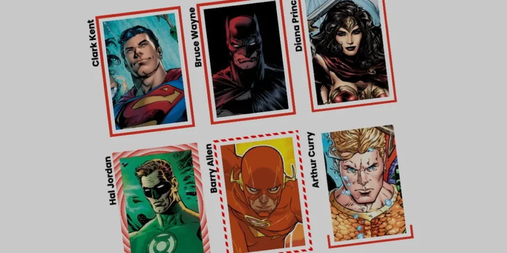
The cascading style sheet (CSS) ecosystem is filled with properties that developers use every day without a second thought. Among these foundational workhorses is the border-image property. While far from being a newcomer to the web standards specification—with front-end veterans like Andy Clarke frequently revisiting its capabilities to demonstrate high-end creative designs—it remains vastly underutilized in modern user interface (UI) design.
Traditionally, developers relegate borders to predictable, static styling: a solid line separating elements, a subtle dashed pattern for drop zones, or perhaps a rounded box with a uniform width. However, by combining border-image with modern CSS features like Houdini’s @property API, developers can break free from these constraints. We can now animate borders fluidly, creating dynamic visual feedback loops that respond to user interactions like hovering.
This deep dive explores how to transcend standard static layouts, harness the efficiency of border images, implement custom property animations, and construct stunning, performant UI components that elevate the overall web experience.
Main Facts: The Power and Mechanics of border-image
At its core, the CSS border-image property allows developers to replace standard border styles with an image or a CSS gradient. The significant takeaway for modern web developers is efficiency: rather than building complex, multi-layered DOM elements or relying on heavy JavaScript intervals to draw lines around containers, border-image automates the replication of designs uniformly across all four sides of an element.
The Anatomy of a Border Image
To fully leverage this property, developers rely on several sub-properties that dictate how the source graphic or gradient is rendered:
border-image-source: Defines the path to the image or gradient (such as alinear-gradientorconic-gradient) used as the border graphic.border-image-slice: Determines how the source image is divided into regions. Similar tobackground-positionorbackground-size, a single slice can be referenced, but border slices stretch across the entire perimeter.border-image-width: Sets the physical thickness of the rendered border, independent of standard layout padding.border-image-outset: Pushes the border graphic away from the element’s box model boundaries, creating breathing room between the content and the animated stroke.border-image-repeat: Controls how the sliced regions are tiled or stretched (e.g., using values likeroundorrepeatto handle responsive scaling smoothly).
The Primary Limitation: Shape Matching
Despite its strengths, border-image comes with a notable caveat: border images do not curve to match border-radius shapes. When an element utilizes border-radius: 50% or even subtle rounded corners, the rectangular coordinate system of the border image will stubbornly remain squared off at the clipping boundaries.
While alternative approaches exist—such as using sophisticated CSS masks pioneered by layout experts like Temani Afif—border-image remains exceptionally lightweight. For animations that traverse the perimeter of a sharp-cornered card, badge, or container, it delivers unmatched performance and clean code architecture.
Chronology: The Evolution of Dynamic CSS Animations
To understand why animating border gradients is suddenly viable today, we must look at how browser rendering engines have evolved over the last decade.
Phase 1: Static Gradients and the Interpolation Wall
Historically, web developers faced a frustrating limitation: CSS gradients could not be animated directly.
If a developer attempted to transition a linear gradient from one color stop percentage to another on a hover state, the browser would fail. Gradients are not single numeric values; they are complex data types made of color stops and percentages. Transitioning them requires interpolating numeric values that browsers historically did not know how to parse dynamically during continuous layout repaints.
Phase 2: The Arrival of CSS Houdini and Custom Properties
The game changed with the introduction of the CSS Properties and Values API (part of CSS Houdini). By allowing developers to explicitly register custom CSS variables (--variable) with specific data types (<percentage>, <angle>, or <number>), browsers learned how to interpolate those values smoothly.
@property --p
  syntax: "<percentage>";
  initial-value: 0%;
  inherits: false;
By registering custom properties, developers effectively bypassed the gradient animation roadblock. They could tie a registered variable directly into a gradient’s color stop, and then trigger smooth transitions using standard CSS transition or animation properties.
Supporting Data: Step-by-Step Implementation
Let’s walk through the practical implementation of an animated linear gradient border on a standard UI card component.
Step 1: The Markup and Base Styles
Our HTML structure is intentionally minimal—a simple container holding a text label:
<div class="card">
  <strong>Bruce Wayne</strong>
</div>
Next, we establish the base styles for our .card element, setting explicit dimensions, positioning, and a background image:
.card
  width: 150px;
  aspect-ratio: 0.69;
  position: relative;
  background: center/90% no-repeat;
  background-image: url("batman.jpg");
  padding: 1rem;
Step 2: Introducing the Border Image Source
To demonstrate the animation cleanly, we utilize a single-color CSS gradient as our background image source. We assign longhand properties to make the exact impact of each rule transparent:
.card
  /* ...base styles... */

  /* Creates a linear color transition */
  border-image-source: linear-gradient(-45deg, red 0%, transparent 0%);

  /* Controls how the gradient is carved */
  border-image-slice: 1;

  /* Sets the physical thickness of the border */
  border-image-width: 5px;

  /* Pushes the border away from the core element */
  border-image-outset: 5px;
In this setup, the gradient is initially fully transparent. Because both red and transparent are set to 0%, the browser has no space to blend them. Because transparent is declared second, it claims the starting position and fills the rest of the gradient space.
Step 3: Animating via Registered Custom Properties
To make the border appear to "draw itself" on hover, we register our custom property --p and hook it into our gradient:
@property --p
  syntax: "<percentage>";
  initial-value: 0%;
  inherits: false;


.card
  /* ...other styles... */
  border-image-source: linear-gradient(-45deg, red var(--p), transparent 0%);
  transition: --p 0.4s ease-in-out;

  &:hover
    --p: 100%;
When a user hovers over the card, the custom property --p transitions from 0% to 100%. The red segment expands across the linear gradient, creating a seamless, high-performance drawing effect around the container.
Advanced Variations: Conic Gradients and Tiling
Linear gradients are only the beginning. By swapping in a conic-gradient and leveraging the border-image-repeat property, we can achieve complex, spinning geometric effects.
@property --n
  syntax: "<number>";
  initial-value: 1;
  inherits: false;


@property --a
  syntax: "<angle>";
  initial-value: 0deg;
  inherits: false;


.card
  border-image-source: conic-gradient(from var(--a), red var(--a), transparent 0%);
  border-image-width: 5px;
  border-image-slice: var(--n);
  border-image-repeat: round;
  transition-property: --n, --a;
  transition-duration: 0.6s;

  &:hover
    --n: 20;
    --a: 360deg;
Understanding border-image-repeat: round
The round value instructs the browser to tile the sliced regions along the border track. If the container dimensions do not fit a mathematically perfect number of tiles, the browser dynamically stretches or compresses the image slightly until a flawless fit is achieved. Combined with our animated --n (slice depth) and --a (gradient angle) variables, this produces an expanding, rotating color-wheel border that reacts instantly to user input.
Official Responses & Industry Consensus: Performance and Accessibility
As front-end engineering standards lean heavily into GPU-accelerated styling, web standards working groups and design system architects have weighed in on the rise of Houdini-powered CSS animations.
- Performance Benefits: Unlike JavaScript-driven canvas loops or heavy DOM element manipulation, registered custom properties processed via Houdini run efficiently within the browser’s style and layout pipeline. They avoid layout thrashing, keeping frame rates high even on mobile devices.
- Accessibility Considerations: Design systems engineering teams emphasize that while aesthetic enhancements like animated borders improve visual engagement, they must respect user preferences. Developers should wrap these hover states in
@media (prefers-reduced-motion: reduce)queries to ensure users prone to motion sickness are not overwhelmed by spinning or expanding interface elements.
@media (prefers-reduced-motion: reduce)
  .card
    transition: none;
Implications for Future Web Design
The intersection of border-image and CSS Houdini custom properties marks a paradigm shift in how we approach micro-interactions on the web. For years, adding a polished, glowing, or dynamically drawing border required heavy SVG path manipulations or cumbersome multi-div wrappers.
By streamlining these effects into native CSS properties, developers gain several distinct advantages:
- Reduced Code Complexity: Eliminating unnecessary HTML wrapper elements keeps the DOM clean and semantic.
- Maintainability: Design tokens can be easily tied to custom properties, making global theme updates effortless.
- Creative Freedom: As demonstrated through linear, radial, and conic gradient permutations, the visual ceiling for component borders has expanded dramatically.
Ultimately, mastering techniques like animated border images empowers front-end developers to craft immersive, application-grade interfaces with minimal overhead. The tools are native, the performance is optimized, and the creative potential is entirely in the hands of the developer.








