Rethinking the Dark Mode Toggle: Why Web UI/UX Experts Want to Kill the Three-State Switch
In the modern landscape of web development, few user interface elements are as ubiquitous as the light/dark mode toggle. Nestled comfortably in the header or navigation bar of countless websites, these switches usually offer users three distinct choices: Light, Dark, and System.
However, a vigorous debate sweeping through the front-end engineering community—sparked by prominent web standards advocate and developer Lea Verou—is challenging this convention. The core thesis is remarkably straightforward yet revolutionary for interface designers: we should ditch the tri-state toggle in favor of a frictionless, intelligent two-state system, or perhaps eliminate the toggle altogether.
As web developers continually seek ways to reduce cognitive load and streamline user experiences, this deep dive into UI/UX philosophy examines why the standard dark mode dropdown might finally be heading for extinction.
Main Facts: The Anatomy of the Dark Mode Debate
The conversation centers around how websites handle user color scheme preferences, balancing operating system defaults with manual overrides.
- The Status Quo: Most modern websites use a tri-state toggle (Light / Dark / System) or a persistent icon in the navigation bar that cycles through these three options.
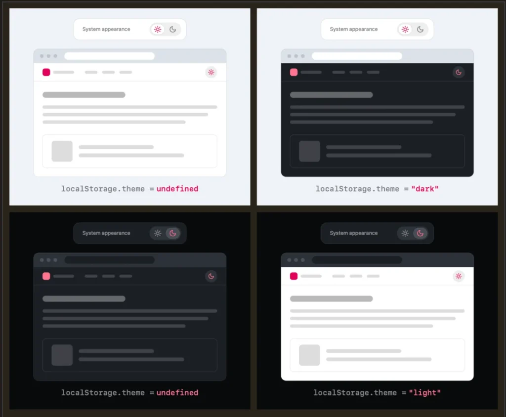
- The Critique: Lea Verou argues that a well-designed two-state control is entirely sufficient to express all three underlying states (Light, Dark, and System override). Users only need to apply a manual override the first time the system setting diverges from their personal preference.
- The Mechanism: Instead of forcing users to explicitly select "System," a site should default to matching the operating system’s preference. If a user clicks the toggle to change it, that override is saved locally (e.g., via
localStorage) for future sessions. - The Scope: This design philosophy specifically targets persistent UI elements—those ever-present toggles sitting in a website’s header—which can introduce unnecessary visual clutter and cognitive friction.
Chronology: How the Discussion Unfolded
The evolution of the light/dark mode toggle debate highlights how quickly community insights can reshape established web conventions.
Phase 1: The Proliferation of Dark Mode
When dark mode transitioned from a niche developer-tool preference to a mainstream operating system feature (popularized heavily around 2018–2019 by Apple and Google), web developers scrambled to support it. The CSS prefers-color-scheme media query was introduced, allowing websites to automatically match the user’s OS settings.
To give users manual control—since someone might want a dark OS but a light browser experience, or vice versa—developers implemented toggles. Naturally, the path of least resistance was to mirror the three possibilities: Light, Dark, and System.
Phase 2: Lea Verou’s Manifesto
In August 2026, web developer and CSS Working Group member Lea Verou published a seminal blog post titled "Dark Mode Toggles and Good Two-State UX." In the post, she pushed back against the bloated three-state UI implementations cluttering modern websites. She argued that a streamlined two-state interface could elegantly handle system inheritance without wasting precious pixels or mental bandwidth on a dedicated "System" option.
Phase 3: Community Backlash and Validation
Verou’s post immediately sparked intense discussions across platforms like Bluesky, Mastodon, and Hacker News. Developers debated the nuances of state persistence, edge cases involving user intent, and the fundamental philosophy of browser-level versus website-level controls.
Phase 4: The Follow-Up and Synthesis
Following the initial wave of feedback, Verou published a follow-up article summarizing the consensus. The discussions clarified an important boundary: while application-heavy dashboards or settings pages might justify tri-state controls, public-facing content websites with persistent header toggles are far better served by the minimalist two-state approach—or by trusting system defaults entirely.
Supporting Data and Technical Architecture: Why Two States Are Enough
To understand why a two-state toggle can replace a three-state dropdown, one must look at how user intent and state logic intersect on the web.
The Logic of the Override
In a traditional tri-state setup, the system maintains three distinct values: light, dark, and system.
In Verou’s proposed two-state model, the application logic shifts to:
- No explicit preference stored? Fall back dynamically to the CSS
prefers-color-schememedia query (matching the operating system). - User clicks the toggle? Apply a manual override (
lightordark), and store that preference inlocalStorage.
Mathematically and experientially, this covers every single scenario a user might encounter:
- If the user is happy with their system settings, they do nothing, and the site respects the OS.
- If the user wants the opposite of their system setting, they click the toggle once. The site locks into that preference.
The Cognitive Dissonance of UI Clutter
Every interactive element placed in a website’s primary navigation demands a fraction of the user’s attention. When a visitor lands on a content site, their primary intent is to read an article, purchase a product, or find information—not to configure the site’s color palette.
Displaying three options (often represented by confusing sun, moon, and computer/gear icons) introduces unnecessary visual noise. As UI/UX studies consistently show, reducing options diminishes decision fatigue. Less UI that accomplishes the exact same functional goal is almost universally a superior design pattern.
Official Responses and Developer Perspectives
The developer community has weighed in heavily on the proposal, highlighting both the elegance of the idea and the philosophical questions it raises about browser design.
The Browser vs. Website Responsibility Debate
One of the most compelling insights generated during the discussion came from developer Chris Coleman, who noted on Bluesky:
"All I ever wanted was for my OS to be dark, not every website I look at. It was a huge leap by the browser vendors to tie all web content to that system preference. Anyway, I think the light/dark preference should be in the browser, and what you propose seems perfectly in line with that."
This touches on a deeper architectural flaw in how the web adopted dark mode. Browsers tied web content globally to operating system themes. Because browsers themselves often lack granular, per-site theme controls in easily accessible UI menus, individual website creators were forced to build their own custom toggle infrastructure.
Verou’s approach acts as a bridge: it respects the user’s OS preference by default while minimizing the burden of website-level customization.
When Are Three States Actually Necessary?
To be fair to comprehensive UI design, Verou’s guidelines do carve out specific exceptions where a tri-state control remains appropriate. These scenarios generally include:
- Complex Applications & Settings Panels: Deep within a user profile, account settings, or a dedicated appearance configuration page (such as in VS Code or GitHub settings), explicit tri-state radios or dropdowns provide absolute clarity.
- Asymmetrical Default States: When the default behavior of a platform deliberately breaks away from system inheritance for branding or legibility reasons, explicit states ensure the user knows precisely what context they are modifying.
Implications for Future Web Design
As the dust settles on this UI/UX debate, what does it mean for the future of web development?
1. A Shift Toward Invisible Design
The ultimate conclusion of this design philosophy is that the best interface is often no interface at all. If operating systems and browsers become smarter at handling user preferences natively, websites may drop theme toggles entirely. Until then, adopting the two-state minimalist toggle ensures that sites respect user intent without sacrificing aesthetic cleanliness.
2. Re-Evaluating Component Libraries
Popular front-end component libraries and design systems (such as Tailwind UI, Bootstrap, and Material-UI) often default to shipping tri-state theme dropdowns or complex icon cyclers. If the industry shifts toward Verou’s two-state paradigm, we can expect to see updated design kits that favor simple, binary switches (e.g., a single sun/moon toggle that simply flips the current active state).
3. Prioritizing User Intent
Ultimately, the dark mode debate serves as a healthy reminder to web designers: never let peripheral features overshadow primary user goals. By stripping away redundant interface options, developers can create cleaner, faster, and more respectful digital spaces.
Whether you choose to implement a sleek two-state override or rely entirely on the browser’s native prefers-color-scheme, the era of the cluttered tri-state header dropdown may finally be coming to a close.