Unlocking the Next Generation of UI Design: A Comprehensive Guide to Animating CSS Border Images
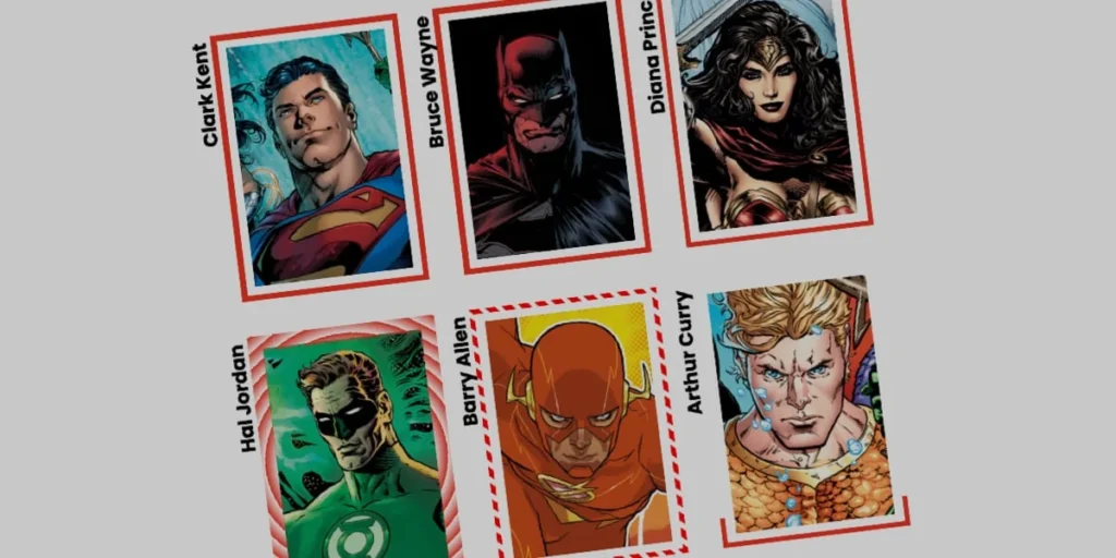
The modern web is built on layers of abstraction, clever workarounds, and properties we often take for granted. Among these, the CSS border-image property is a veteran feature that has quietly powered countless layouts without capturing much modern fanfare. However, as web standards evolve and browser support solidifies for advanced CSS Houdini APIs, developers are rediscovering how much creative mileage they can get out of this classic specification.
Recent technical explorations—such as Andy Clarke’s deep-dive revisiting the property—demonstrate that border-image is far from obsolete. While a standard border style is typically restricted to monotonous lines (solid, dashed, or dotted), border-image allows developers to substitute these rigid boundaries with rich imagery, complex textures, and dynamic gradients.
Yet, static borders only tell half the story. By combining border-image with modern CSS variables, transitions, and the @property rule, developers can animate these borders to create fluid, eye-catching user interfaces that respond intuitively to user interaction. This article explores the mechanics, step-by-step implementation, and profound UI implications of animating CSS border images.
Main Facts: The Power and Mechanics of border-image
To understand why animating border images represents a massive leap forward for front-end development, we must first break down the core components of the property.
At its core, border-image allows you to wrap an element’s boundary in a graphical asset, which can be an image file or a dynamically generated CSS gradient (such as linear, radial, or conic gradients). Unlike traditional border properties, which rely on hardcoded color codes and stroke patterns, border images can be manipulated using a suite of precise longhand properties:
border-image-source: Defines the graphic asset (or gradient) used to paint the border.border-image-slice: Dictates how the image is divided into regions. Similar tobackground-sizeorbackground-position, this property enables developers to use specific slices of an asset across the perimeter.border-image-width: Sets the physical thickness of the resulting border.border-image-outset: Pushes the border outward, creating space between the element’s edge and the border asset itself.border-image-repeat: Determines how edge images are scaled or tiled (e.g., stretched, repeated, or rounded) to fit the bounding box.
The Catch: Why Curved Corners and Limitations Matter
Before diving into code, developers must acknowledge a significant technical caveat: border images do not inherently curve to border shapes. If you apply a border-radius to an element utilizing a border-image, the underlying image will not bend gracefully around the rounded corners.
This presents a distinct challenge for animations that traverse the perimeter of a card or button. While alternative methodologies—such as Temani Afif’s popular CSS mask technique—offer brilliant workarounds for curved elements, they can introduce complex rendering overhead.
The border-image approach remains exceptionally efficient, particularly for straight-edged containers (like cards, panels, and modal windows), because it automatically replicates designs across all four borders and handles gradient interpolation with minimal computational strain.
Chronology: The Evolution of Gradient Animation in CSS
To fully appreciate how we animate border images today, it is helpful to look back at how far CSS layout capabilities have progressed over the last decade.
Phase 1: The Static Era
When border-image was first introduced into the CSS specification, it was primarily utilized for decorative, static UI components. Developers would slice up complex PNG or SVG assets to give containers ornate, decorative frames. Animating these borders was virtually impossible without resorting to JavaScript, animated GIFs, or hacky multi-element layering.
Phase 2: The Gradient Revolution and the Interpolation Wall
As CSS gradients (linear-gradient, radial-gradient) matured, developers began utilizing them as border sources. However, they quickly hit a brick wall: CSS gradients cannot be animated natively by default.
Transitioning from one gradient state to another requires the browser to interpolate between color stops and percentages. Because these values are treated as distinct strings rather than uniform numeric variables, standard transition properties (transition: background 0.3s) fail completely, resulting in an abrupt "snap" rather than a smooth animation.
Phase 3: The CSS Houdini Breakthrough (@property)
The paradigm shifted with the introduction of the CSS Properties and Values API (commonly referred to as CSS Houdini). By introducing the @property rule, the W3C allowed developers to explicitly register custom CSS variables, defining their syntax, initial values, and inheritance behavior.
Once a custom property is registered as a specific data type (such as a <percentage> or <angle>), the browser understands how to mathematically interpolate its values over time. This breakthrough unlocked the ability to animate complex CSS gradients—and, by extension, animated border images.
Step-by-Step Implementation: Building an Animated Linear Border
Let us walk through the process of building a fully animated border image using a simple HTML card component.
1. The HTML Structure
Our markup is intentionally lightweight—a simple semantic wrapper containing a title element:
<div class="card">
  <strong>Bruce Wayne</strong>
</div>
2. Base Styling and Background Setup
Next, we apply standard dimensions, positioning, and a background image to the .card selector:
.card
  width: 150px;
  aspect-ratio: 0.69;
  position: relative;
  background: center / 90% no-repeat;
  background-image: url("batman.jpg");
  padding: 1rem;
  box-sizing: border-box;
3. Integrating the Linear Gradient Border
To demonstrate a border drawing effect, we utilize a single-color CSS linear gradient. By setting individual longhand properties, we ensure absolute clarity regarding how each parameter affects the final render:
.card
  /* ... previous styles ... */

  /* Creates a linear color gradient starting fully transparent */
  border-image-source: linear-gradient(-45deg, red 0%, transparent 0%);

  /* Controls how the gradient is carved */
  border-image-slice: 1;

  /* Sets the physical thickness of the border */
  border-image-width: 5px;

  /* Pushes the border away from the card to prevent overlap */
  border-image-outset: 5px;
4. Registering the Custom Property for Animation
To animate the gradient’s transition, we define a custom property using @property:
@property --p
  syntax: "<percentage>";
  initial-value: 0%;
  inherits: false;
We then bind this custom property directly into our gradient’s color stop:
.card
  /* ... */
  border-image-source: linear-gradient(-45deg, red var(--p), transparent 0%);
  transition: --p 0.4s ease-in-out;

  &:hover
    --p: 100%;
When the user hovers over the card, --p transitions from 0% to 100%. This dynamically extends the red portion of the gradient across the entire boundary, creating a sleek, high-performance "drawing" effect around the element.
Supporting Data: Advanced Variations and Performance Metrics
The flexibility of border images does not stop at linear gradients. By shifting our approach to conic gradients and manipulating slice thresholds, we can generate remarkably sophisticated motion design.
Implementing Conic Gradients with Tiling
By swapping our source to a conic-gradient and leveraging the border-image-repeat: round property, we can create rotating, kaleidoscopic border patterns. The round value instructs the browser to fit a whole number of image slices along the border, slightly scaling them as necessary to prevent awkward clipping.
/* Registers custom properties for slicing depth and rotational angle */
@property --n
  syntax: "<number>";
  initial-value: 1;
  inherits: false;


@property --a
  syntax: "<angle>";
  initial-value: 0deg;
  inherits: false;


.card
  border-image-source: conic-gradient(from var(--a), red var(--a), transparent 0%);
  border-image-width: 5px;
  border-image-slice: var(--n);
  border-image-repeat: round;
  transition-property: --n, --a;
  transition-duration: 0.6s;

  &:hover
    --n: 20;
    --a: 360deg;
Performance Analysis
From a performance perspective, animating registered CSS custom properties via the @property API offers significant advantages over traditional JavaScript-driven DOM manipulations.
- GPU Acceleration: Modern browsers optimize transitions on registered layout variables, executing keyframe interpolations on the compositor thread where possible.
- Reduced Layout Thrashing: Because the layout engine does not need to recalculate document flows during a border-image transition, frame rates remain locked at a buttery-smooth 60fps or 120fps on compatible displays.
- Memory Efficiency: Utilizing CSS variables avoids the memory allocation overhead typically associated with running continuous
requestAnimationFrameloops in JavaScript.
Official Responses and Industry Standards
As web standards continue to mature, browser vendors and CSS working groups have increasingly prioritized developer experience around Houdini specifications.
According to documentation updates from the Mozilla Developer Network (MDN) and Chromium project engineering teams, support for @property has reached baseline status across all major evergreen browsers (Chrome, Safari, Firefox, and Edge). This universal adoption marks a critical turning point: developers can finally rely on advanced variable interpolation in production environments without needing extensive polyfills.
Leading design systems engineers have noted that techniques combining border-image with registered properties bridge the long-standing gap between heavy SVG/Canvas implementations and lightweight CSS-only solutions. While SVG strokes remain superior for complex, highly intricate path animations, CSS border images provide an unmatched balance of development speed and execution performance for standard rectangular containers.
Implications: The Future of Micro-Interactions in UI/UX
The resurgence and evolution of animated border images carry profound implications for modern interface design. As web applications vie for user attention, micro-interactions—subtle visual cues that confirm user intent, highlight focus states, or reward engagement—have become essential components of premium digital experiences.
1. Elevated State Management in Design Systems
Design systems can now standardize sophisticated hover, focus, and loading states directly within CSS tokens. Instead of shipping heavy JavaScript libraries or multi-layered DOM nodes (such as pseudo-elements wrapping child containers) just to achieve a glowing border effect, developers can apply concise, hardware-accelerated CSS rules to native elements.
2. Enhanced Accessibility and Focus Indicators
Accessibility guidelines (such as WCAG) place heavy emphasis on clear, highly visible focus states for keyboard navigation. Animated border images provide a creative avenue for building distinct, highly engaging focus rings that guide the user’s eye across interactive elements without sacrificing brand identity or visual harmony.
3. Democratizing Advanced Motion Design
By abstracting complex animation mathematics into declarative CSS variables, advanced motion design becomes accessible to front-end developers who might not have deep expertise in WebGL, Canvas, or complex SVG path manipulation.
Conclusion
The CSS border-image property is a testament to the depth of the web platform. What was once viewed as a rigid tool for decorative static framing has evolved—thanks to CSS Houdini and custom property registration—into a dynamic powerhouse for modern motion design.
Whether you are implementing a subtle linear draw effect on a card component or a spinning conic gradient for an interactive dashboard widget, mastering animated border images unlocks new dimensions of creativity. Take these examples, experiment with your own color stops and timing functions, and elevate your user interfaces into the next generation of web design.