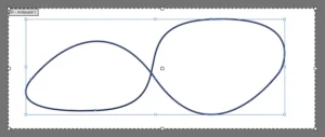
Beyond the Script: The Quest for a Pure CSS Pie Chart

In the evolving landscape of front-end development, the debate over the "proper" way to render data visualizations has long been dominated by heavy-duty JavaScript libraries. From D3.js to Chart.js, the industry standard has prioritized dynamic calculation over structural simplicity. However, a recent technical discourse—sparked by developer Juan Diego Rodríguez and furthered by a compelling "no-JavaScript" experiment—has reignited interest in pushing CSS to its absolute limits.
This article explores the technical odyssey of building a semantic, accessible, and fully functional pie chart using nothing but CSS, effectively challenging the assumption that complex geometry requires client-side scripting.
The Main Facts: Rethinking Data Visualization
The core premise is straightforward: can we create a perfectly functional, customizable pie chart without a single line of JavaScript? While standard web practices dictate that calculating the start and end angles of a pie slice requires a script to iterate through data points, the recent "CSS-only" movement argues that if the browser can handle complex layouts, it should be able to handle basic trigonometry and arithmetic via CSS variables and modern selectors.
The primary objective is to maintain semantic HTML. By moving the data source—the percentages for each slice—to the parent container rather than the children, developers can create a "source of truth" that CSS can then parse and distribute. This approach ensures that the markup remains clean and accessible, while the visual representation remains fluid and style-agnostic.
Chronology: A Lunch-Break Breakthrough
The journey began with Juan Diego Rodríguez’s exploration of the "perfect CSS pie chart." His work established a template: using pseudo-elements to inject data values into the DOM, keeping JavaScript to a bare minimum.
The challenge was then picked up by other developers who sought to eliminate the JavaScript dependency entirely. The process followed a distinct evolution:
- The "Sibling Problem": Standard CSS cannot inherently "see" the values of preceding siblings. A slice cannot know where the previous slice ended without external intervention.
- The Parent-Level Pivot: Developers realized that by moving the data attributes (the percentages) to the parent
<ul>element, they could index the values. - The "CSS-Only" Polyfill: By assigning these values to CSS variables (
--p-100-1,--p-100-2, etc.) and usingnth-childselectors, the CSS could effectively "calculate" the accumulation of percentages across the chart. - Refinement: The latest iterations have begun incorporating cutting-edge CSS features like
sibling-index()andsibling-count(), signaling a shift toward a more native, browser-supported future for CSS-based data visualization.
Supporting Data: Why the "No-JS" Approach Matters
Critics often argue that removing JavaScript is merely an academic exercise. However, the supporters of the CSS-only movement point to several key advantages:
- Performance: Eliminating JavaScript execution paths reduces the main-thread workload, potentially improving the rendering speed on low-end devices.
- Accessibility: By keeping the data in the markup and using CSS to present it, the structural integrity of the page is preserved. Screen readers, which are often confused by canvas-based charts or complex SVG injections, can easily parse the semantic list of items.
- Maintainability: The ability to update a chart by simply changing an attribute in the HTML, without needing to touch a complex configuration object in a JavaScript file, streamlines the workflow for content editors and developers alike.
Comparative Analysis: The "Prior Art"
Before this innovation, the industry relied on several existing solutions. Libraries like Chart-CSS have long advocated for the use of HTML tables as a data source. While these libraries are robust, they often require the developer to manually define the start and end angles of every slice. The "new wave" of CSS-only development differentiates itself by automating these calculations, allowing the user to provide only the base percentages.
Official Responses and Industry Reception
The reaction from the developer community has been one of cautious optimism. While professional front-end engineers acknowledge that these techniques are not yet "production-ready" for highly complex data sets, they are viewed as a significant leap forward for lightweight, progressive enhancement.
Roman Komarov, a prominent figure in the CSS community, has noted that the ability to use property animations and CSS variables in tandem creates a "declarative" way to handle state that was previously thought to be the sole domain of JavaScript. The anticipation for the widespread adoption of sibling-index()—now moving toward Baseline status—is particularly high, as it will replace the currently "repetitive" code blocks required for indexing with native, performant browser logic.
Implications for the Future of Web Development
What does this mean for the future of the web? The move toward "CSS-only" charts suggests a broader shift in how we conceive of UI components.
1. The Rise of "CSS Components"
We are approaching an era where components that were once built with heavy frameworks can be replaced by light DOM structures. This shift favors "progressive enhancement"—where the page works perfectly in raw HTML/CSS, and JavaScript is only added for truly interactive, real-time data needs.
2. The Standardization of Math in CSS
The current reliance on repetitive calc() functions and manual variable indexing is an indicator that CSS needs more robust math capabilities. The community’s persistence in finding workarounds has provided a clear roadmap for the W3C (World Wide Web Consortium) on what features, such as @function and improved native math operators, are most desired by developers.
3. Accessibility as a Default
Perhaps the most profound implication is the forced focus on accessibility. Because these charts are built on semantic <ul> and <li> elements, they are inherently more accessible than the <div> soup often generated by charting libraries. By making accessibility a byproduct of the design process rather than an afterthought, developers are creating a more inclusive web.
Conclusion: A New Paradigm
The quest for the perfect CSS pie chart is far more than a fun weekend project; it is a fundamental stress test of the browser’s rendering engine. By successfully offloading the logic of data visualization from the scripting layer to the styling layer, developers are proving that the line between "content" and "presentation" is becoming increasingly fluid.
As we move toward a future where CSS supports more complex logic natively, we should expect to see more of these "impossible" UI patterns become standard practice. For the professional developer, the lesson is clear: before reaching for a library, consider whether the browser, with its ever-expanding suite of native tools, can already handle the job. The "no-JavaScript" constraint, once a radical challenge, is rapidly becoming a viable—and perhaps even preferred—method for delivering efficient, accessible, and performant web interfaces.
The code is available, the theory is proven, and the standard is rising. The next time you need a chart, consider the beauty of a calculation written in CSS. It may be the most efficient, clean, and elegant way to visualize your data.