Less is More: Why UI/UX Expert Lea Verou Argues Against the Three-State Dark Mode Toggle
In the ever-evolving landscape of front-end web development and user interface (UI) design, few debates are as persistent or seemingly minor yet fiercely contested as the implementation of light and dark mode switches. For years, the industry-standard approach for website theme toggles has settled into a comfortable, albeit cluttered, routine: present the user with a tri-state control—Light, Dark, and System.
However, prominent web standards expert and UI/UX researcher Lea Verou has ignited a robust industry debate by challenging this convention. In a series of provocative blog posts and discussions across social platforms like Bluesky, Verou argues that the ubiquitous three-state toggle is an anti-pattern. Instead, she advocates for a streamlined, intelligent two-state control—or, ideally, abandoning persistent toggles altogether in favor of robust system defaults.
This deep dive explores the mechanics of Verou’s proposal, the chronological evolution of the debate, the psychological and technical data underpinning the argument, community reactions, and the broader implications for modern web design.
Main Facts: Deconstructing the Tri-State Toggle
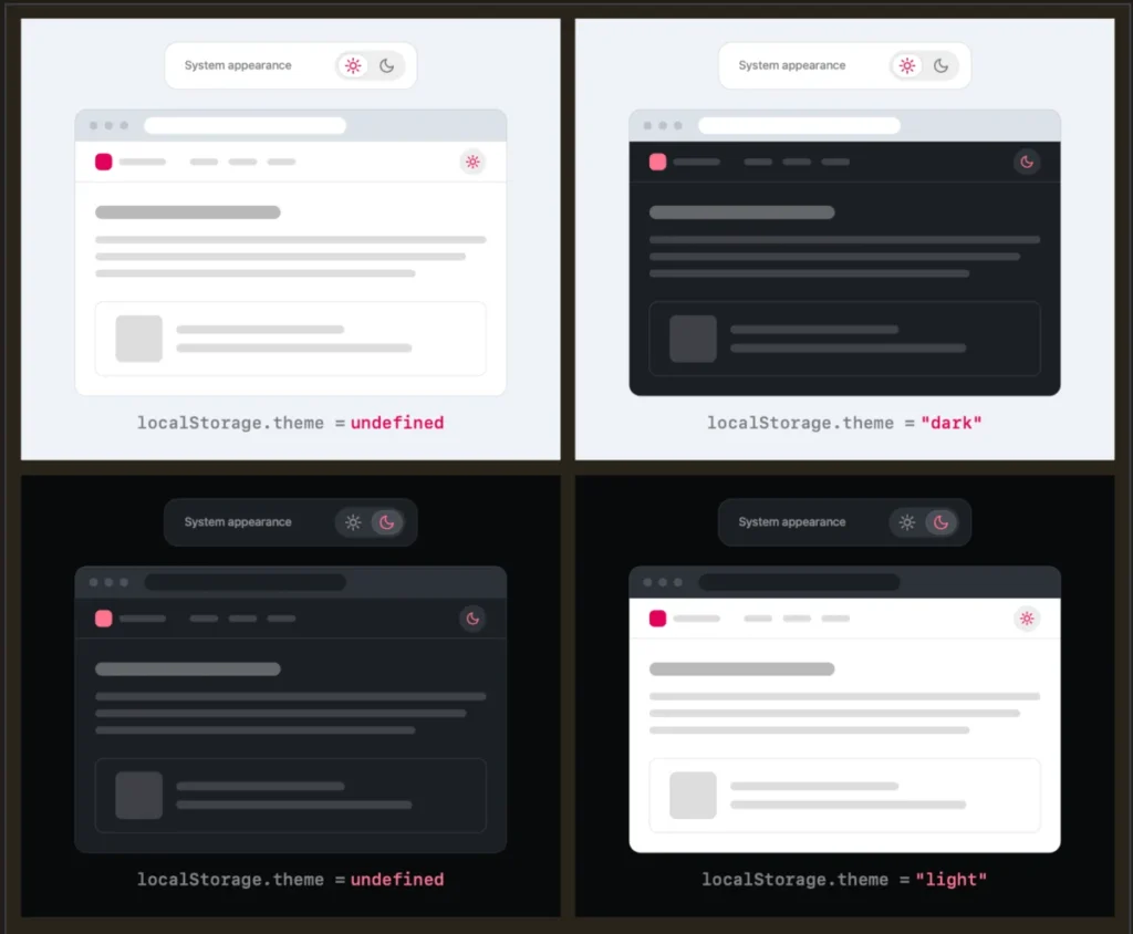
At the heart of Verou’s critique is a fundamental question of interface efficiency: Why force users to manually select a "System" option when a properly implemented two-state control can seamlessly express all three necessary states?
Under Verou’s proposed model, the user experience follows a streamlined logic:
- Default Behavior: By default, the website respects the visitor’s operating system or browser-level preference (light or dark).
- The Override: If the user desires a specific theme that contradicts their system setting, they interact with a simple two-state toggle (e.g., a sun/moon icon) to apply an override.
- Persistence: Once triggered, this explicit preference is saved locally—typically via
localStorage—ensuring that future visits respect the user’s explicit choice rather than reverting blindly to the system state.
According to Verou, displaying a dedicated "System" button alongside "Light" and "Dark" introduces unnecessary cognitive friction. Theme switching is rarely, if ever, the primary intent of a user visiting a content-driven website. By cluttering persistent UI elements—such as a header or main navigation bar—with redundant options, designers inadvertently introduce cognitive dissonance, pulling the user’s attention away from the primary content.
Chronology: How the Debate Unfolded
The conversation surrounding modern dark mode toggles did not happen in a vacuum. It unfolded through a series of progressive iterations and public discourse:
- Early 2026: Lea Verou publishes her initial exploratory thoughts on dark mode toggles, noting the architectural inefficiencies of standard UI implementations. She introduces the concept of the "good two-state control," demonstrating how it can handle system inheritance and manual overrides without a third button.
- Mid-2026 (The Bluesky Discourse): Verou takes her thoughts to Bluesky, sharing scenarios where traditional tri-state menus fail to respect user workflow. The post goes viral among frontend developers, UI/UX engineers, and CSS enthusiasts, generating widespread debate.
- August 6, 2026: Industry peers weigh in. Prominent developers analyze the edge cases of persistent navigation toggles, discussing how browsers handle media queries (
prefers-color-scheme) and how local storage variables should behave when a user cycles a toggle back and forth. - Post-Discussion Follow-Up: Prompted by the overwhelming community response, Verou publishes a comprehensive follow-up article summarizing the nuances, clarifying that her guidance specifically targets persistent UI elements (such as header navigation bars) rather than buried settings menus.
Supporting Data and Technical Scenarios
To appreciate why Verou’s model works, one must examine the edge cases of theme management. Critics of the two-state approach often ask: What happens when a user toggles back to a state that matches their system preference? Does it generate an unnecessary override in localStorage?
Verou dismisses this concern as practically negligible by reframing the user’s mindset:
"Remember, this control is entirely tangential to the actual user goal for visiting the website. Even if their intent were to pin light instead of reverting to System (light), this is something they would only notice once these diverge, i.e. the OS switches to dark. At that point, fixing it is a single click away. It’s such an easy fix, that there is no point in dwelling on it further."
When Are Three States Appropriate?
While Verou strongly advocates for purging the tri-state toggle from standard website headers, she acknowledges that three states are not entirely obsolete. Her research outlines specific scenarios where a tri-state control remains valid:
- Complex Application Dashboards: In heavy software-as-a-service (SaaS) environments or developer tools where environment isolation matters, explicit control over distinct app-only themes (independent of the broader workspace) may require granular options.
- Granular Browser-Level Settings: As developer Chris Coleman noted in the Bluesky discourse, the root frustration often stems from operating systems forcing global changes onto web content. Coleman argued that light/dark preferences ideally belong natively inside browser configurations rather than individual website headers. If a browser manages this natively, a tri-state setup within browser settings becomes entirely logical.
Official Responses and Community Feedback
The developer community’s reaction to Verou’s thesis has been largely receptive, marked by a mixture of architectural validation and nostalgic relief at the prospect of cleaner UI design.
Front-end engineers noted that simplifying header controls directly correlates with cleaner CSS and JavaScript logic. Instead of managing a complex tri-state state machine (light | dark | system) within application state management tools, developers can rely on a binary state (dark override active: true/false) combined with standard CSS media queries.
However, accessibility (a11y) advocates raised important considerations regarding screen readers and keyboard navigation. Any two-state control replacing a tri-state menu must clearly communicate its current state versus its action state (e.g., aria-labels must accurately state "Switch to dark mode" rather than just showing an ambiguous icon). Verou’s proposals emphasize that simplicity must never come at the expense of clear semantic labeling.
Implications for Modern Web Design
The implications of Verou’s arguments stretch far beyond a simple icon swap in a website header. They touch upon core tenets of modern product design:
1. Reduction of Cognitive Load
Every element placed in a primary navigation bar demands a fraction of the user’s cognitive bandwidth. By removing the redundant "System" option, websites respect the user’s attention span, allowing them to focus on content rather than interface mechanics.
2. Respecting System Intent
Modern operating systems—across macOS, Windows, iOS, and Android—have sophisticated scheduling for dark mode based on time of day, ambient light sensors, or user routines. Forcing users to continually re-declare their preference across hundreds of individual websites undermines the utility of OS-level dark mode integration. A system-default-first approach honors the user’s overarching device configuration.
3. Minimalism as a Standard
As web design trends continue to favor clean, uncluttered layouts, the minimalist approach to theme switching represents a broader philosophical shift. Just as cookie consent banners and newsletter pop-ups are increasingly scrutinized for creating "UX clutter," secondary navigation controls are now being evaluated with the same rigorous standard: Does this genuinely improve the user’s journey, or is it just there because everyone else does it?
Conclusion
Lea Verou’s critique of the traditional three-state dark mode toggle is more than a nitpick about CSS variables and button counts; it is a masterclass in intentional UI design. By proving that a well-designed two-state toggle can gracefully handle system inheritance, manual overrides, and local persistence without bloating the user interface, she has given developers a compelling reason to rethink their navigation bars.
Whether web creators choose to adopt the two-state pattern or abandon persistent toggles altogether in favor of trusting the browser’s native capabilities, one thing is certain: the era of thoughtless, tri-space theme buttons in website headers is facing a well-deserved reckoning.