
Mastering Depth: A Deep Dive into the CSS translateZ() Function
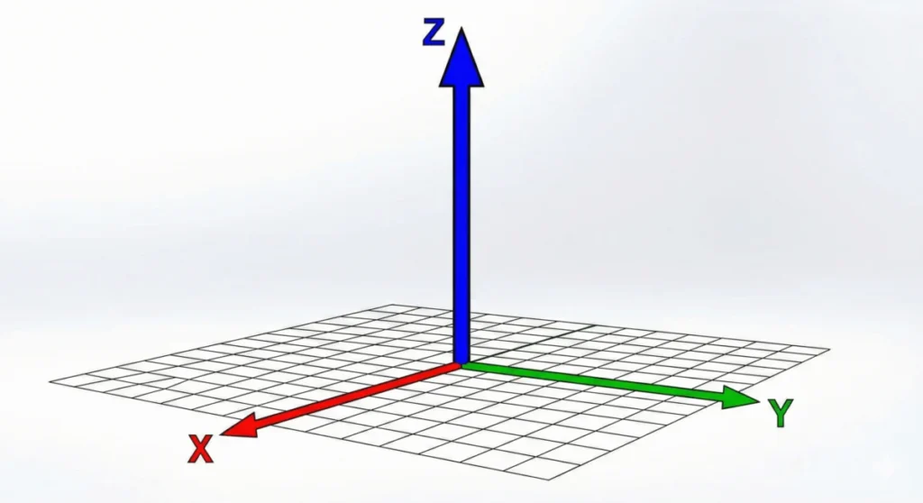
In the evolution of web design, the transition from flat, static layouts to immersive, three-dimensional interfaces has been one of the most significant shifts in front-end engineering. At the heart of this transition lies the CSS translateZ() function. While often misunderstood as a simple scaling tool, translateZ() is a sophisticated mechanism that allows developers to manipulate elements along the Z-axis, effectively introducing depth to the two-dimensional browser canvas.
Understanding how to leverage this property is essential for any modern developer looking to build complex animations, high-performance UI components, or truly reactive 3D environments.
Main Facts: Defining translateZ()
The translateZ() function is a CSS transform method that shifts an element along the Z-axis—the imaginary line that runs perpendicular to the screen, extending from the background toward the user (or away from them).
Key Technical Characteristics:
- Dimensionality: It operates within the context of 3D space, which must be explicitly initialized.
- Perspective Requirement: Unlike
translateX()ortranslateY(),translateZ()will yield no visible result unless the element or its parent container has aperspectiveproperty orperspective()function defined. - Coordinate System: A positive value pulls the element closer to the viewer, creating the illusion of growth, while a negative value pushes it further into the background, causing it to appear smaller.
It is critical to distinguish translateZ() from scale(). While both can make an object appear larger or smaller, translateZ() alters the spatial positioning relative to the camera, whereas scale() modifies the dimensions of the object itself.
Chronology: The Evolution of 3D Transforms
The journey of 3D transforms in CSS is tied to the broader maturation of the web as an application platform.
- The Early Web (Pre-2010): The web was strictly two-dimensional. Developers relied on background images and clever CSS sprites to simulate depth.
- The Advent of CSS3 (2010–2012): As browsers adopted the CSS Transform Module Level 1, developers gained the ability to rotate and skew elements. However, true 3D space was limited.
- The Transform Level 2 Specification: This era introduced the comprehensive suite of 3D properties, including
translateZ(),perspective, andtransform-style: preserve-3d. This provided a standardized way for browsers to calculate the projection of 3D objects onto 2D screens. - Hardware Acceleration (2015–Present): Developers discovered that triggering 3D transforms forced browsers to use the GPU (Graphics Processing Unit), leading to the widespread "GPU hack" where
translateZ(0)became a standard performance optimization technique.
Supporting Data: Perspective and Projection
To truly grasp how translateZ() functions, one must understand the relationship between the camera (the user’s eye) and the object.

The perspective Property
The perspective property defines the "distance" of the user from the Z=0 plane. A value of 800px suggests a standard viewing distance. If the value is too small, the distortion becomes extreme (like a wide-angle lens); if the value is too large, the perspective becomes flattened (like a telephoto lens).
perspective vs. perspective()
The difference between the property and the function is a matter of scope:
perspective(property): Applied to a parent container, it creates a shared 3D context. All children inside this container will share the same vanishing point, allowing for complex 3D scenes where multiple objects interact in the same space.perspective()(function): Applied directly to the element within thetransformshorthand. This creates a "local" perspective. It is restricted to that specific element, making it less useful for scenes involving multiple related 3D objects.
Implementation Best Practices
When nesting 3D elements, always ensure the parent utilizes transform-style: preserve-3d. Without this, child elements will be flattened into the parent’s plane, neutralizing the depth created by translateZ().
Official Responses and Specifications
The translateZ() function is governed by the CSS Transform Module Level 2 specification, maintained by the W3C (World Wide Web Consortium). The specification emphasizes that while the function is straightforward, its implementation is subject to the "User Agent" (the browser’s) rendering engine.
Official documentation clarifies that translateZ() should be used as part of the transform property string:
.element
  transform: perspective(1000px) translateZ(200px);
The order of operations is critical. Because CSS transforms are applied sequentially, the perspective function must come before the translateZ movement to ensure the projection is calculated correctly.

Implications: Performance and Optimization
Beyond aesthetics, translateZ() holds a significant role in web performance. This is perhaps its most practical application in professional development.
The GPU Acceleration Hack
Browsers traditionally render page layouts using the CPU. However, complex animations can cause the CPU to struggle, resulting in "jank" or stuttering. By applying a 3D transform—specifically translateZ(0)—developers force the browser to promote that specific element to its own "layer" in the GPU.
- Benefit: The GPU is significantly more efficient at handling matrix calculations and transformations than the CPU.
- Result: Animations become buttery-smooth, and the "flicker" often associated with CSS transitions is effectively eliminated.
- Caution: Overusing this technique (adding
translateZ(0)to every element on a page) can lead to excessive memory consumption, as each layer requires its own allocation of video memory. It should be used surgically on elements undergoing active animation.
Practical Implementation: A Step-by-Step Guide
To build a robust 3D interface, follow these steps:
- Define the Scene: Create a parent container and apply
perspective: 1000px;. This establishes the "world" the 3D objects inhabit. - Enable 3D Context: Apply
transform-style: preserve-3d;to the container to ensure the browser keeps the child elements in 3D space rather than collapsing them. - Apply the Transform: On the target element, use
transform: translateZ(distance);. - Add Interaction: Pair this with a
:hoverstate or a JavaScript event listener to animate the Z-value, creating an engaging "pop-out" effect.
Troubleshooting Common Issues
- "Nothing is happening": Check if you have defined a
perspectivevalue. Without it, the browser has no coordinate system for depth. - "It looks like scaling": If your element appears to scale rather than move, verify that you aren’t using
scale()by accident. Remember thattranslateZ()will only look like scaling if you are moving it toward or away from the camera. - "The effect is distorted": Adjust your
perspectivevalue. A very low value (e.g.,100px) will create heavy, fish-eye style distortion, while a higher value (e.g.,2000px) will make the movement look more subtle and natural.
Conclusion
The translateZ() function is a powerful tool in the CSS developer’s arsenal. While its primary purpose is the spatial positioning of elements within a 3D environment, its secondary role as a performance-enhancing trigger makes it indispensable for high-end web development. By mastering the relationship between perspective, transform-style, and the GPU, developers can move beyond the limitations of the flat screen and create experiences that feel tactile, responsive, and modern.
As we continue to push the boundaries of what is possible in the browser, understanding these fundamental spatial functions will remain a hallmark of professional-grade front-end engineering.








