
The Evolution of Motion: Mastering Scroll-Driven Animations in Modern Web Design
In the fast-evolving landscape of front-end development, the line between static documentation and immersive digital experiences continues to blur. One of the most compelling trends to emerge recently is the "scroll-driven animation"—a technique that transforms the act of scrolling from a simple navigation tool into a performative interaction. While some designers initially dismiss these concepts as "silly" or superfluous, they often evolve into essential design patterns that provide users with visual cues, depth, and a sense of responsiveness.
This article explores the mechanics of building a sophisticated "opposing columns" effect, where content blocks glide in opposite directions based on the user’s scroll position. By leveraging modern CSS features, developers can now achieve effects that once required heavy JavaScript libraries or complex frame-by-frame calculations.
The Core Concept: Redefining the Scroll
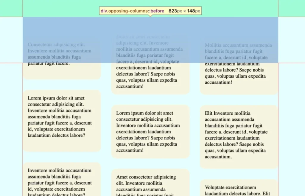
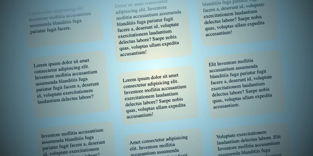
The "opposing columns" effect is a visual strategy designed to create a sense of vertical rhythm. By staggering the movement of three distinct columns—two moving upward and one moving downward—the developer creates a "parallax-lite" experience. The items appear to emerge from a hidden space, glide across the viewport, and vanish as if they were being swallowed by the top and bottom margins of the container.
This technique relies on a combination of Flexbox for structural layout and the relatively new animation-timeline property. Crucially, this implementation is built with accessibility in mind, respecting the prefers-reduced-motion media query to ensure the site remains usable for those who find high-motion interfaces distracting or disorienting.
Chronology of Development: From Concept to Code
Building a complex animation requires a methodical approach, starting from the skeletal HTML structure and moving into the sophisticated logic of CSS masking.
1. The Structural Foundation
The HTML is intentionally minimalist. By utilizing a parent element—.opposing-columns—and nested child elements, we keep the DOM clean. This reduces the performance overhead, as the browser only needs to track a handful of nodes to render the entire motion sequence.
2. Styling the Parent and the Masking Illusion
The secret to the "disappearing" effect is not opacity manipulation, but rather a masking technique using CSS pseudo-elements. By placing :before and :after elements on the parent container, we create "masking zones" at the top and bottom of the viewport.
These masks use a linear-gradient that transitions from the document’s background color to transparent. Because these pseudo-elements sit in a higher stacking context (z-index: 1) than the items, the columns appear to slide under the top and bottom edges of the parent. This creates a clean, seamless loop where content seems to originate from and disappear into the ether of the page background.
3. The Mechanics of Movement
The heart of the effect lies in the view() function. Unlike standard CSS animations, which rely on a fixed temporal duration (e.g., animation-duration: 5s), scroll-driven animations are tethered to the user’s progress through the page. By setting animation-range: entry 0% cover 100%, we instruct the browser to map the element’s entrance into the viewport to the start of the animation and its exit to the end.
Supporting Data and Technical Requirements
While the code is elegant, it is important to acknowledge the current state of browser support. As of this writing, animation-timeline is natively supported in Chrome and Safari. Firefox users may require a fallback or a polyfill to experience the same effect.
Key CSS Properties Explained
animation-timeline: view(): This property allows the animation progress to be tied to the intersection of the element within the scrollport.animation-range: This defines the exact points within the scrollport where the animation begins and terminates.linear-gradient: Used in conjunction with pseudo-elements to create the illusion of fading content without the performance cost of changing theopacityproperty on every frame.
Performance Considerations
One of the primary benefits of using CSS-native scroll-driven animations is hardware acceleration. Because the browser’s compositor thread handles these animations, they are significantly more performant than JavaScript-based scroll event listeners, which can lead to "jank" or stuttering if not optimized correctly. By keeping the logic in CSS, we ensure a smooth 60fps experience on modern mobile and desktop hardware.
Professional Perspectives and Industry Standards
The industry has largely shifted toward "progressive enhancement" as the standard for such effects. This means building the layout so that it works perfectly even if the animation fails to load.
Official Guidelines for Motion
Accessibility experts emphasize that motion must be optional. The implementation of the prefers-reduced-motion media query is not just a best practice; it is a professional requirement. Developers should ensure that when this preference is enabled, the animations are completely removed and the pseudo-element masks are disabled, defaulting to a static, readable layout.
Browser Compatibility Strategy
To ensure enterprise-grade stability, developers should use the @supports rule:
@supports (animation-timeline: view())
  /* Scroll-driven logic here */
This allows developers to define a robust fallback—such as a static grid or a standard CSS transition—for browsers that do not yet support the view() function, ensuring that the user experience is never broken by modern, bleeding-edge design choices.
Implications for Web Design and User Experience
The ability to link animations directly to scroll position signals a new era for storytelling on the web. Historically, long-form content was static; now, it can be dynamic and reactive.

1. Engagement Metrics
Studies suggest that users are more likely to engage with content that feels "alive." By using scroll-driven animations to guide the user’s eye, designers can effectively prioritize specific pieces of information, such as brand logos, testimonials, or key data points, without overwhelming the reader.
2. The Death of Heavy Libraries
For years, libraries like GreenSock (GSAP) or ScrollMagic were the industry standard for these types of effects. While these libraries remain powerful, native CSS support for scroll-driven animations significantly reduces the need for external dependencies. This leads to smaller bundle sizes, faster load times, and a reduced carbon footprint for web applications.
3. Future-Proofing Design
As we look toward the future, it is clear that browsers will continue to standardize these features. The "opposing columns" effect is merely one application. Developers can expect to see scroll-driven transitions applied to navigation menus, image carousels, and even complex data visualization dashboards.
Conclusion: A Call for Experimentation
The "opposing columns" concept is a testament to the fact that modern CSS is a tool for creativity, not just layout. What may seem like a "silly" experiment often lays the groundwork for how we will build the web of the future.
As the community continues to refine these techniques, the focus must remain on the intersection of aesthetics and performance. By mastering the view() function, respecting user accessibility settings, and writing clean, forward-thinking code, developers can create digital environments that are not only beautiful but also remarkably intuitive.
What will you build next? The tools are available, the performance is there, and the possibilities for scroll-based storytelling are limited only by the imagination. Whether you are using this for a minimalist portfolio or a complex data-heavy dashboard, the lessons learned from this "opposing columns" experiment remain universal: simplify the logic, respect the user, and let the browser do the heavy lifting.








